 Figma
Figma
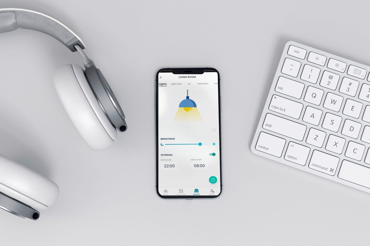
A device screen that behaves like a remote: one job, big controls. The core promise of the whole rebuild, in a single view.
Overview
Redoing the whole app and design language from scratch as Vitae22's first real product.
The idea behind this project was to redesign an app that could sit alongside Vitae 22's hardware and give people a complete home IoT solution, one that actually improved the everyday experience instead of just adding another screen to it. The app that existed was cumbersome: the navigation confused people, and the design style never quite settled into anything you could call a style at all.
I was responsible for the complete design and planning of the app's interface, start to finish. That meant sitting with the mess first: a UX audit and research synthesis to understand exactly where people were getting stuck and why.
From there I owned all of it: new user flows and information architecture, grayscale wireframes for every screen and state, a complete design system built to hold the whole product together, and the high-fidelity final designs for the app in full.
First-open overwhelm, a setup flow that broke, and daily controls buried out of reach. People were quietly giving up on it.
Fewer choices, plainer words, one job per screen, and a guided, forgiving pairing flow.
Launched in 2019, and the engineers kept shipping features straight from the component library long after, no designer required.
Architecture & Flows
System first. Screens second.
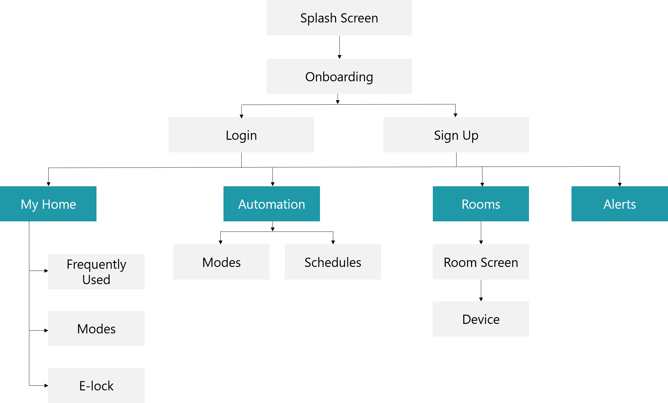
Before any final pixels, I rebuilt the full user flow from scratch, every screen, state and transition, with developers in the room to flag the technical limits early. Teal marks the primary navigation. Everything else stays secondary.
The Work
From early sketches to a calm, consistent app.
Every fix pointed the same way: fewer choices, plainer words, one job per screen.
Working out the home layout and the pairing flow on paper first.
Early sketches were where I stripped each screen down to a single job, home shows only your most-used rooms and devices, and worked out pairing as a guided, step-by-step story instead of a form full of jargon. Every element had to justify its place before it earned a spot in a final screen.
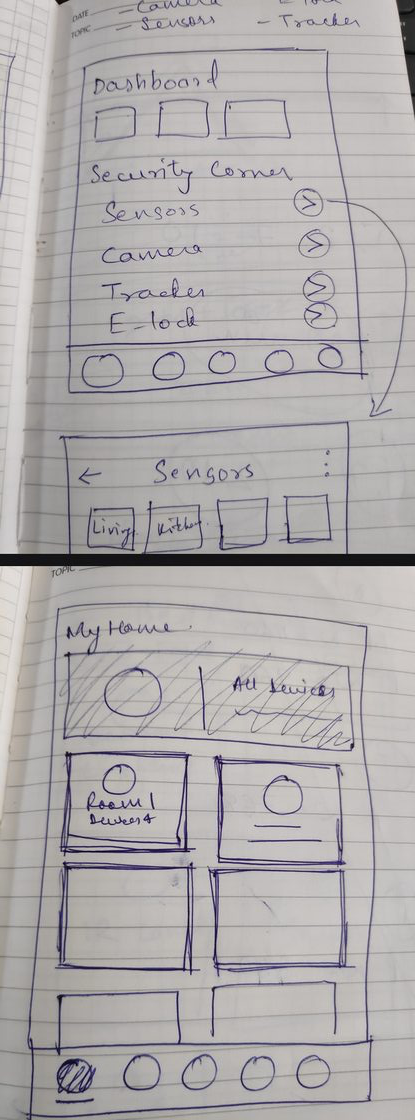
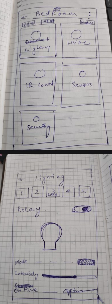
Left: home and dashboard, reduced to what mattered. Right: pairing, rebuilt as one instruction per screen.
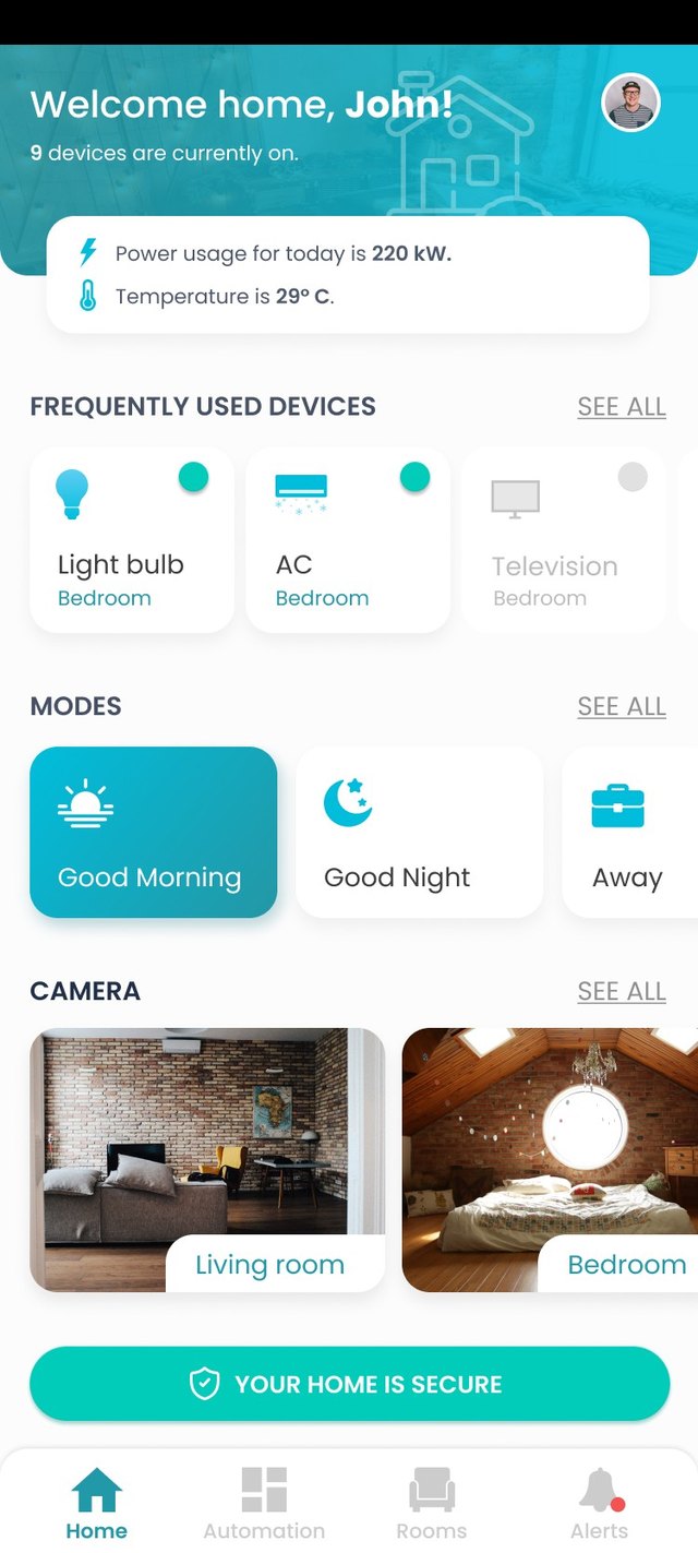
The first thing you see, and everything you need most.
This is the very first screen a user lands on: a welcome message, a quick summary of the home, frequently used devices, modes, and camera thumbnails, all in one view. Built from the same design system as every other screen, so it's the anchor for the whole app rather than just an entry point.
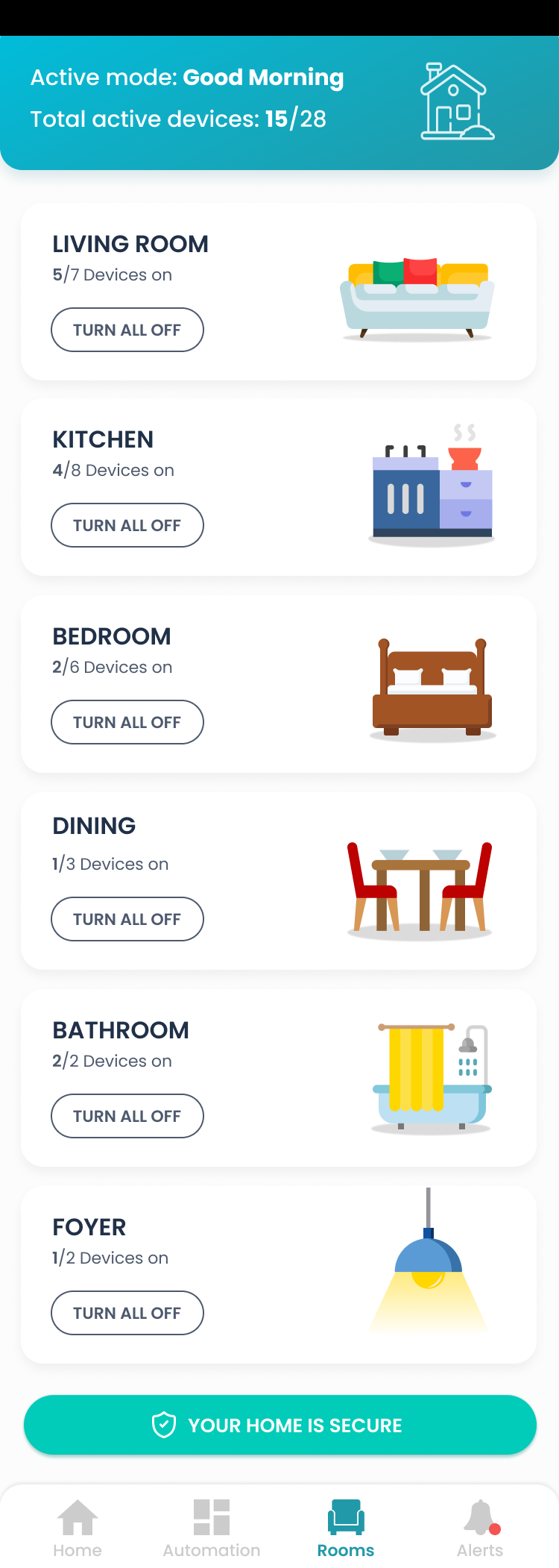
Turn a whole room on or off in one tap.
Favourite devices sit together on one screen so you can switch them all on at once, no hunting through rooms first. The illustration reads the state back to you at a glance: the room glows when devices are on, and goes dark when they're off.
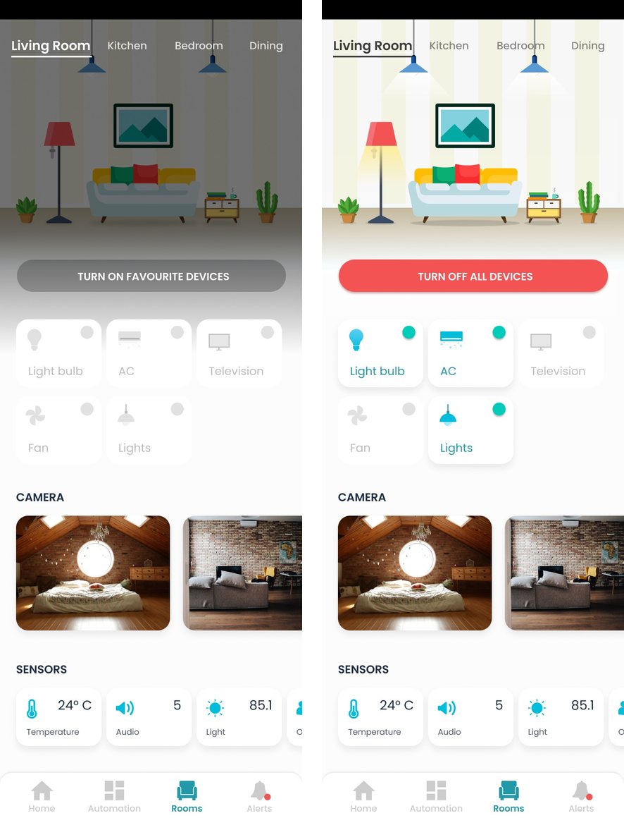
Off state: the room reads dark. On state: the illustration lights up, no need to check each device individually.
Plain language, everywhere it counts.
Automations cover two different needs. Modes, like Good Morning, Good Night, or Away, bundle several actions into a single tap. Schedules go further, letting you set a condition and the action that should follow it, so the home responds on its own without you opening the app at all.
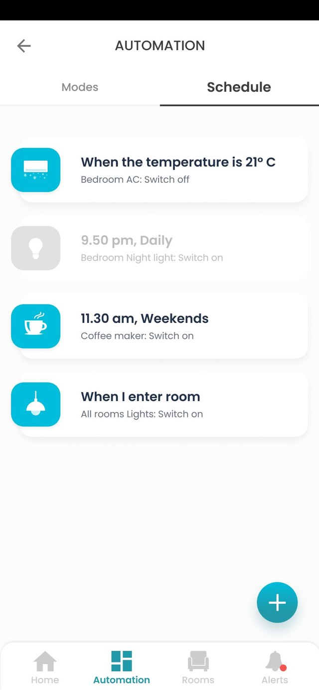
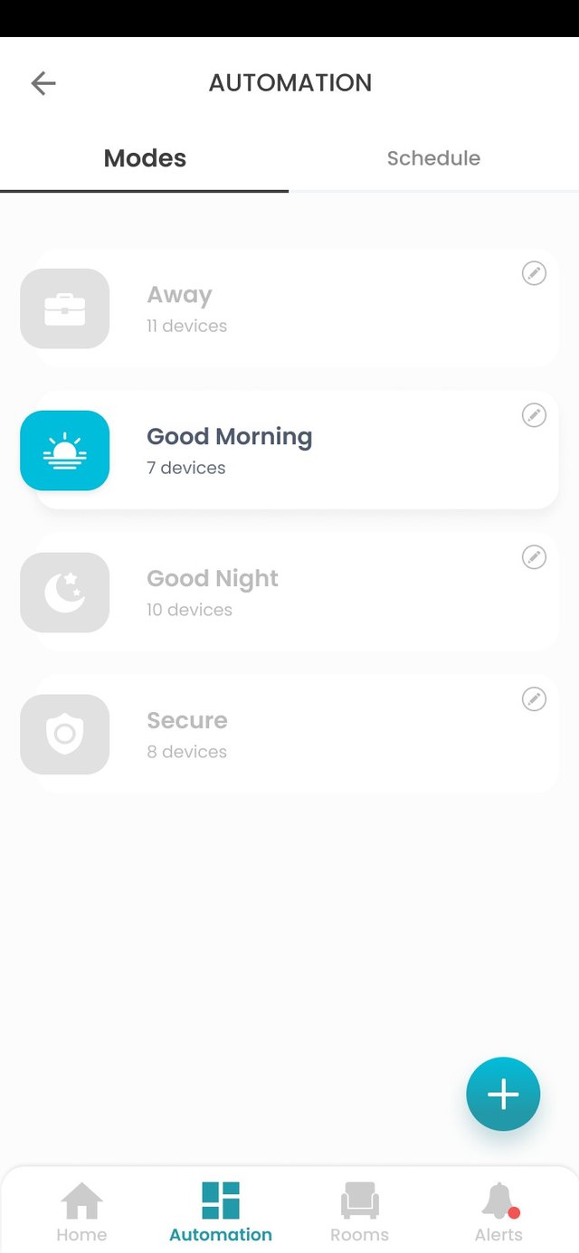
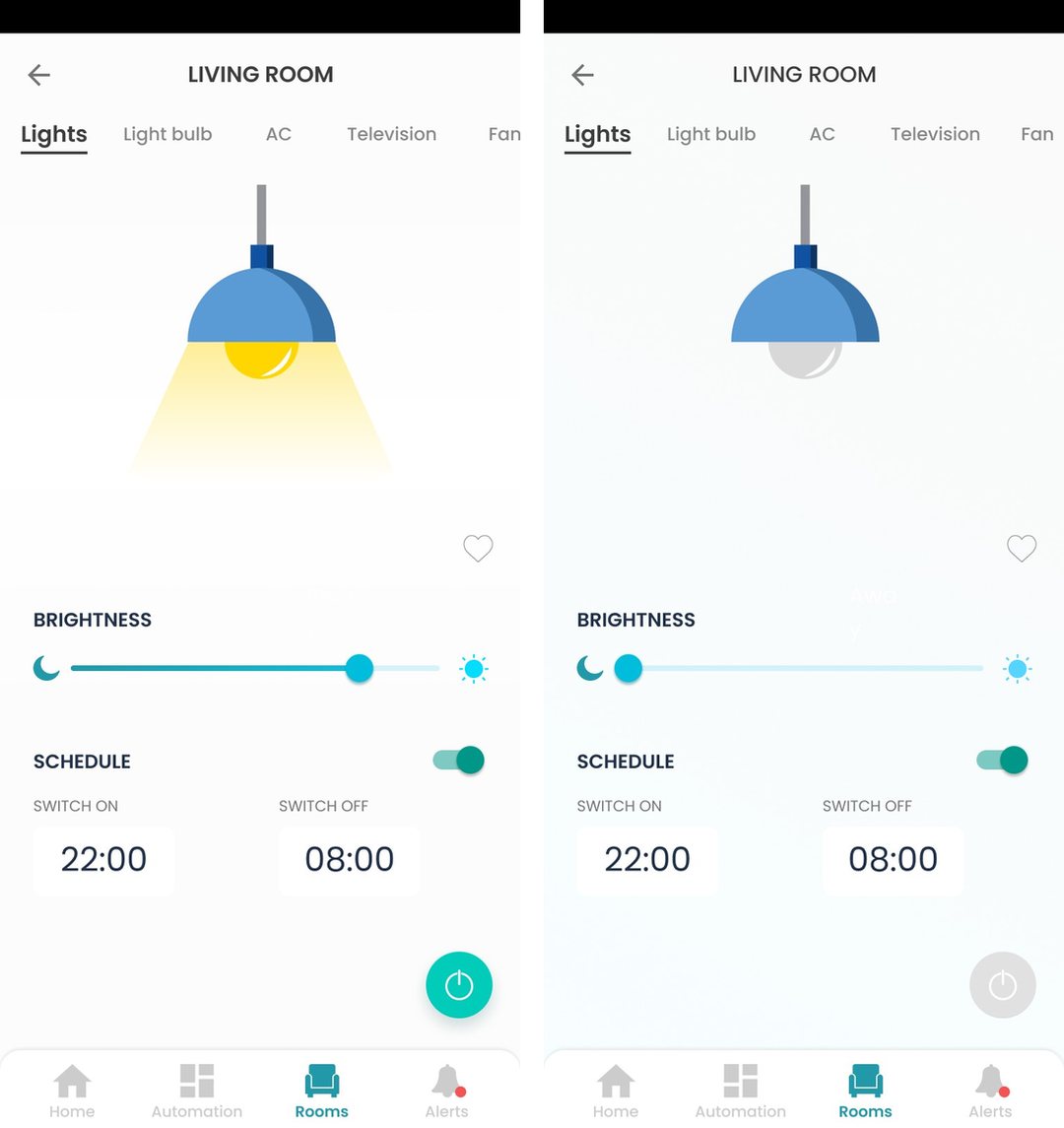
Schedules, modes as tappable cards, and the same control component in two clear states.
Next
Smaller projects that still mattered. Three industries, three roles, same care.
See the range