Context
Tighter in scope, wider in range.
Most of my work lives in deep-dive case studies, one product, one client, one problem unpacked from first principles. These three are different.
A consumer mobile app built from a blank page. A marketing agency site that has to sell taste itself, not just communicate information. An IT consultancy that needed a whole identity, from logo to brand collateral, built from scratch. Three kinds of brief, three different muscles.
Koel.
An app for social audio. Logo and UI design.
Logo design and UI design style.
Koel lets people socialize through voice notes and audio clips instead of text or video, rooms, ongoing audio threads, and reactions. Somewhere between a podcast and a group chat.
I designed the full visual identity from a blank page. The logo folds the bird's name into a sharp-edged origami shape, in gold against dark. The UI followed: neomorphic, dark-themed, gold accents, soft shadows and raised surfaces that feel tactile, which matters for an app built around touch gestures.
Most of the portfolio is web and SaaS. Koel shows I can design a distinct visual identity for a consumer mobile app, one color, one shape language, used with restraint across every screen.
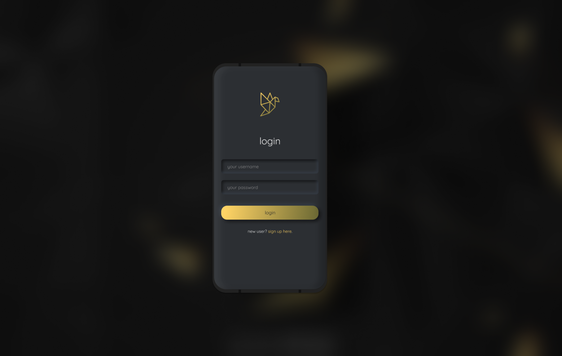
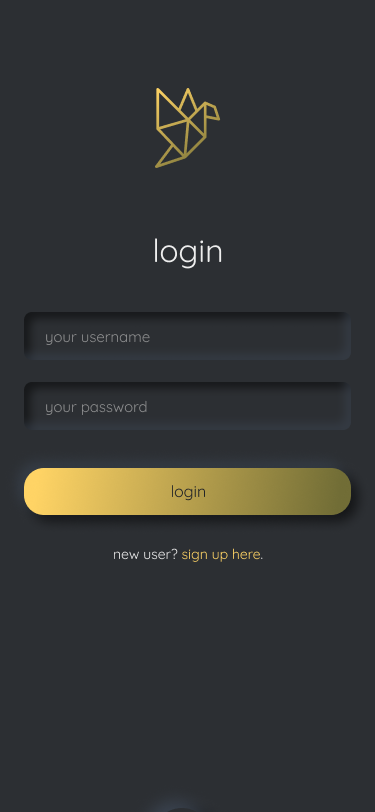
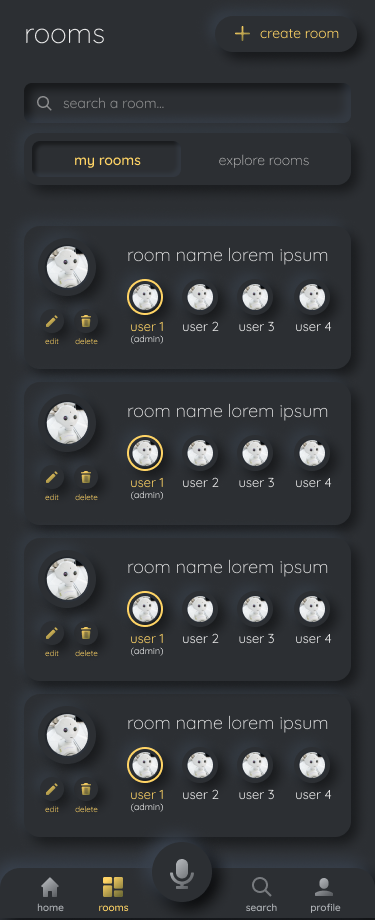
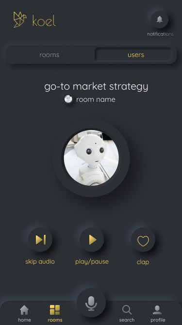
The dark neomorphic style, raised surfaces and soft shadows built for touch.
Webenza.
Website for a Bangalore digital marketing and branding agency.
Website design.
Webenza needed a site that reflected their actual work, brand strategy, digital marketing, and UX for clients like Bosch, Dr. Reddy's, ThoughtWorks, and Red Hat. The old site didn't say "we are good at design" loudly enough for an agency whose whole pitch is design.
Built the visual system around black and white, deliberately restrained, so the agency's project work and client logos could do the talking. Bold serif-meets-sans typography, dark sections for credibility, light sections for breathing room. Block-highlight headline type reads as confident without needing imagery.
An agency website needs to sell taste itself, not just communicate information. This project shows I can design something that's essentially a portfolio for someone else's portfolio.
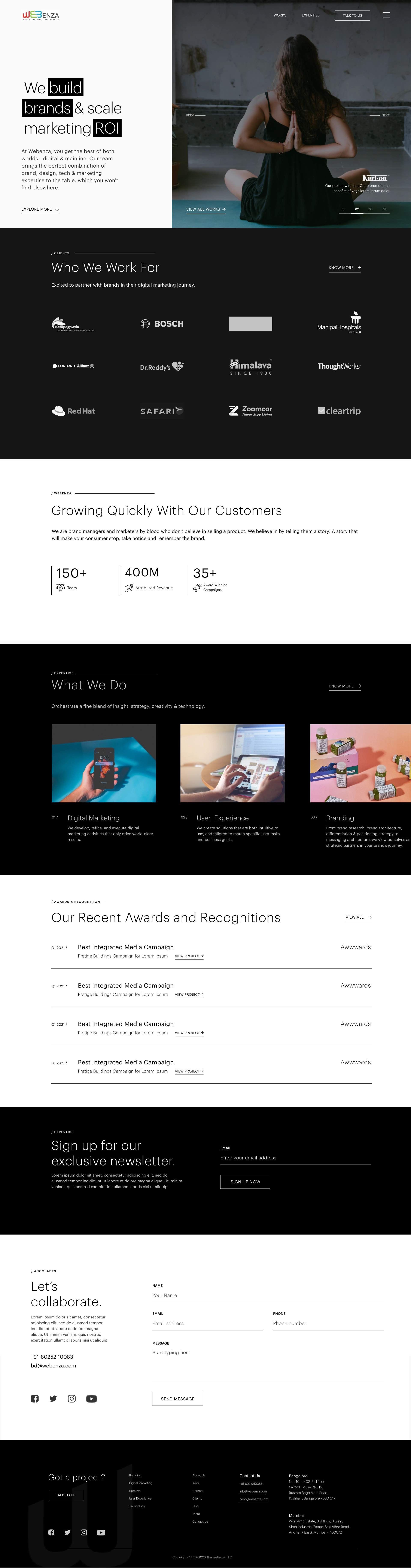
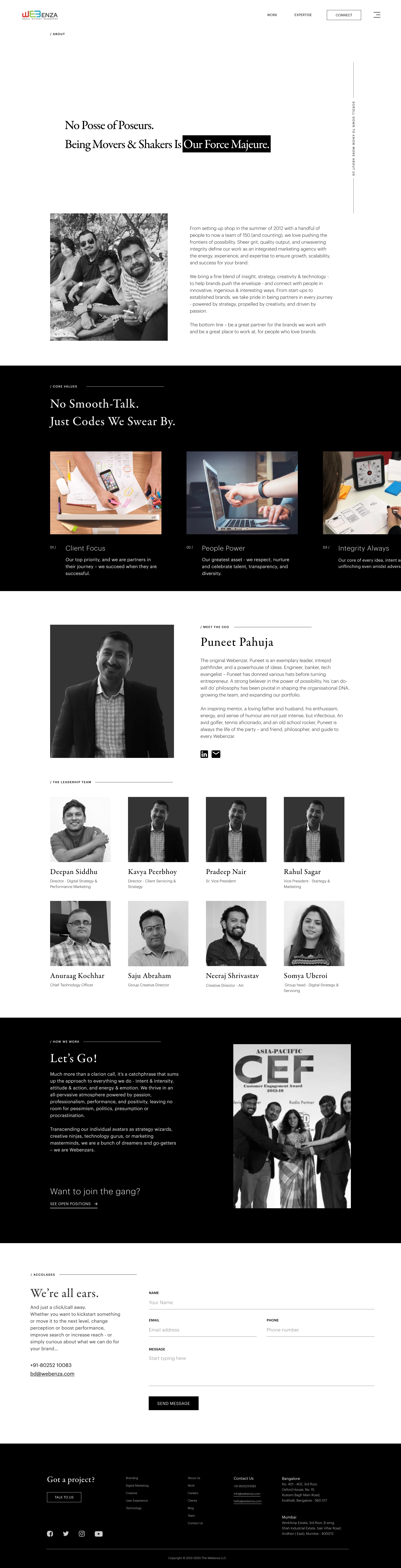
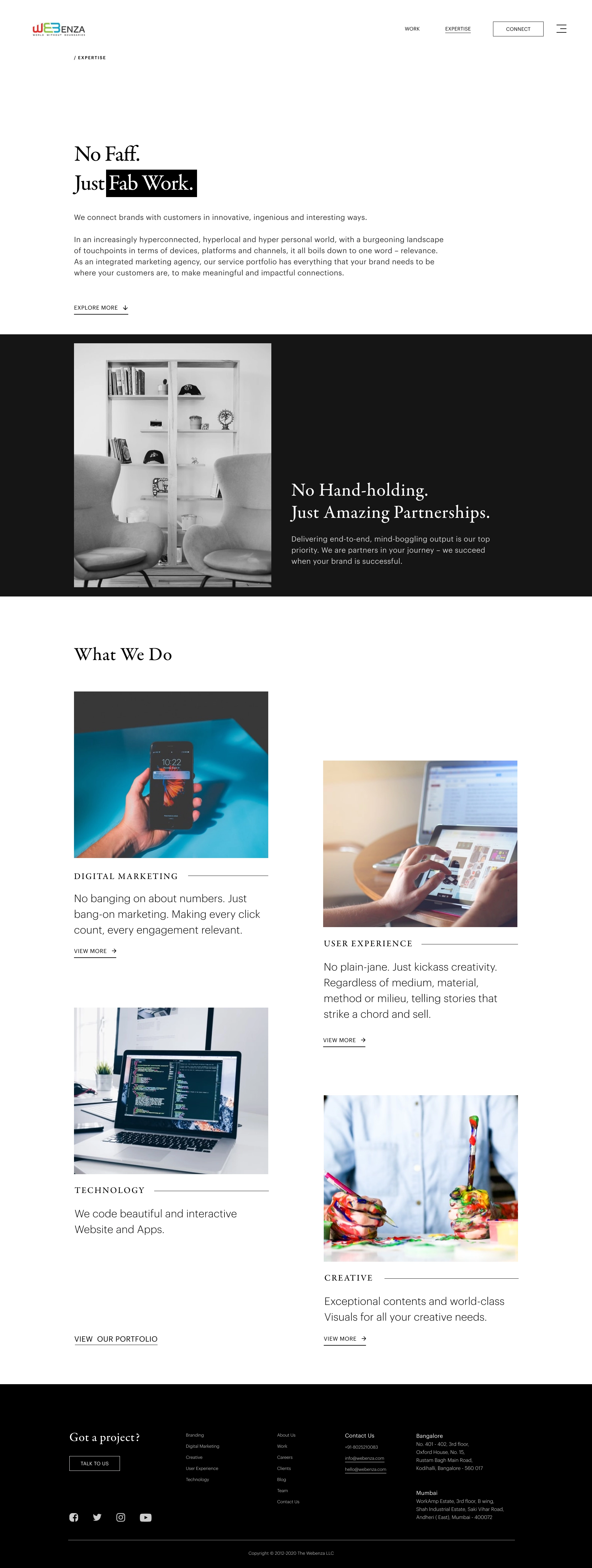
Homepage, About, and Expertise, do they have taste, and do serious clients trust them?
eTranbiz.
Brand identity and marketing collateral for an Oracle IT consulting firm.
Logo design, brand identity, and brochure design.
eTranbiz is an IT consulting firm helping enterprise clients with Oracle products, cloud transformation, and digital strategy. They came in with a name and no visual identity at all, nothing to put on a business card, a proposal deck, or a website.
I explored a dozen-plus logomarks before landing on a faceted geometric badge in teal, green, and gold, meant to read as sharp and technical without tipping into cold. That mark then had to carry the whole brand: a sales brochure, marketing collateral, and the visual foundation for their website.
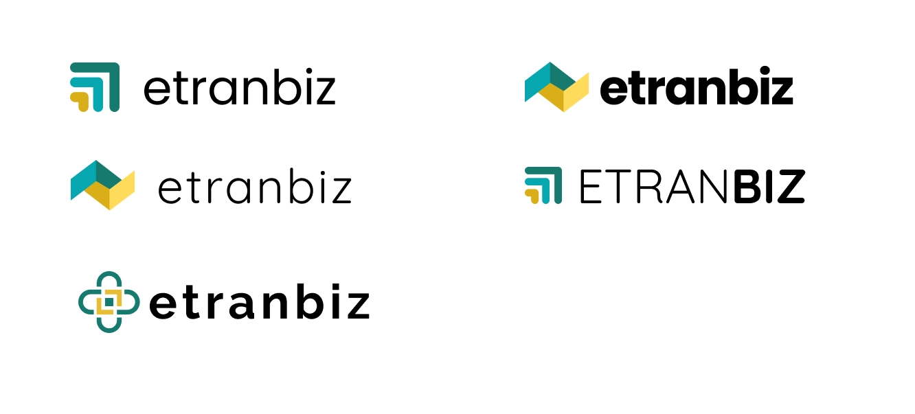
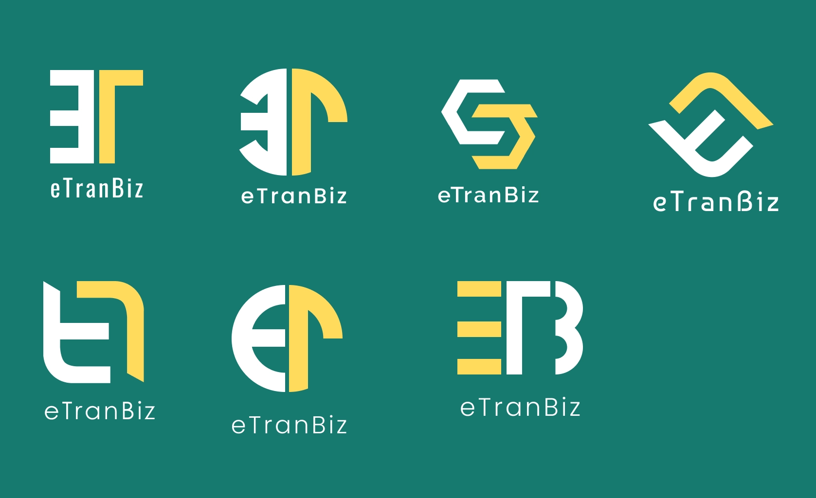
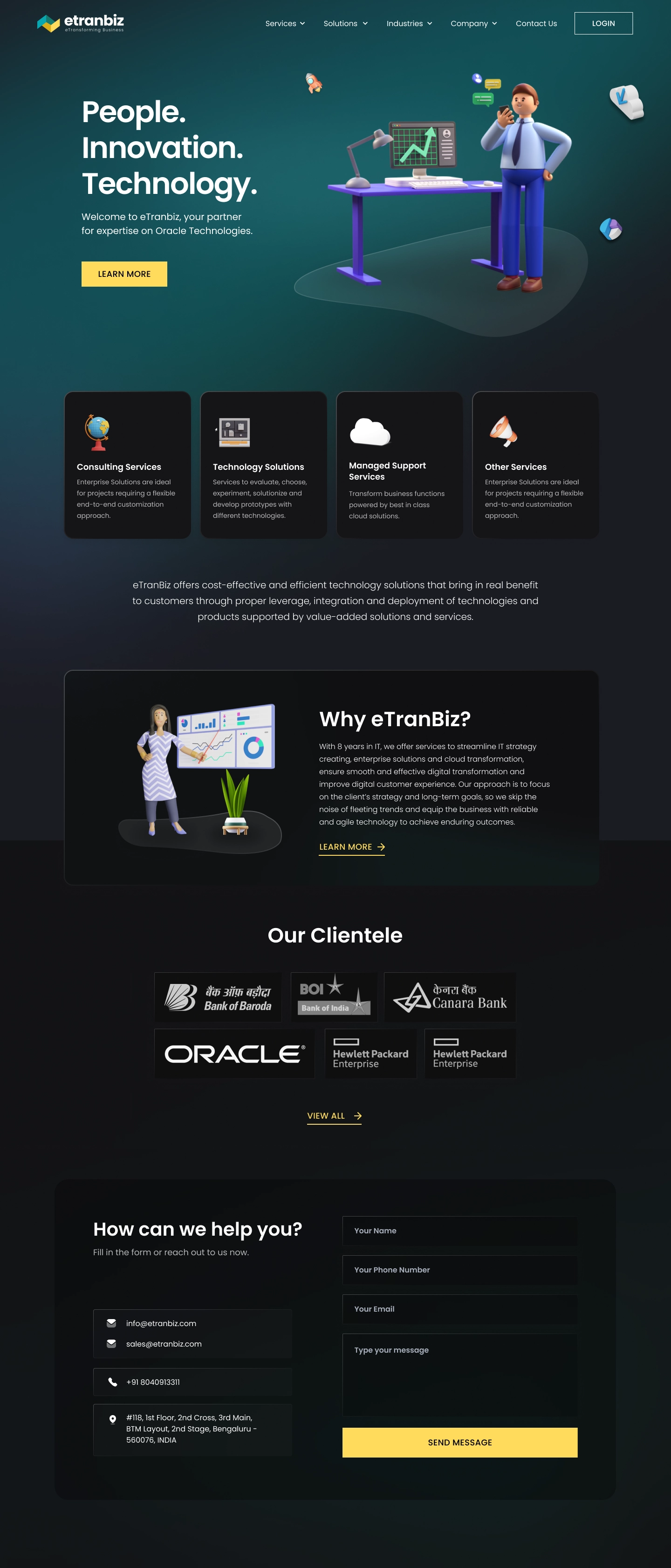
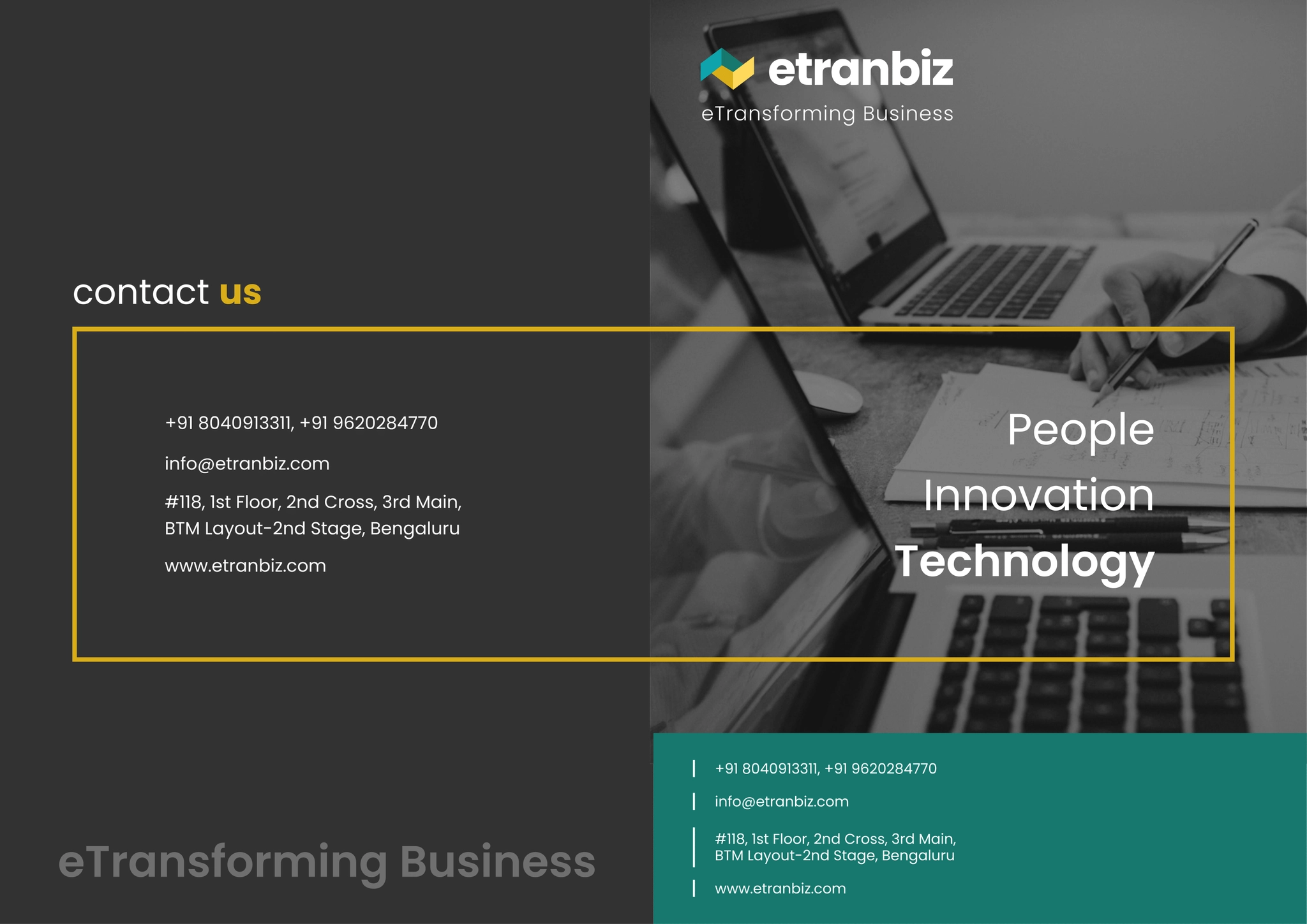
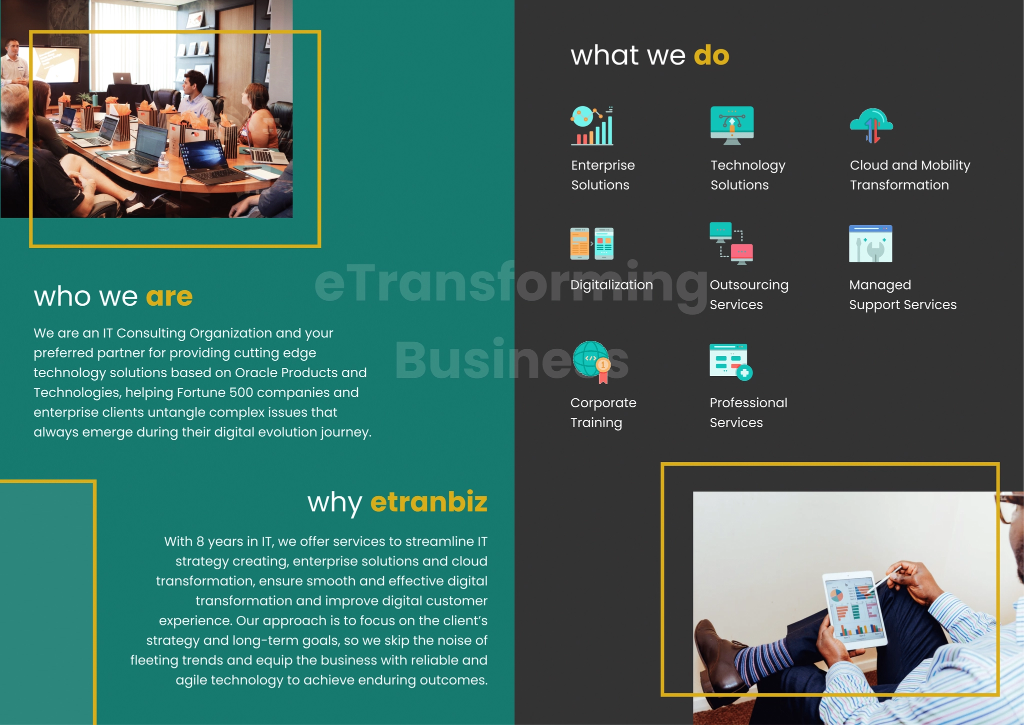
Logomark, early exploration, the resulting website, and the sales brochure it all had to hold together.
Three different industries. Three different roles. Same instinct: understand what the client actually needs, then build the smallest, clearest thing that delivers it.