 Figma
Figma
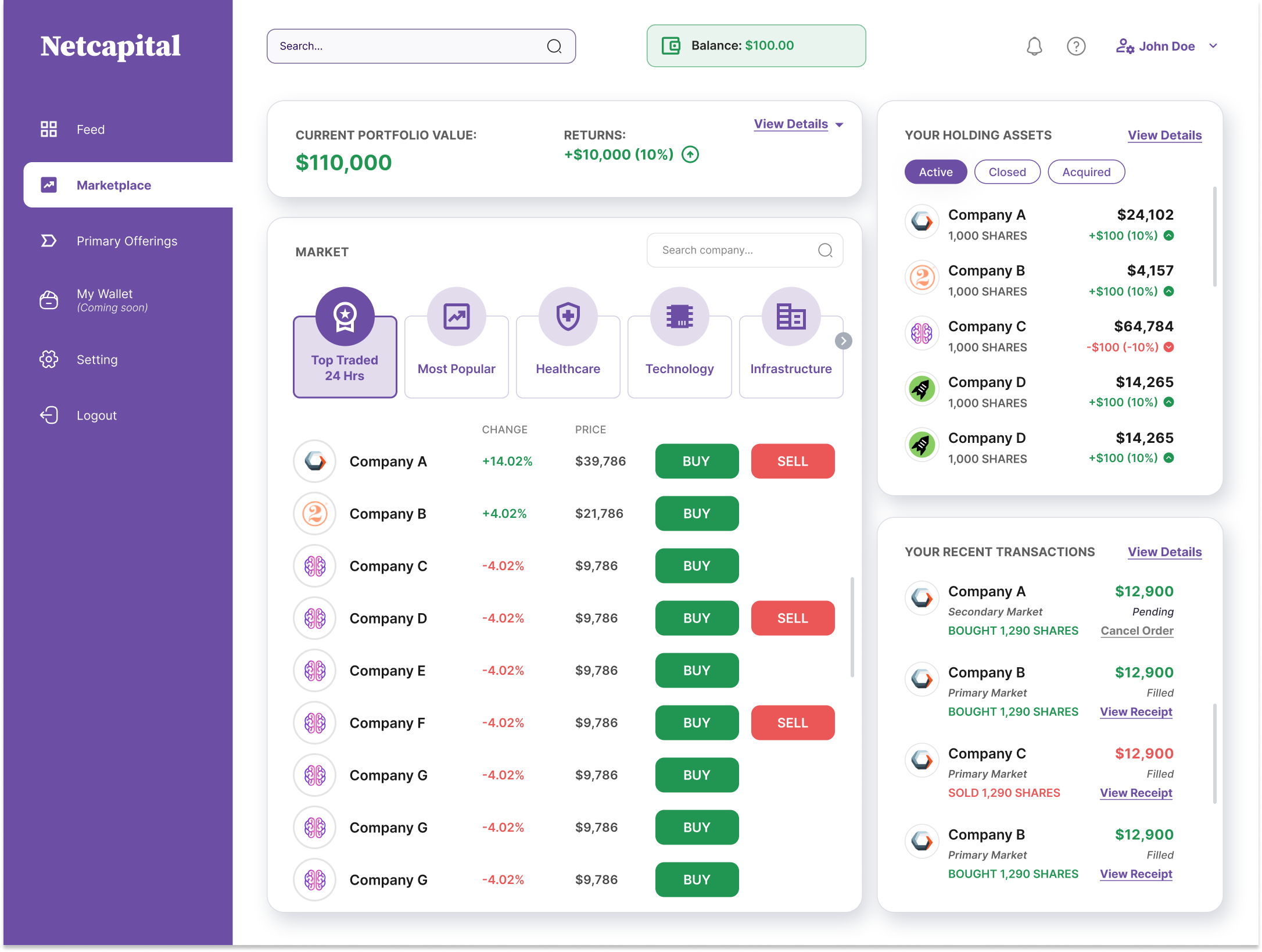
The marketplace dashboard, a trading surface people can read plainly
Overview
I led product design for Netcapital STF, a way out for money that never had one.
Netcapital is an SEC-registered crowdfunding portal. Ordinary people put small amounts into early-stage companies during a raise, and then comes the catch: those shares are private. There is no exit until an acquisition or an IPO, which might be a decade off, if it comes at all.
The Secondary Transfer Facility was Netcapital's answer. A compliant venue where holders post shares for sale, new investors place bids, and the platform quietly matches the two. My job was to take a thicket of securities regulation and order-matching logic and turn it into something a first-time investor could use in three taps, and trust with actual money.
I owned the whole thing: research, information architecture, wireframes, the order mechanic, and every high-fidelity screen on desktop and mobile.
Crowdfunding worked out how ordinary people get into startups. We let them get back out.
A bid and ask marketplace where the price comes from the market, not from us, and every fee and every cancellable commitment sits in plain sight.
A retail-accessible secondary market for Reg CF shares, launched end to end, giving early investors a real path to an exit at last.
Impact · What shipping this meant
Standing up the first compliant retail secondary venue.
Research and outcome figures are illustrative of the project's goals and provided for this case study.
Process · Fidelity ladder
From ballpoint sketches to a settled trade.
Pen and paper to argue about structure, mid-fidelity to pressure-test layout and copy, then high-fidelity designs.
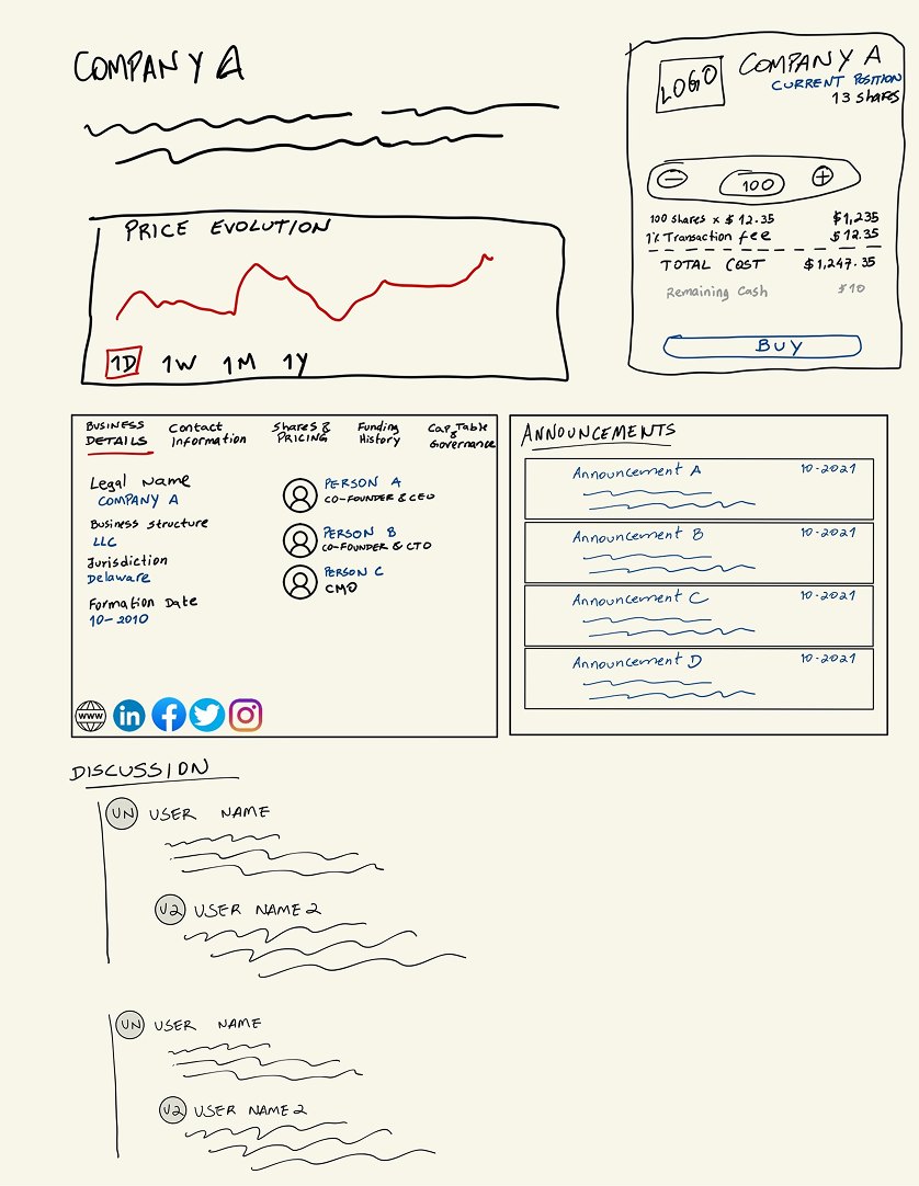
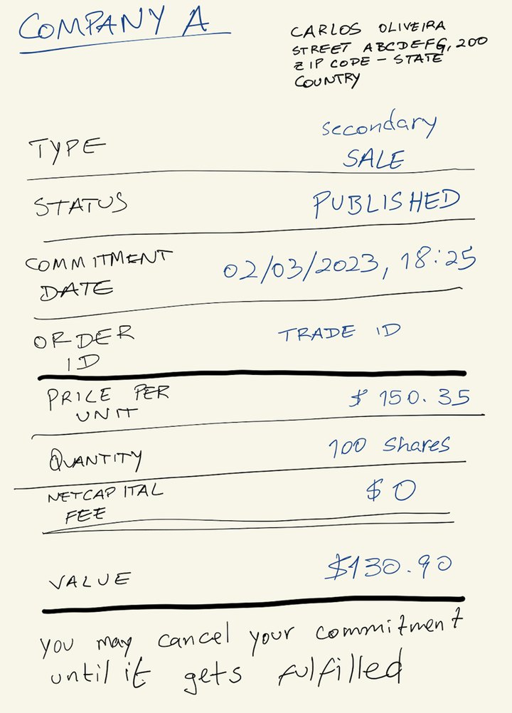
Lo-fi deal page and commitment receipt.
Reframe
A redesign of the platform to include a more transparent process and how it works.
Netcapital's earlier pages talked about secondary transfers the way a brochure talks about a holiday: a promise and a flat table. The redesign turned that promise into a working, real-time venue with a portfolio, a live market, and order placement built right in.
Design System
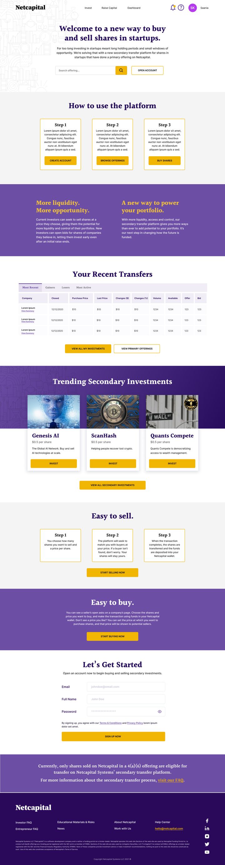
Netcapital's own design system that I had originally design for marketing products
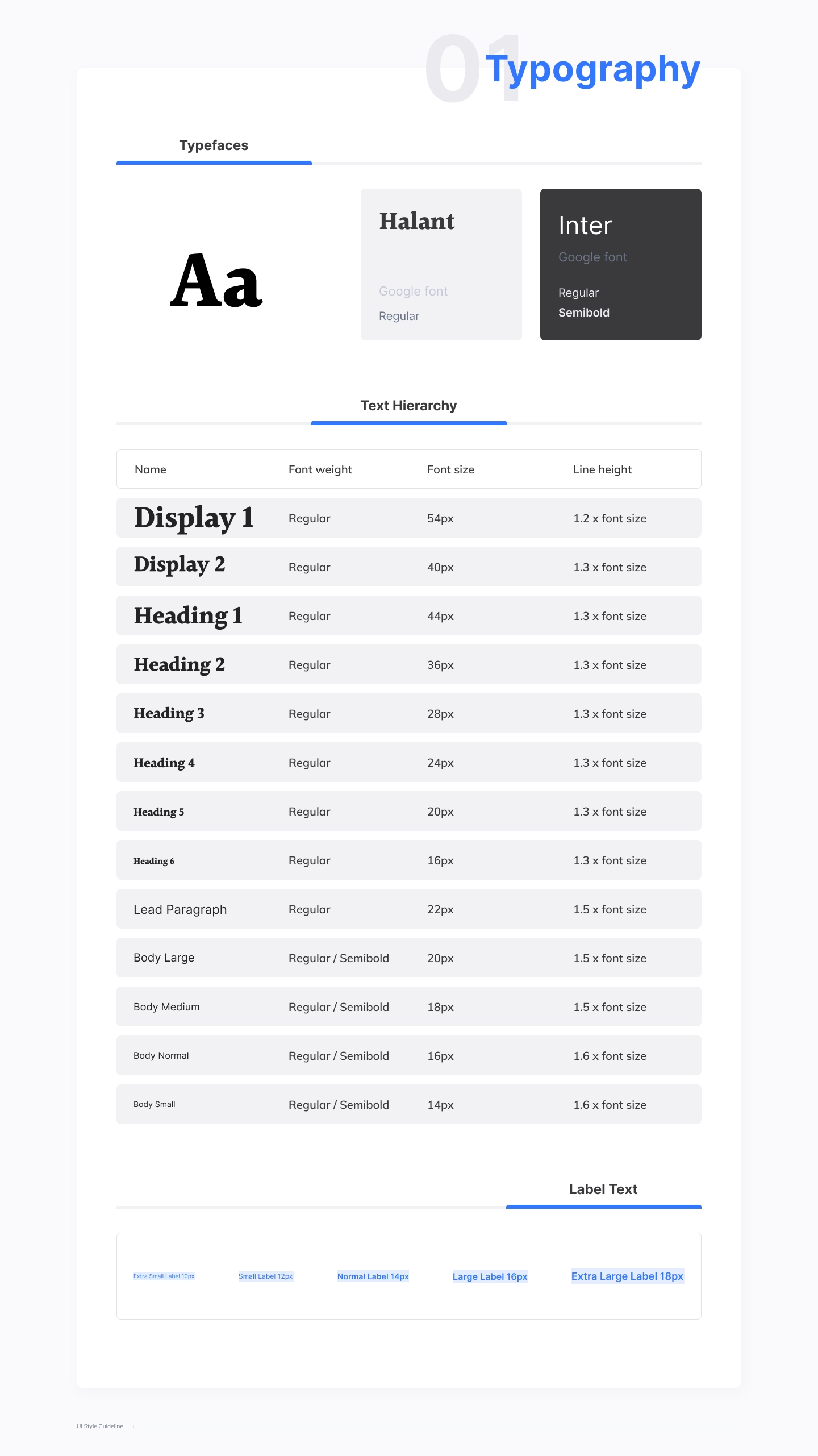
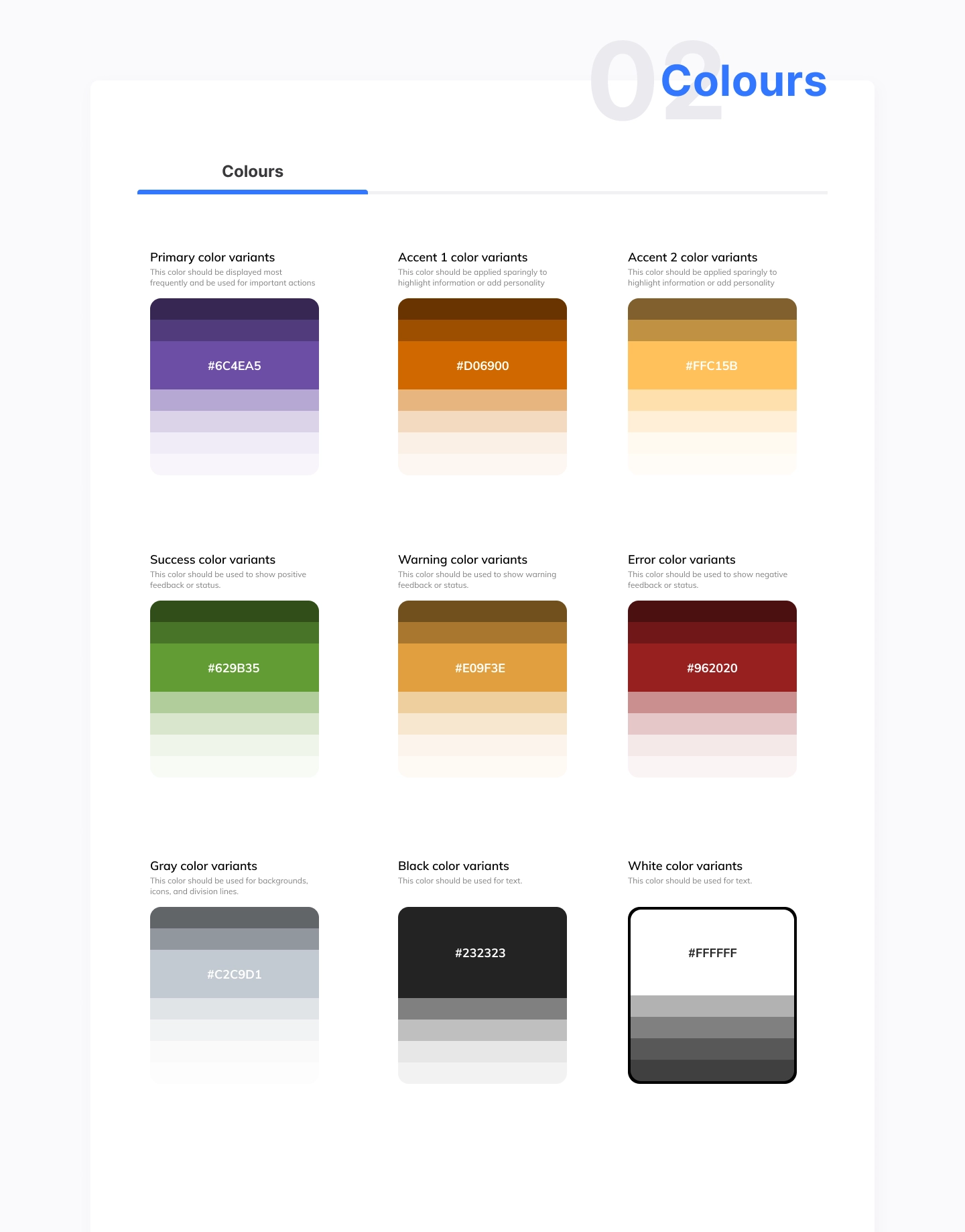
The STF had to feel like an obvious extension of Netcapital's existing brand and component library, not a separate product bolted on. I worked from their established typography, color, grid, and component set.
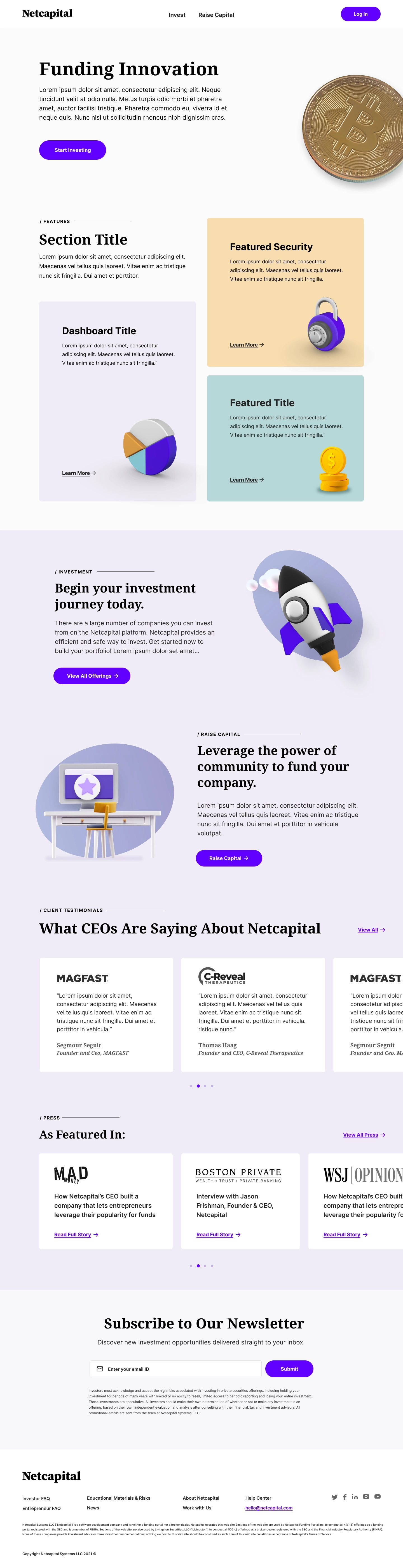
Netcapital's existing homepage, the brand and component foundation the STF had to feel native to.
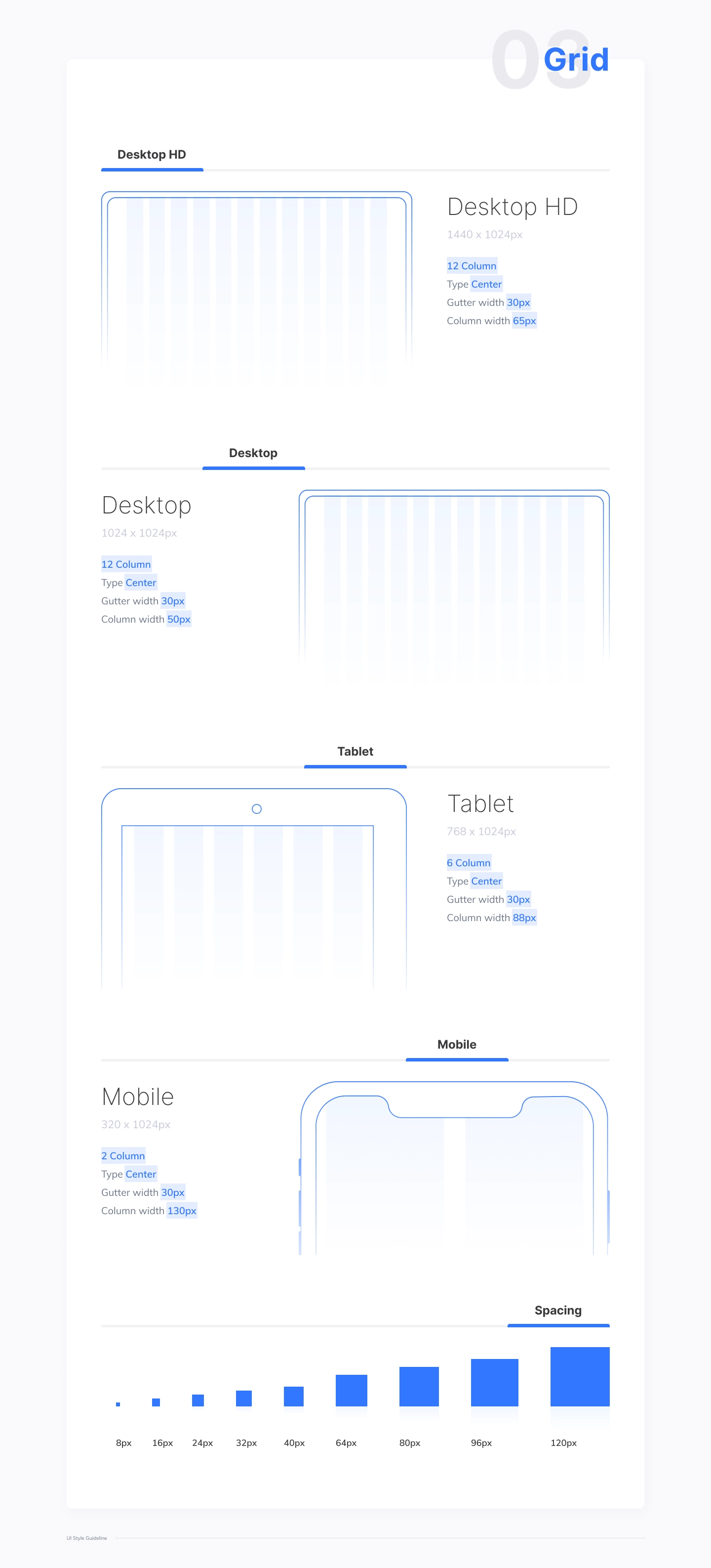
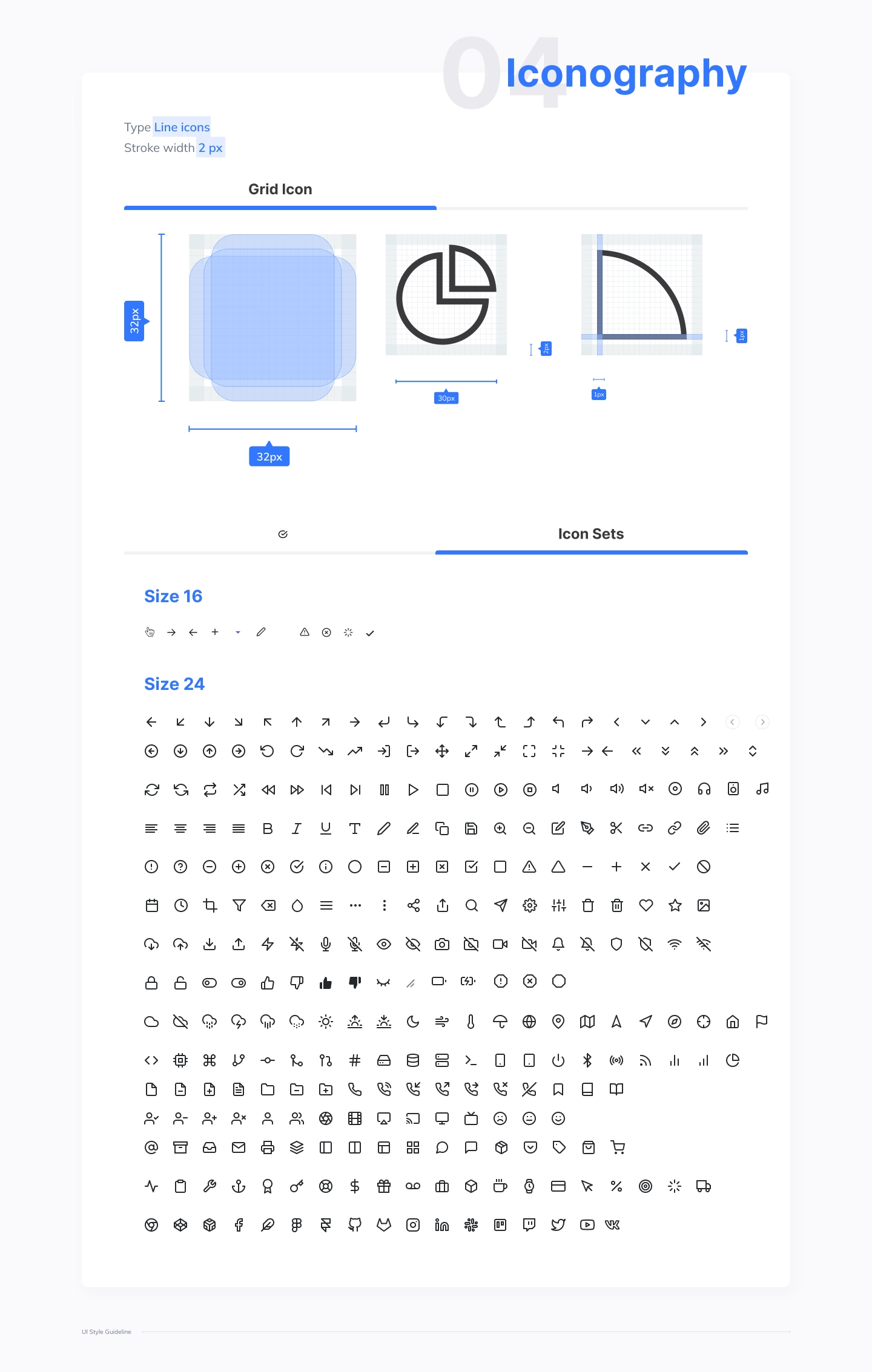
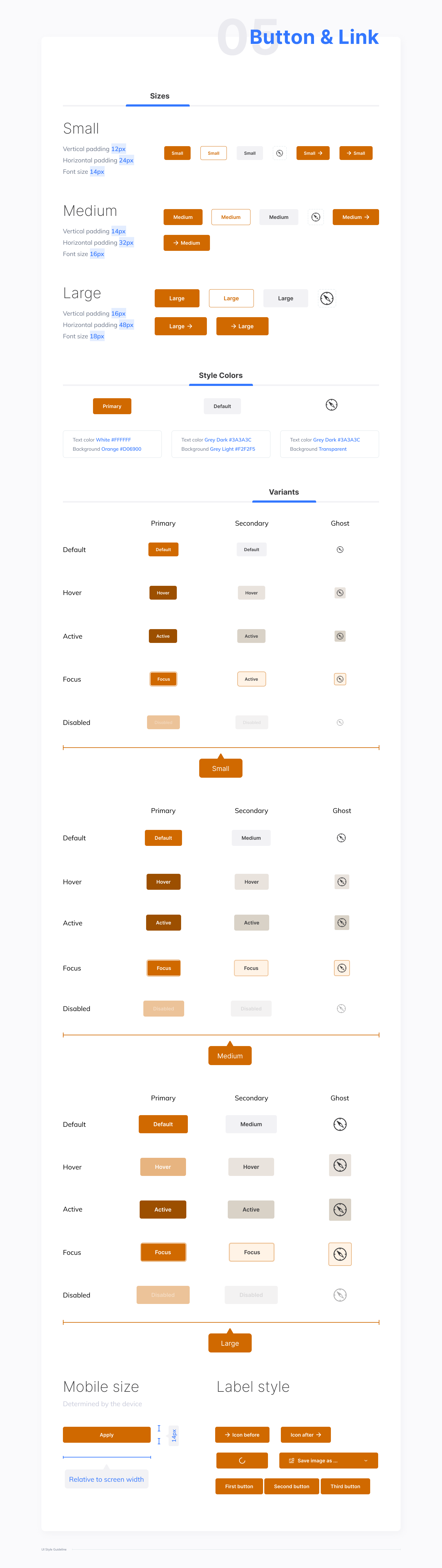
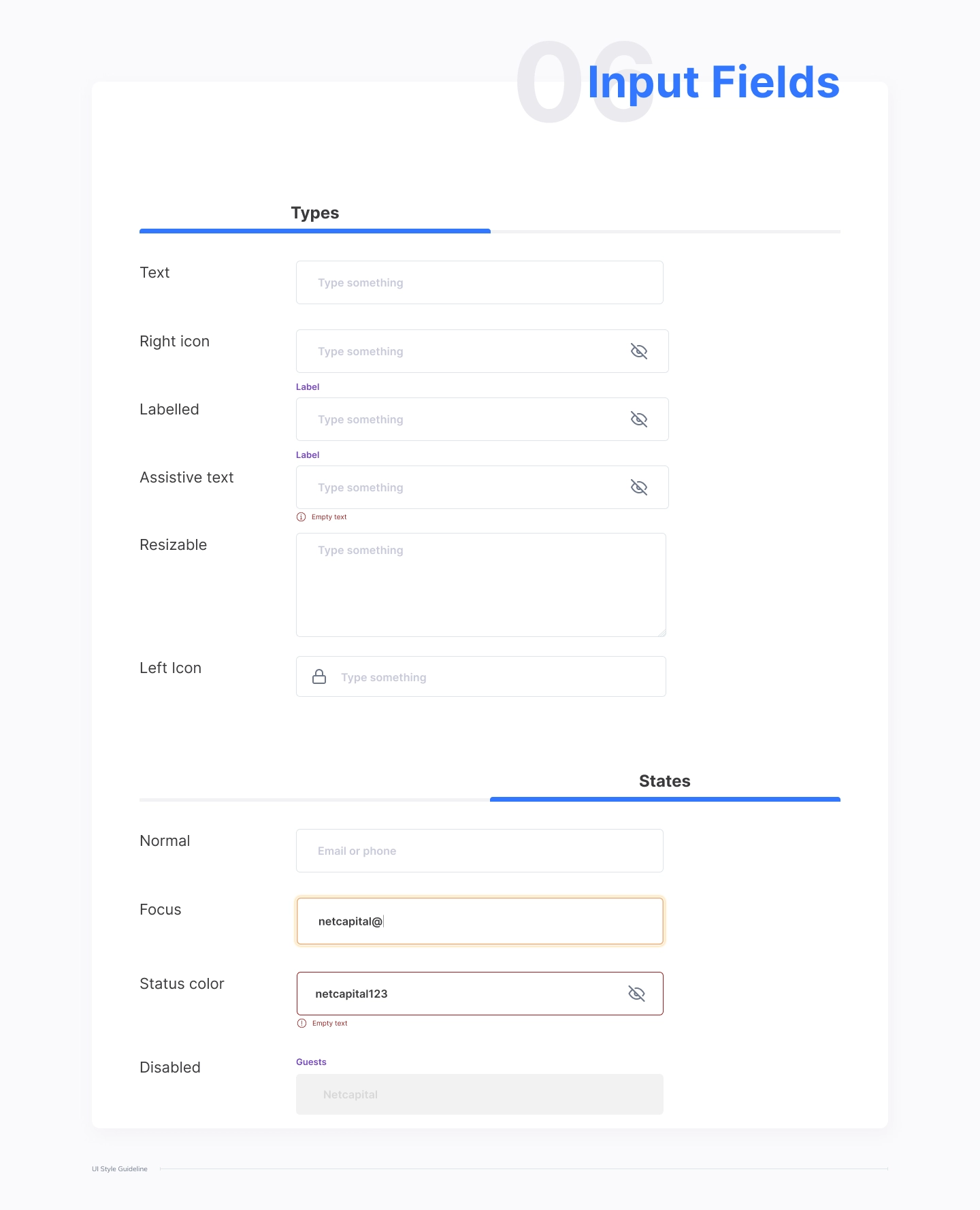
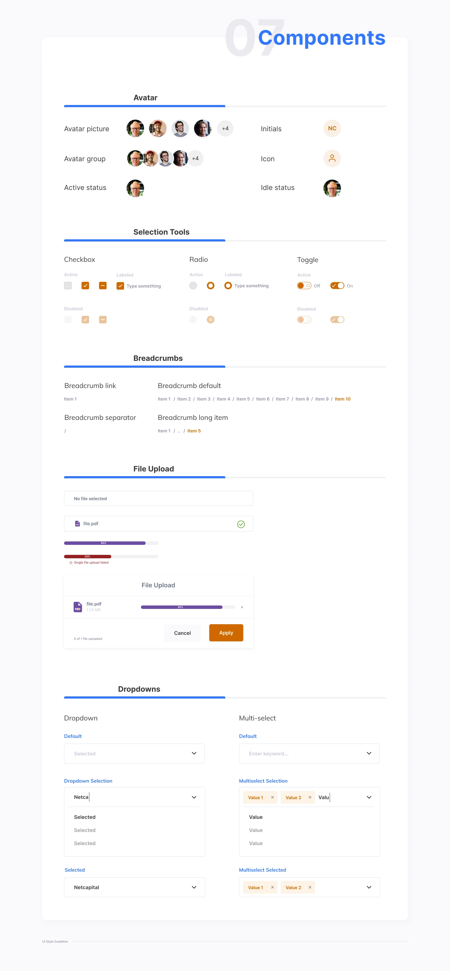
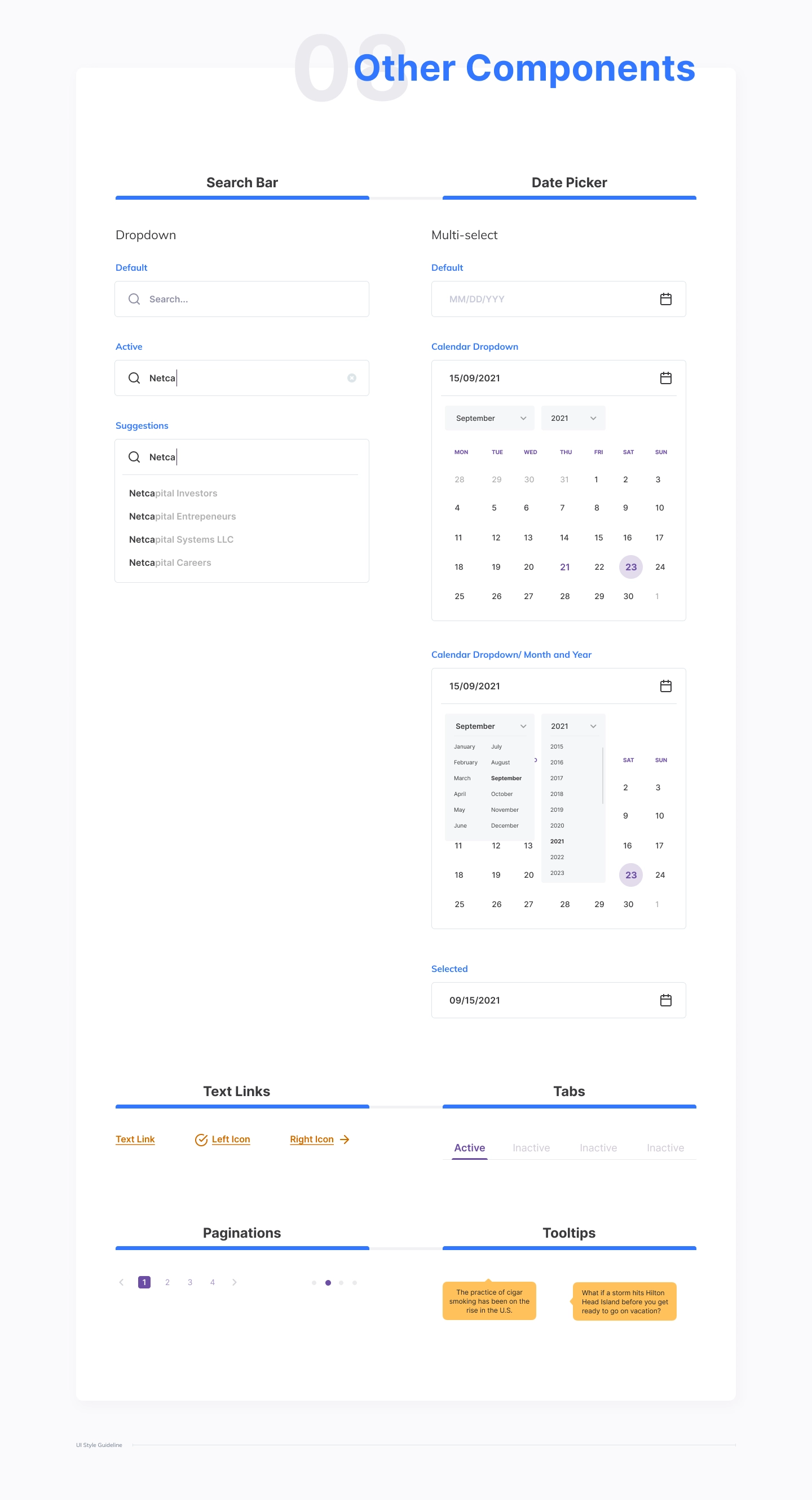
What the STF added
Gain and loss colors are new to the STF, reserved strictly for that meaning, never reused for hover states or decoration.
Action vocabulary
Actions keep one name through a whole flow: the button that says Buy shares produces a receipt that says bought.
The Product
Final product
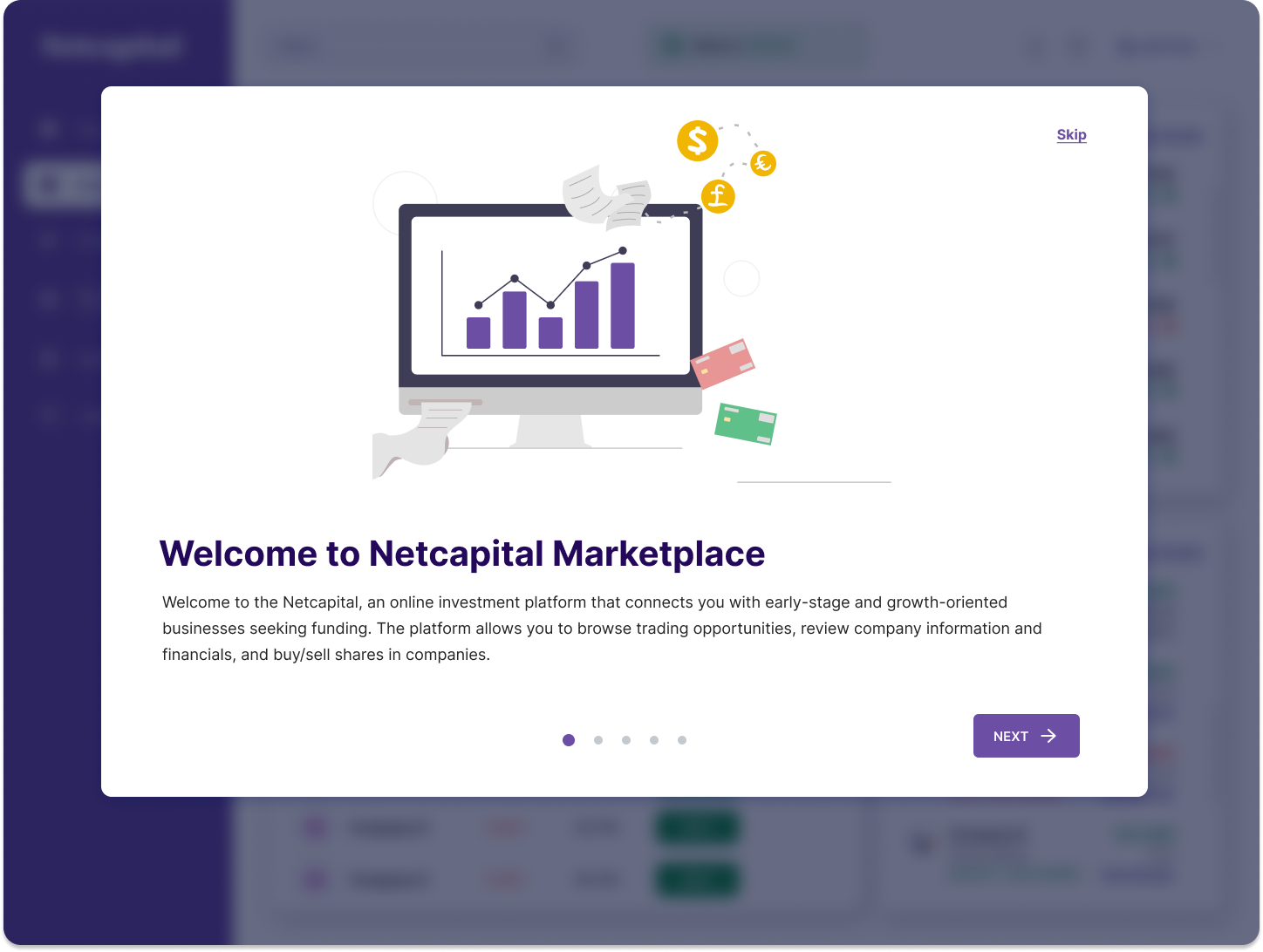
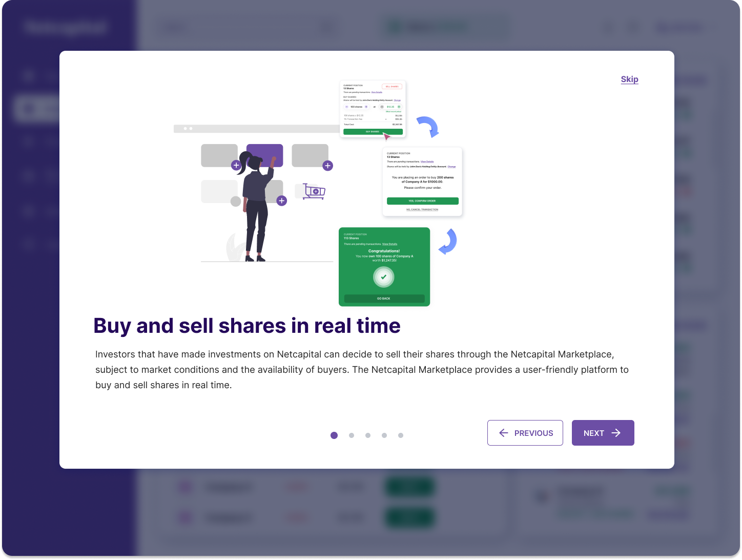
Onboarding that earns trust.
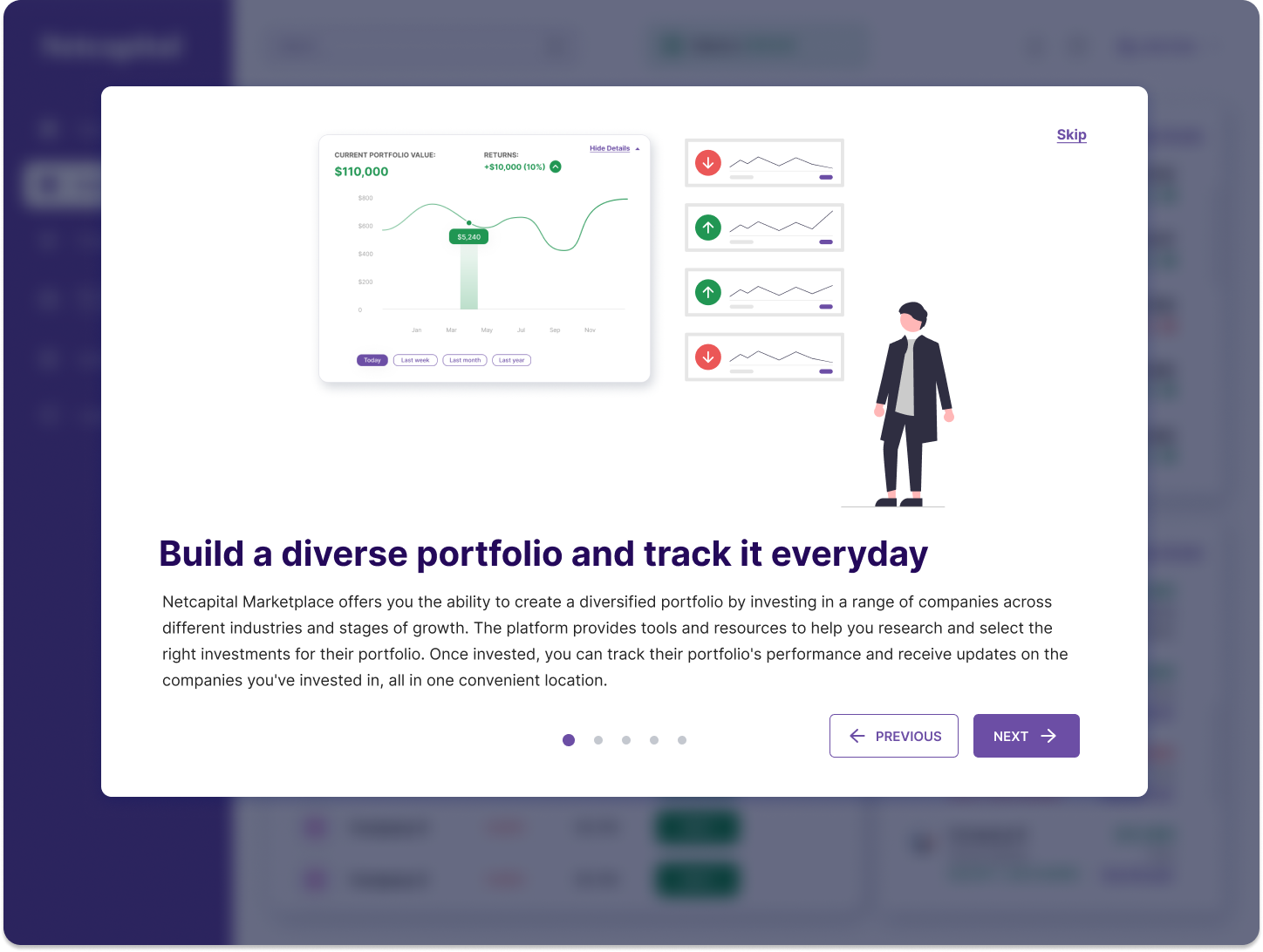
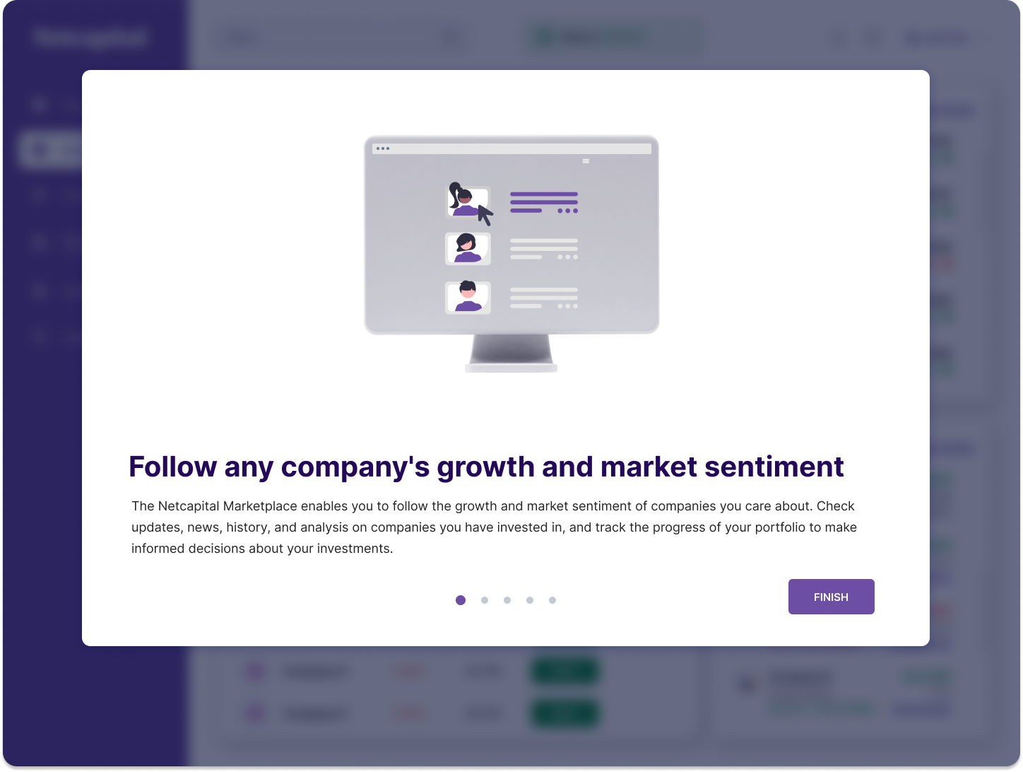
A five-step, skippable carousel explains what the marketplace is and what the risks are. Plain language, never blocking, and you can reopen it from help whenever you like.

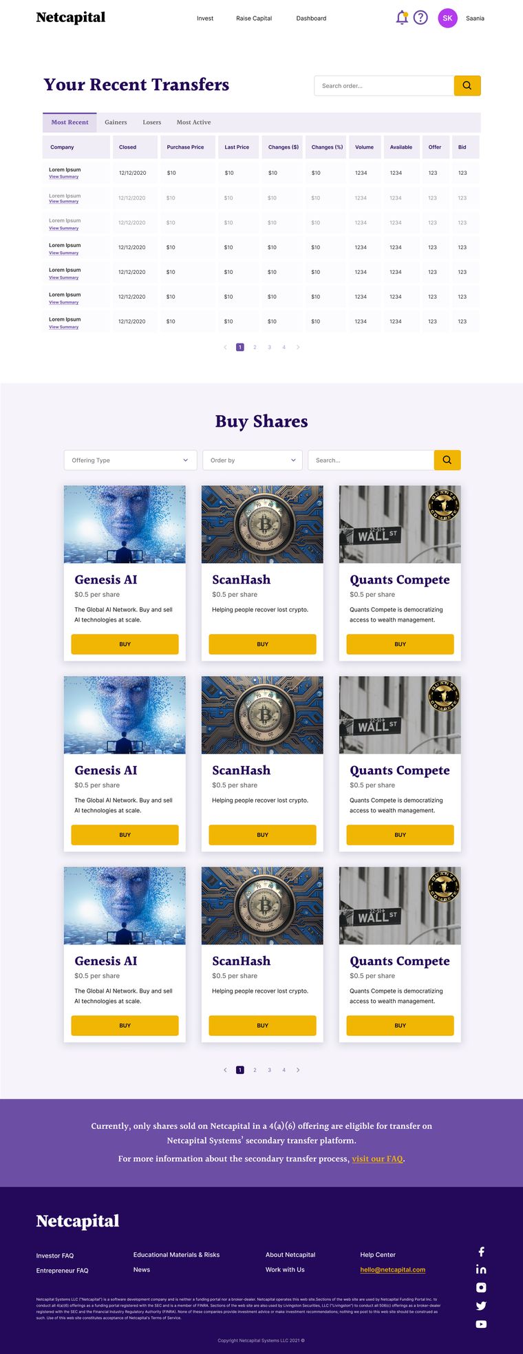
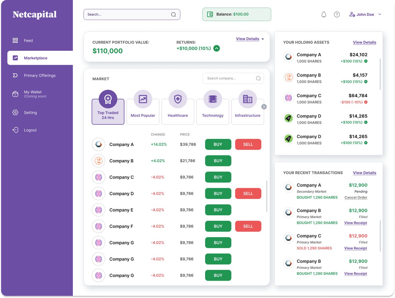
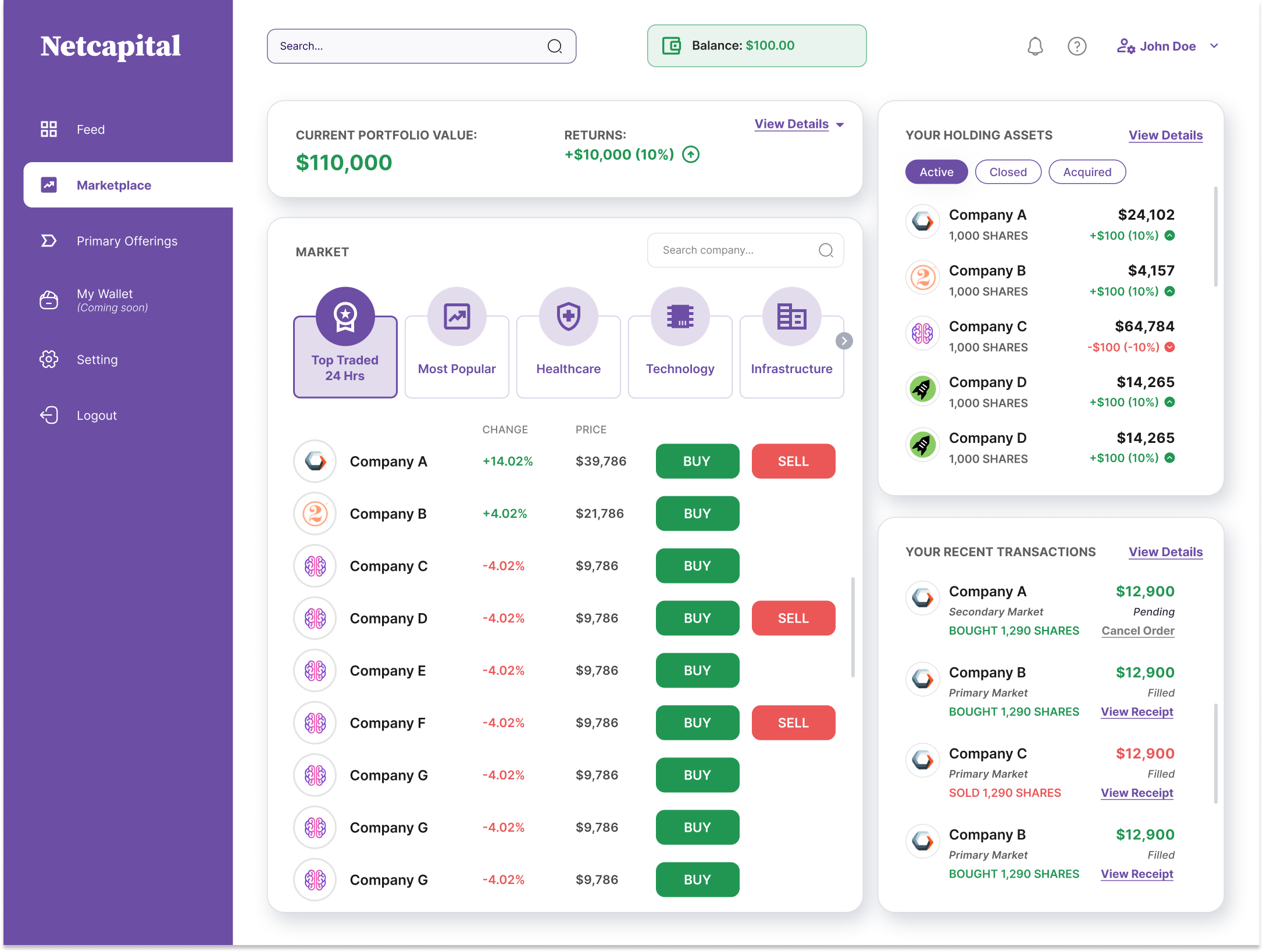
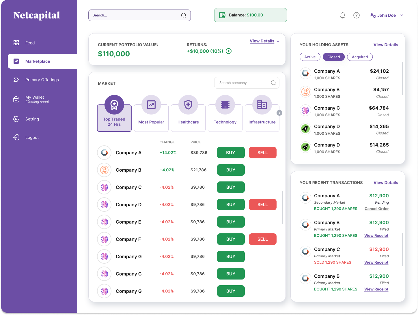
A market dashboard people can read plainly
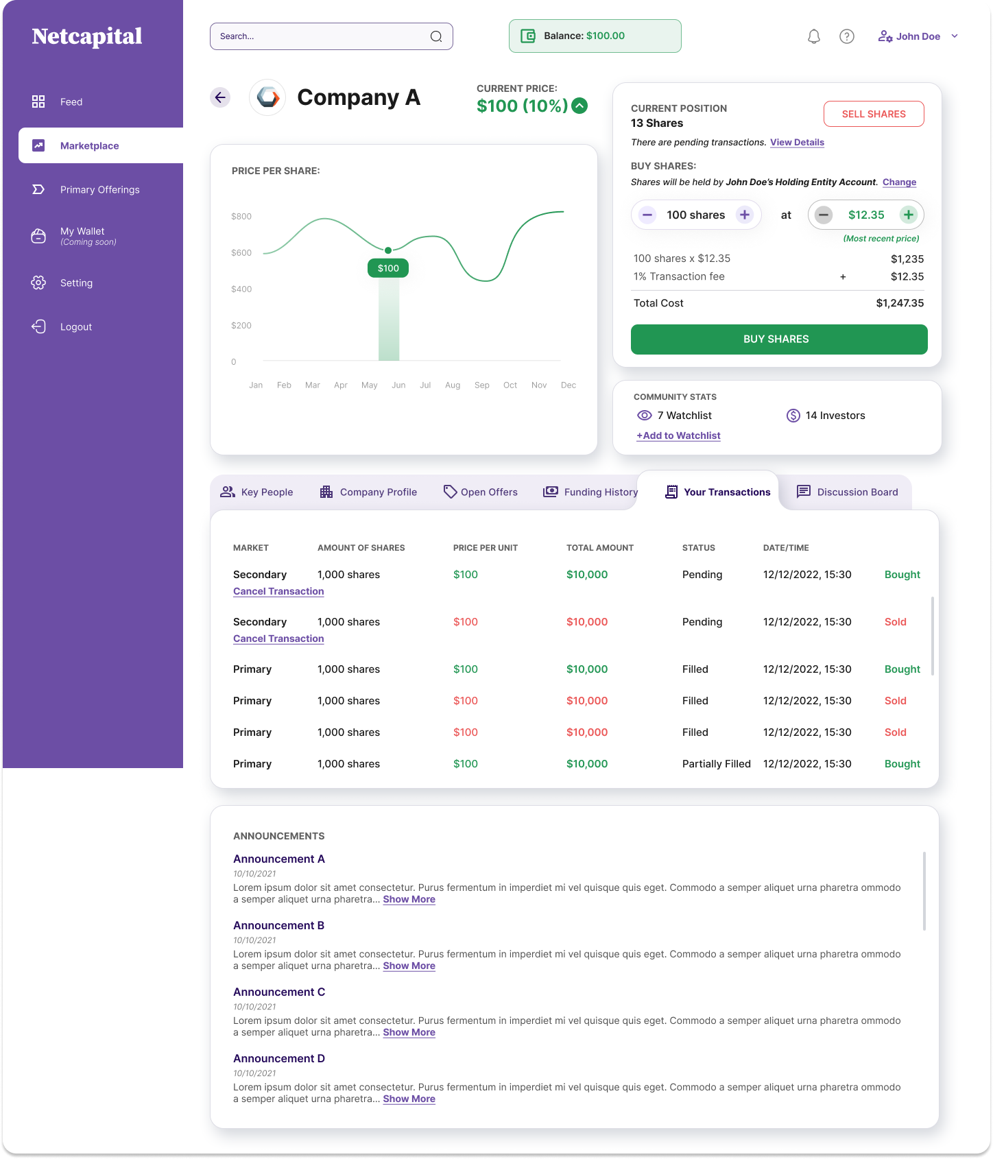
Portfolio value and returns sit up top, a categorised market list with inline Buy and Sell runs down the middle, and holdings and recent transactions keep to the rail. Familiar enough to feel learnable, and clearly showing the status of every order: Pending, Filled, Partially Filled.
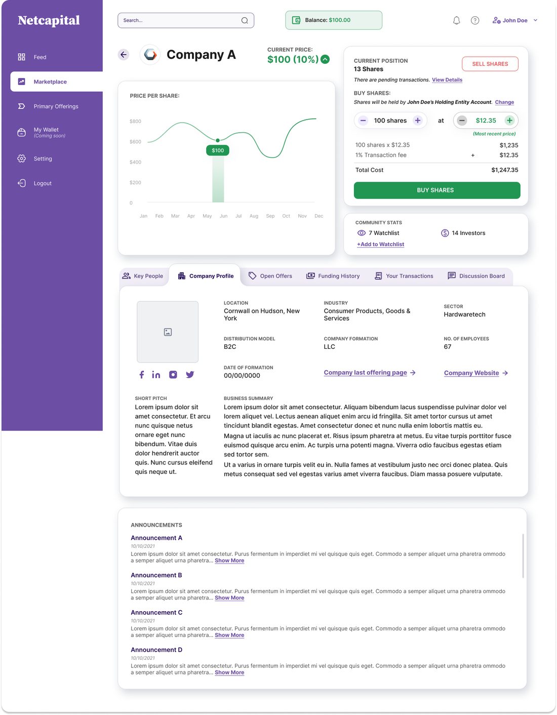
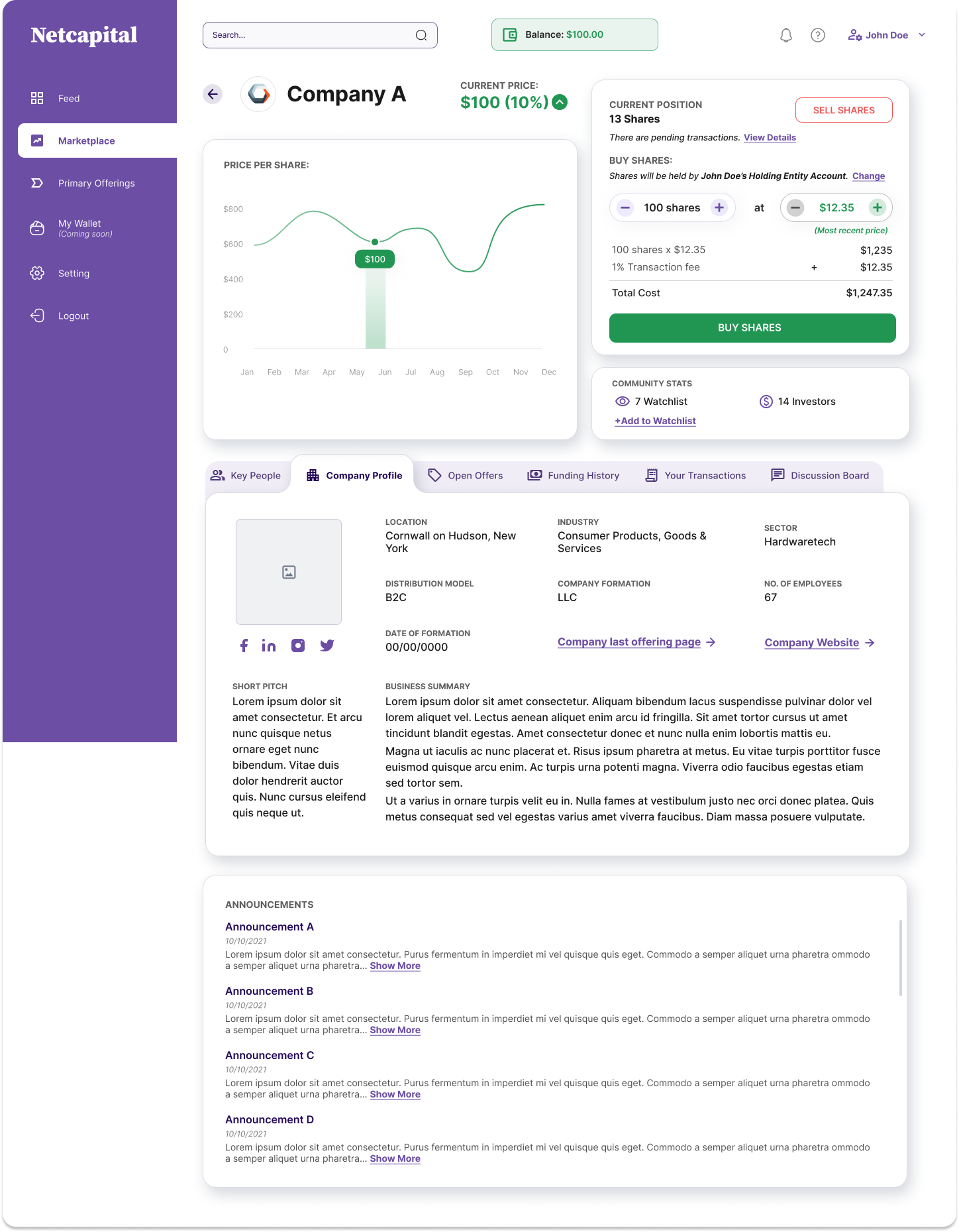
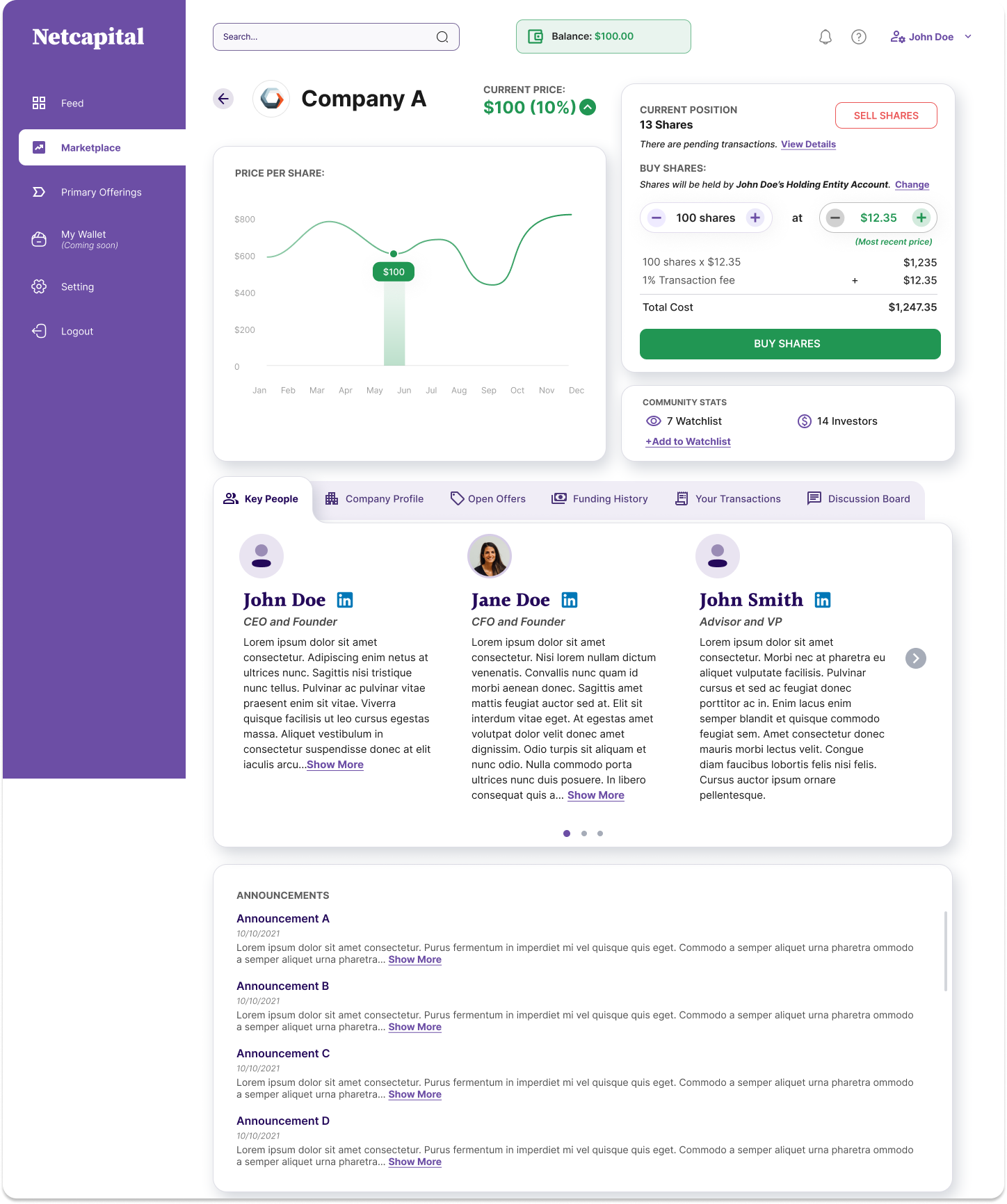
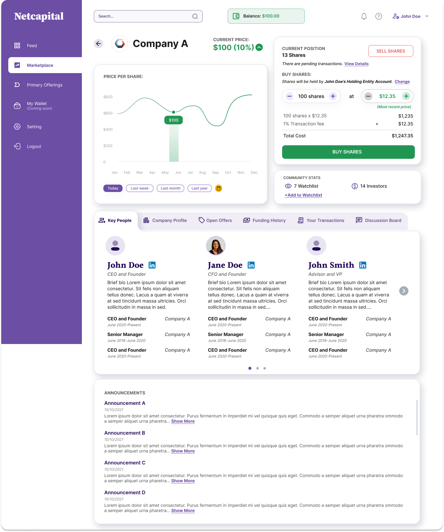
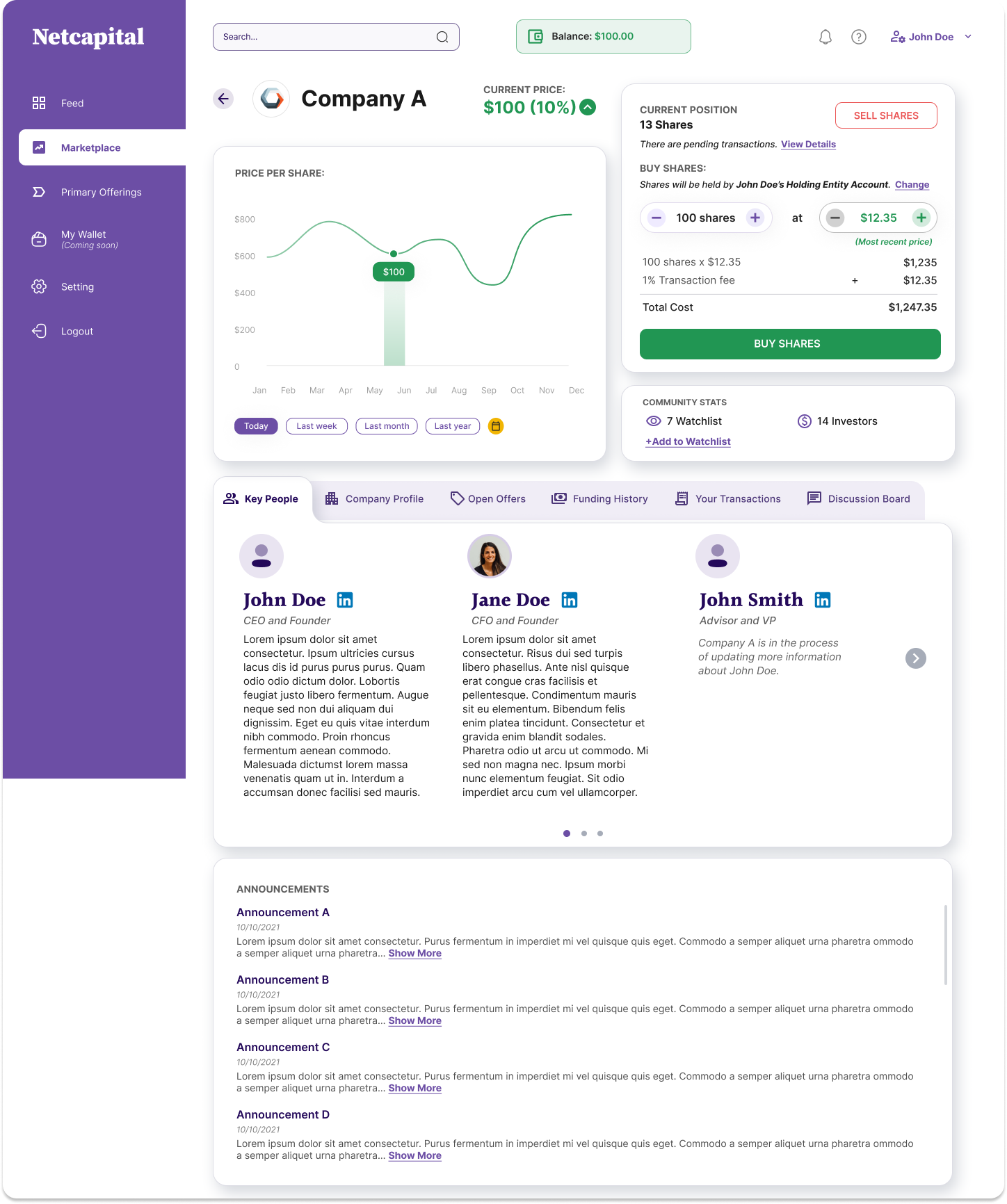
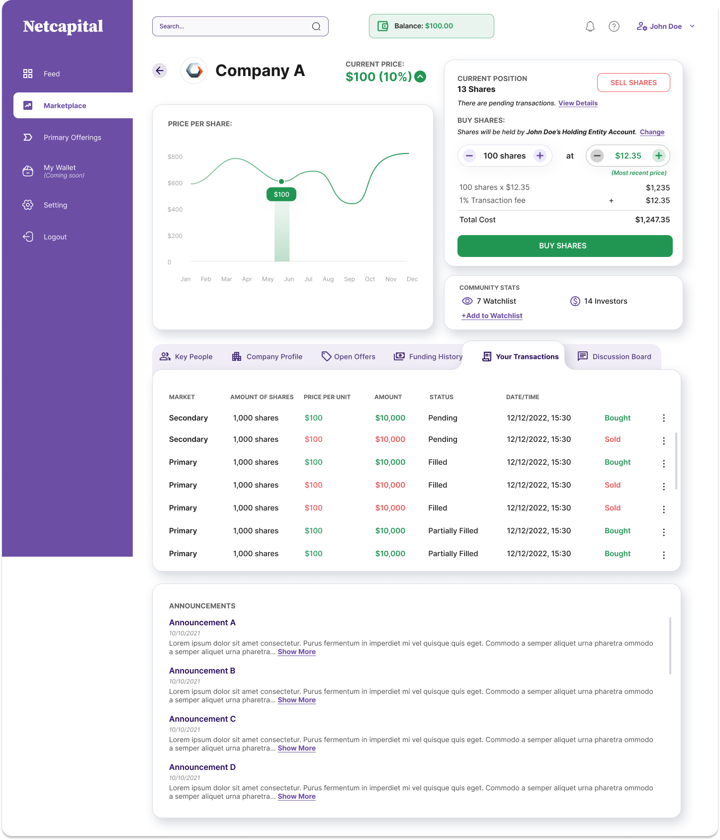
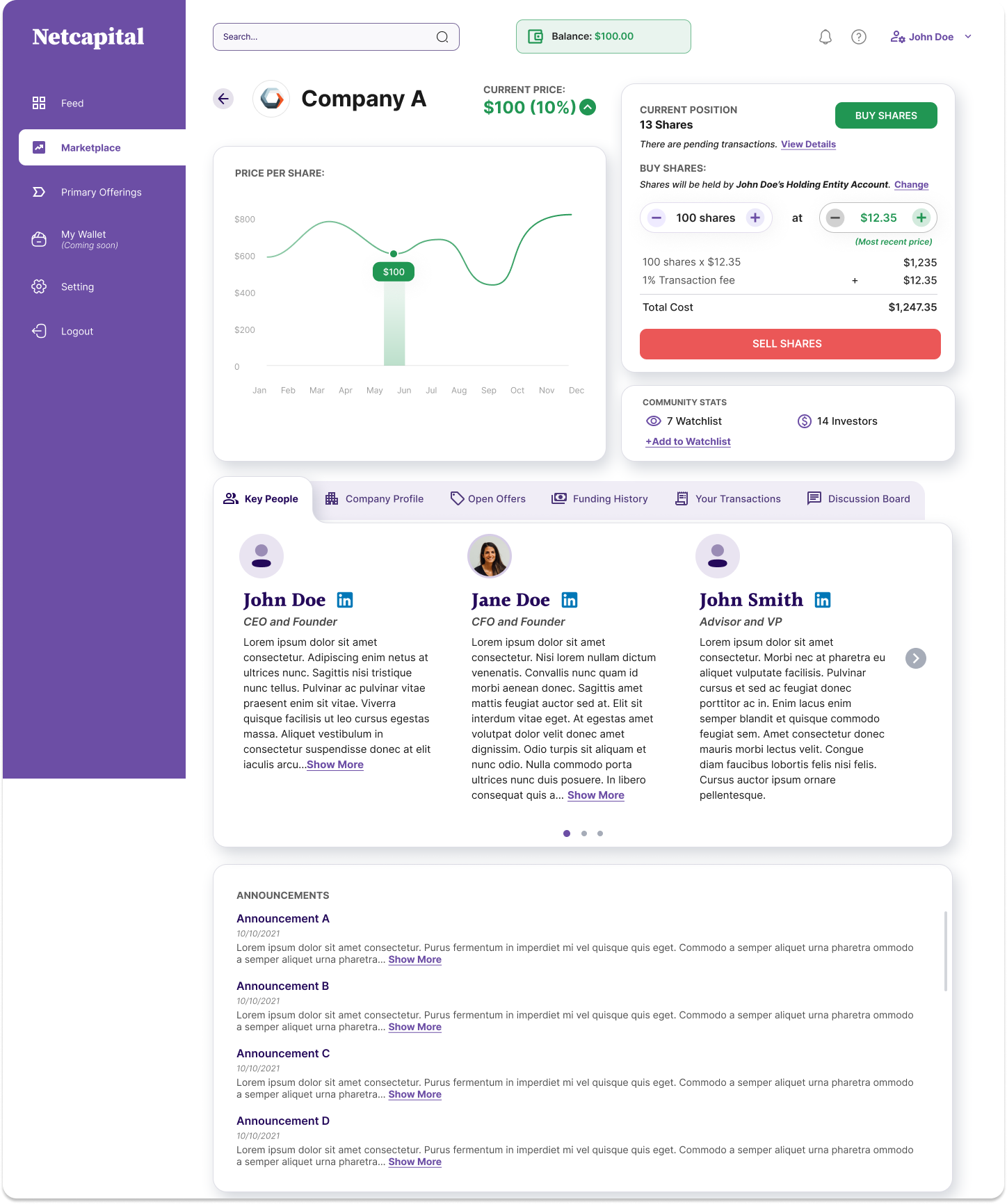
The deal page, everything to decide, in one dense hub.
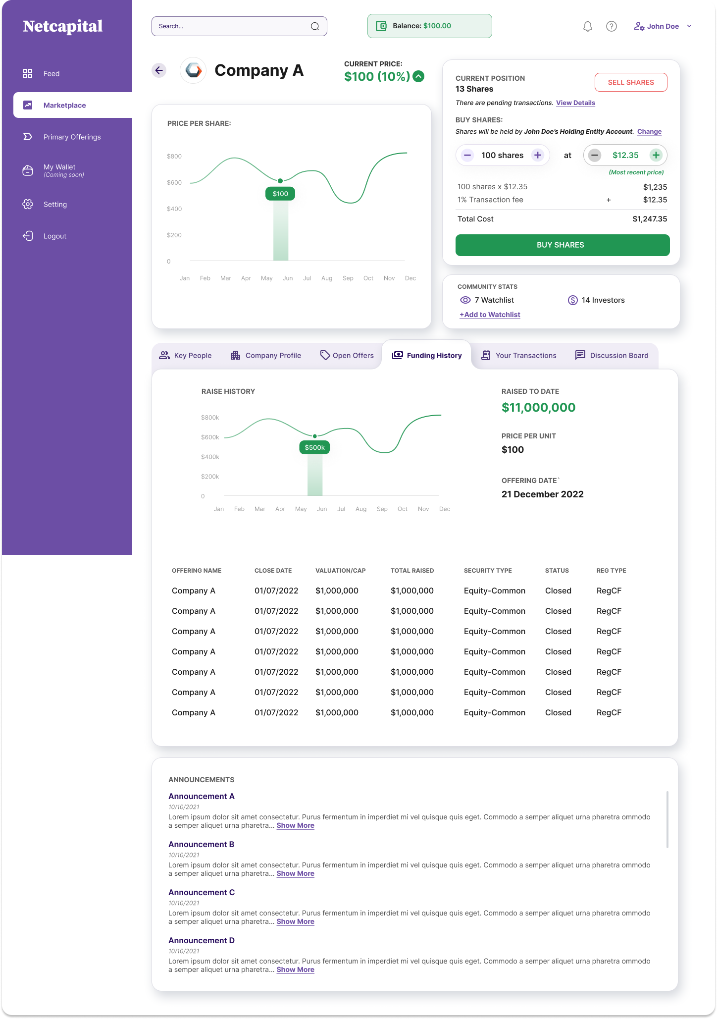
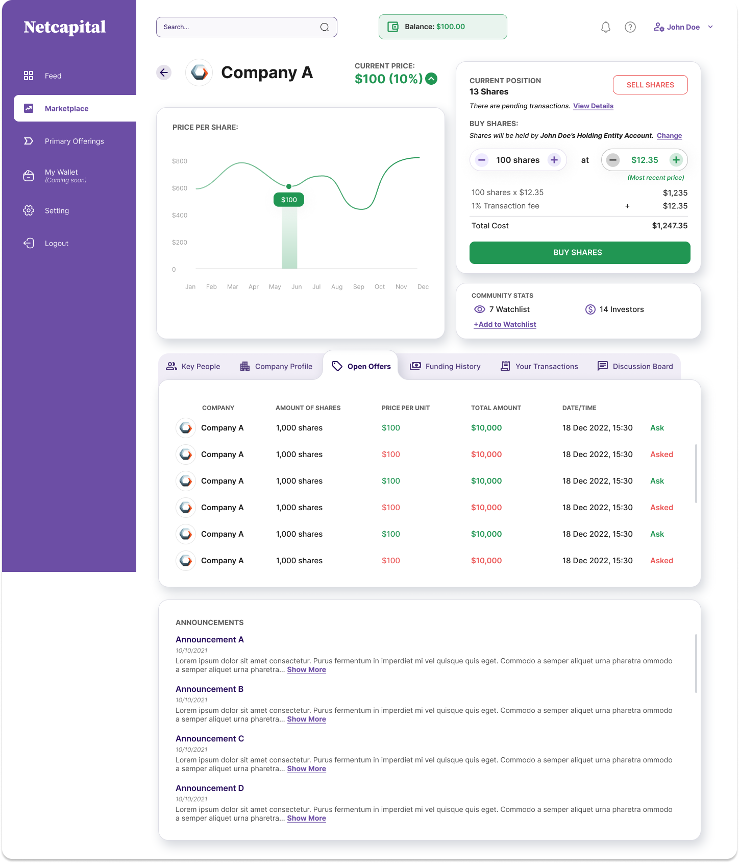
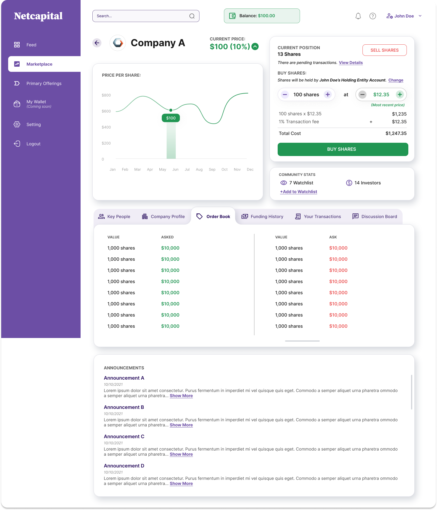
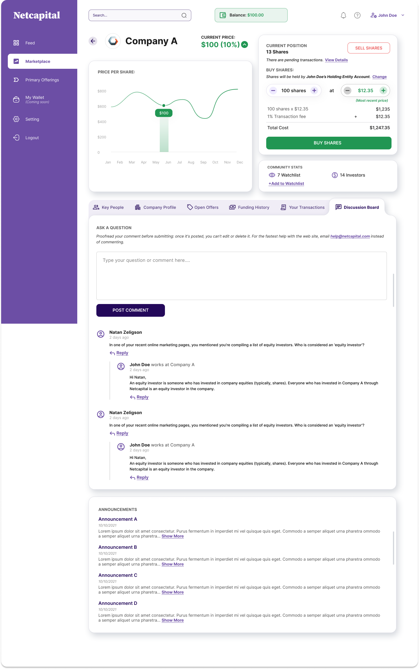
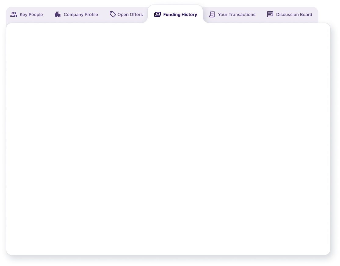
The price chart anchors a defensible reference. The buy panel does the fee math live and names the holding entity. The tabs hold everything a careful person might want to check: people, profile, open offers, funding history, your transactions, discussion. And the sum is always visible: shares × price + 1% fee = total cost, with community stats alongside for a bit of social proof.
Place an order: take an ask, or name your own price.
Buyers see the live ladder of asks and can fill against it on the spot, or name a maximum price and leave a standing bid for the STF to match later. The sell side deliberately mirrors it, so learning one side teaches you the other for free. Net proceeds, after the fee, appear before anyone commits to anything.
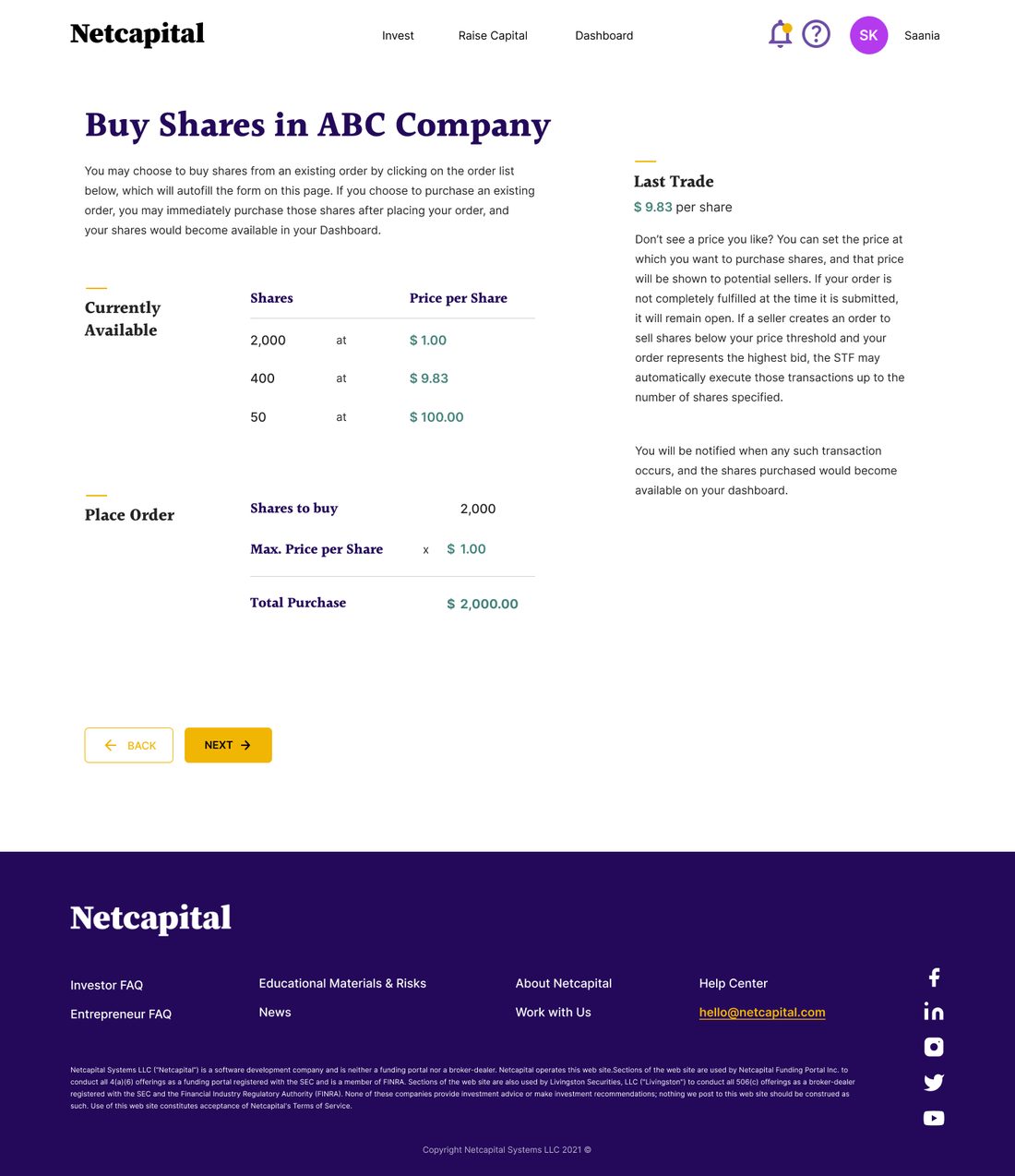
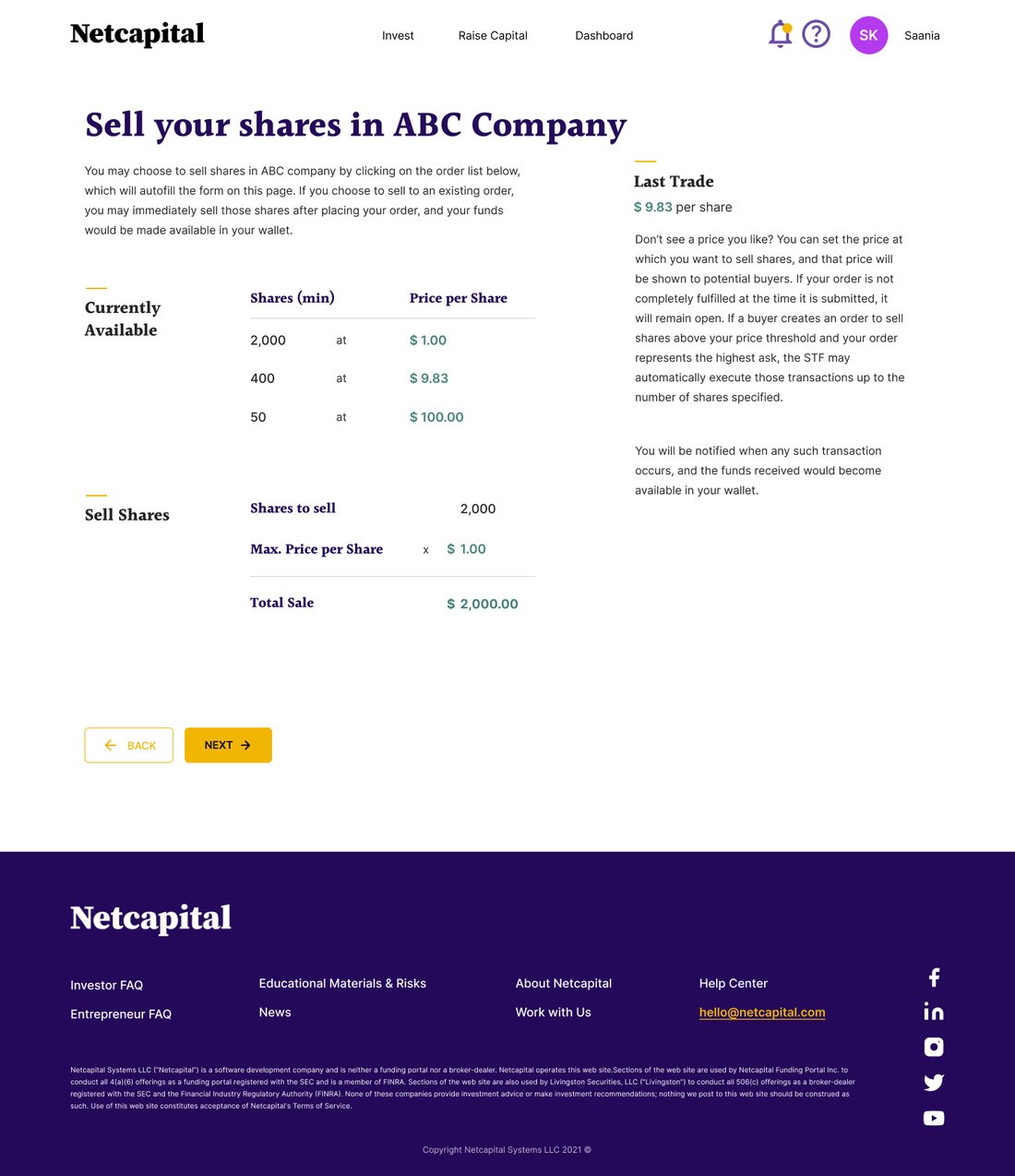
Left: the bid flow with the live order book. Right: the mirrored ask flow.
Making the trade.
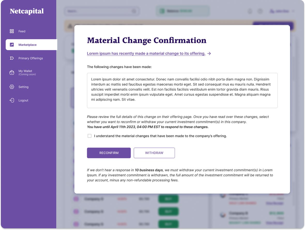
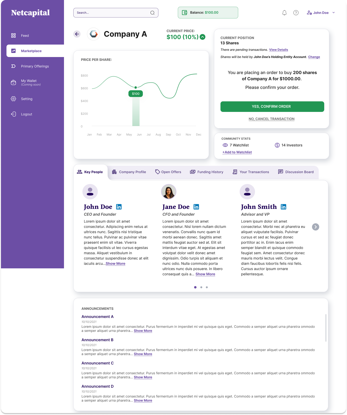
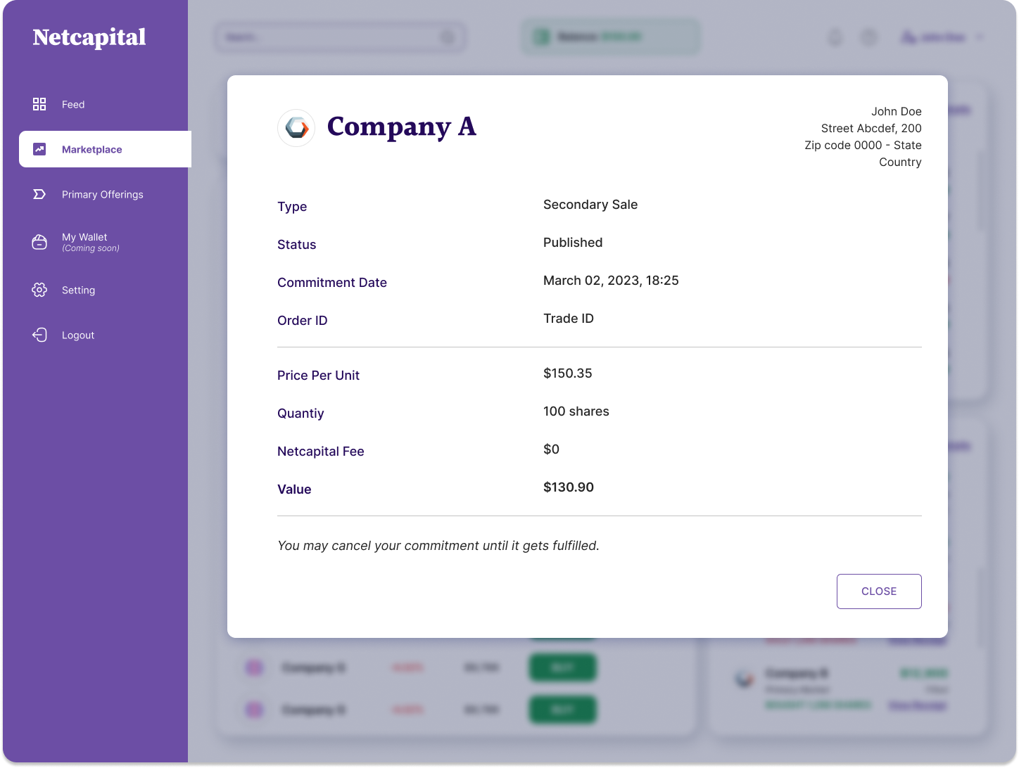
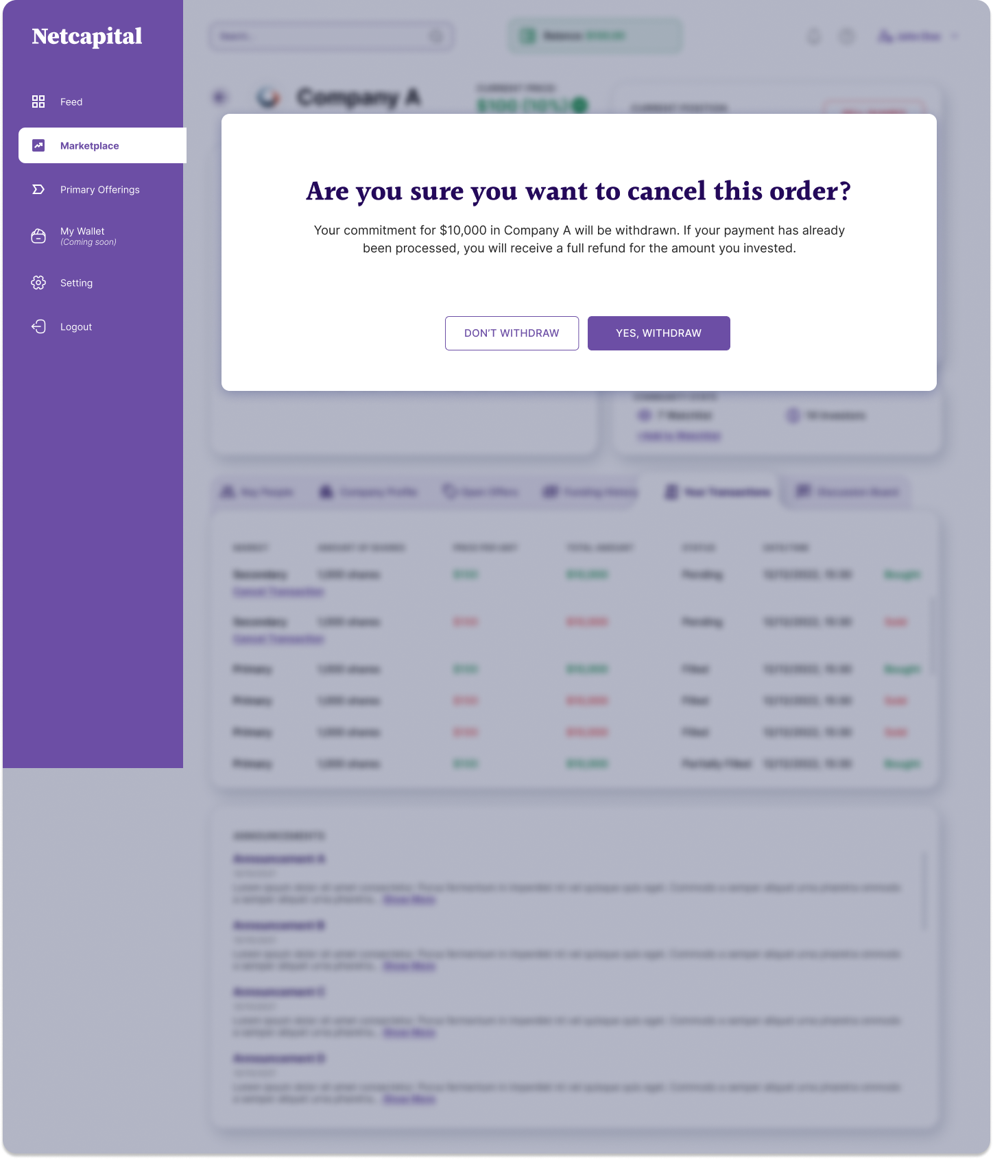
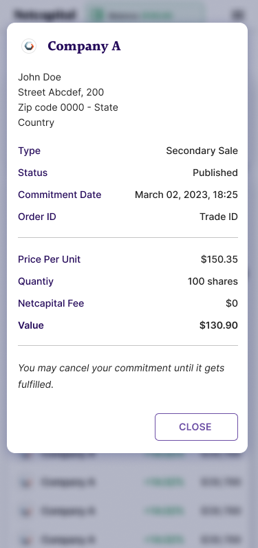
Every order produces a receipt with one line that does the heavy emotional lifting: "You may cancel your commitment until it gets fulfilled." And when an issuer materially changes its offering, holders have to reconfirm or withdraw by a deadline. That's a Reg CF requirement, and I displayed it clearly upfront.
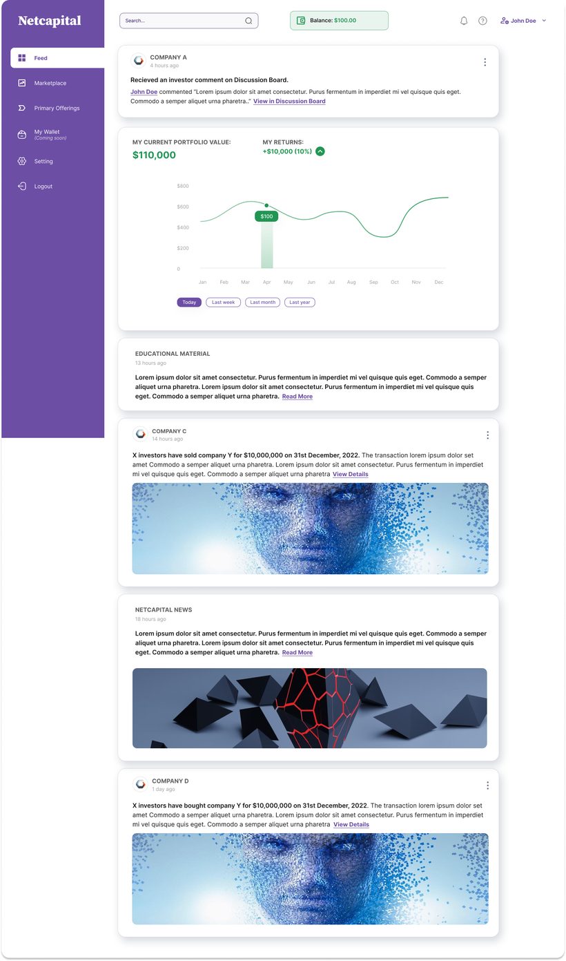
A feed to keep people oriented.
The feed gives the market a pulse: portfolio movement, company news, notable secondary sales.
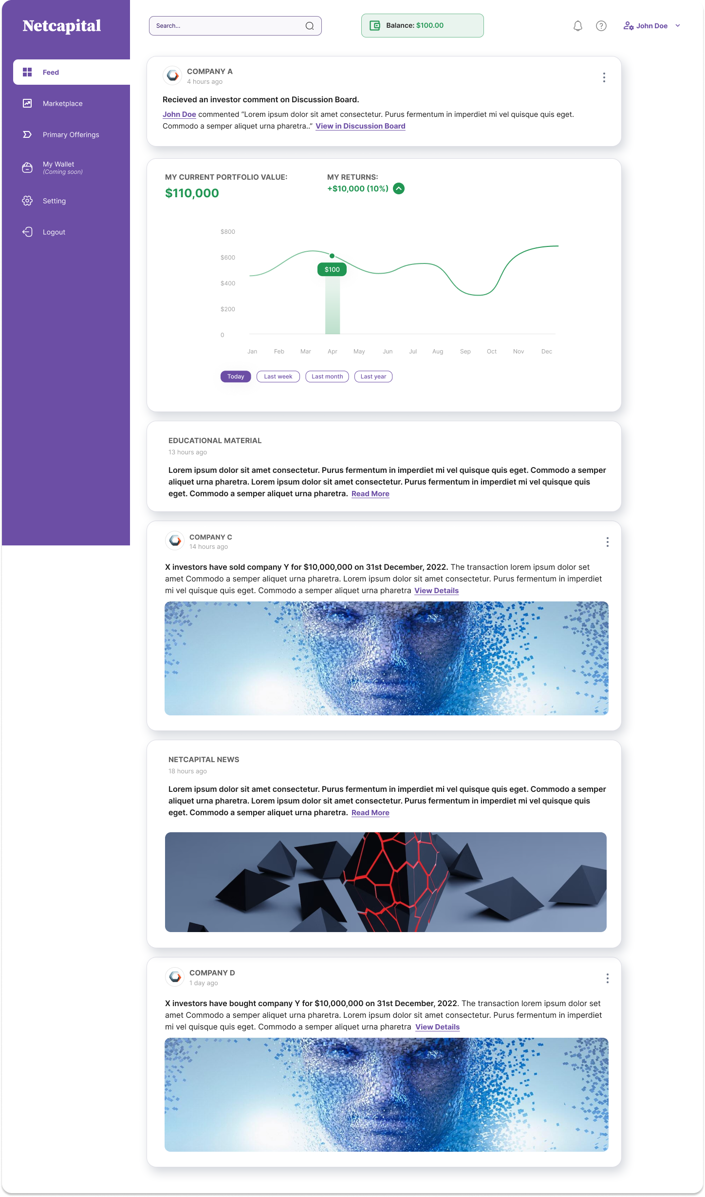
More screens · Dashboard & discovery
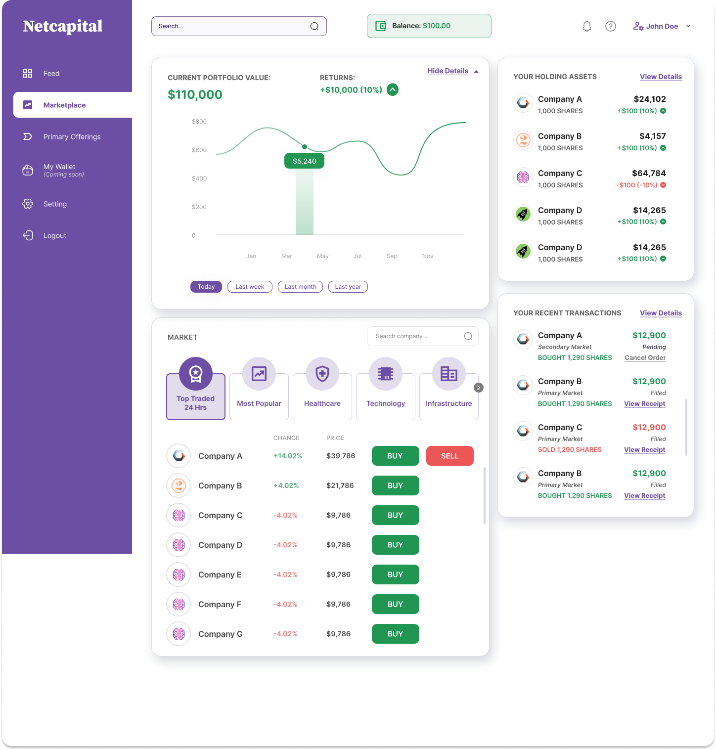
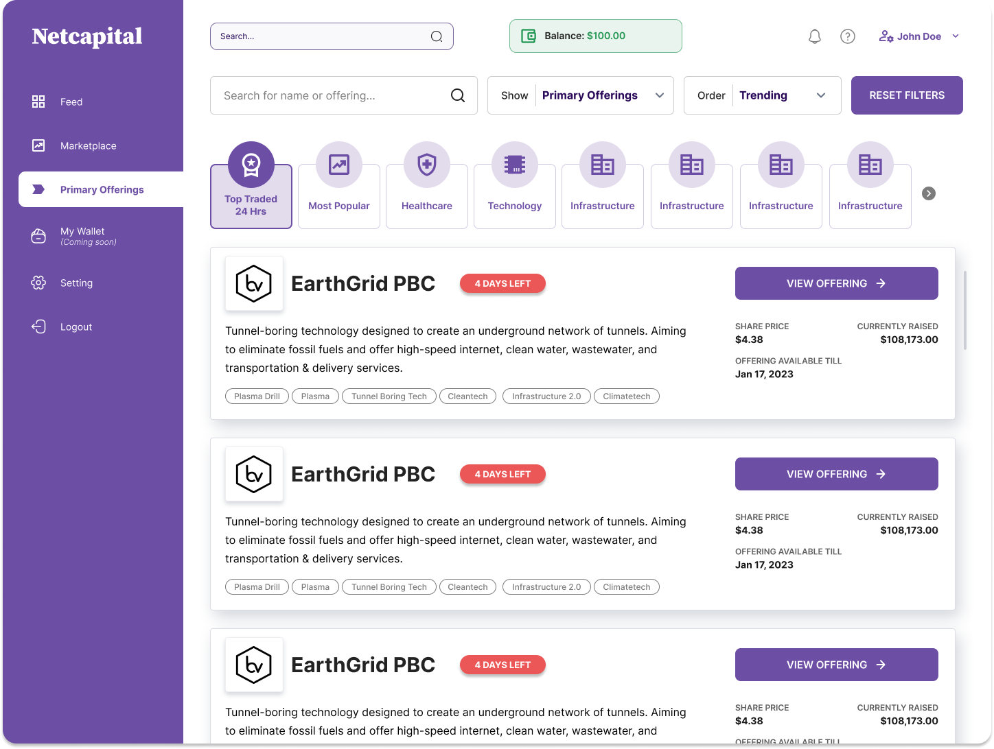
More screens · Deal page tabs
More screens · Orders, receipts & modals

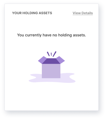
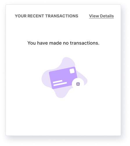
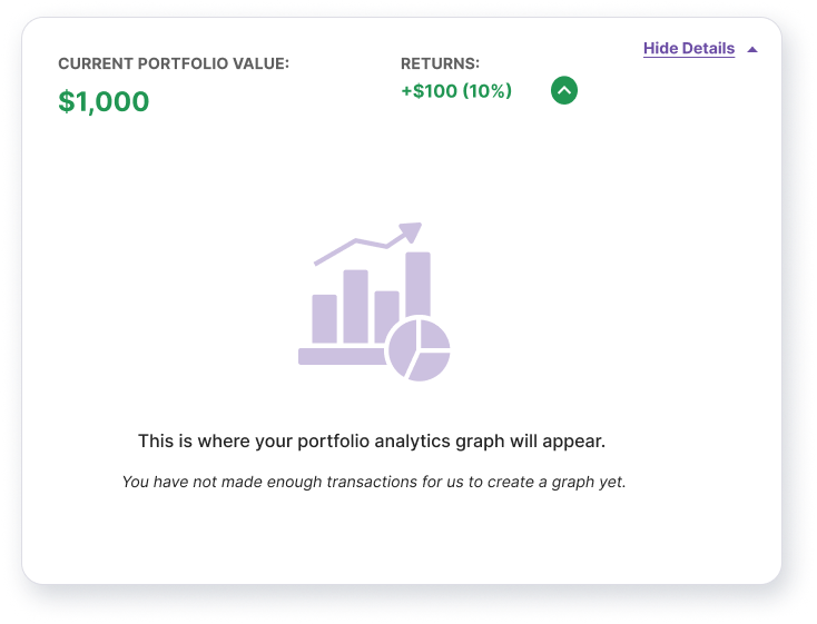
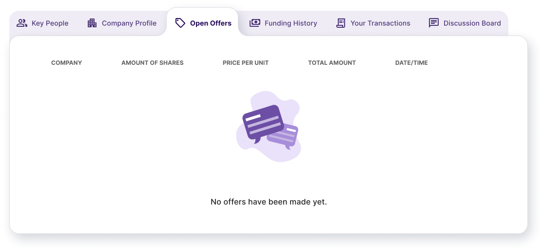
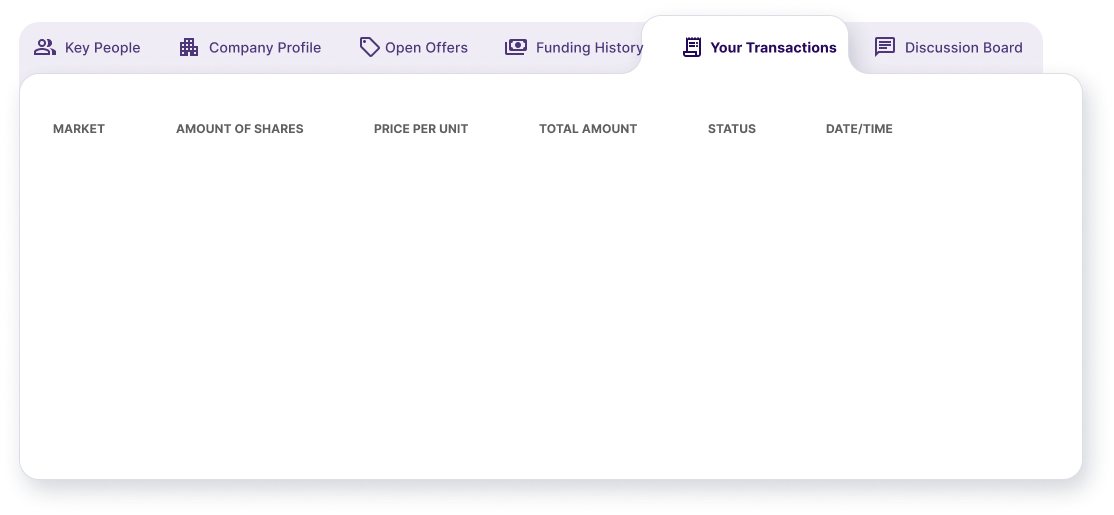
More screens · Empty states
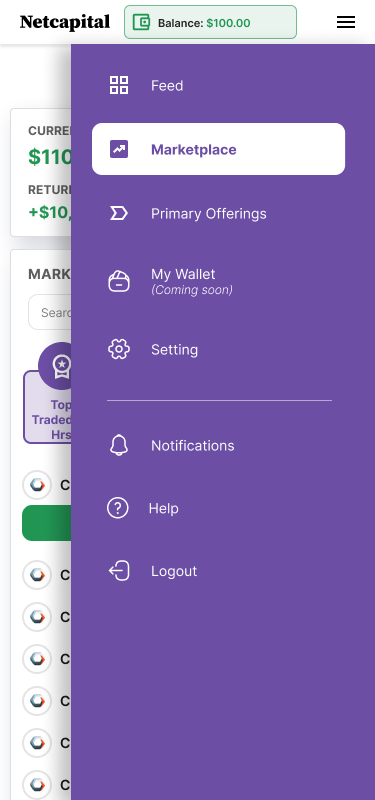
More screens · Mobile















Reflections
What designing a regulated market taught me.
Constraints aren't the enemy of UX, they're the brief.
The Reg CF rules that looked like obstacles, the reconfirmation windows and fee disclosures, turned out to be exactly what made the product trustworthy. Designed as plain decisions rather than fine print, compliance became something people could actually feel.
When money moves, reversibility beats reassurance.
No amount of confident copy calms someone about to move real money. One cancellable commitment did more for trust than a whole page of disclaimers ever could.
Borrow a mental model, then be honest where it breaks.
The stock-app metaphor made the marketplace instantly learnable. But private shares fill partially and carry real risk, and the craft was knowing exactly where to break the familiar pattern, and breaking it loudly.
What I'd do next
An in-app wallet, deeper price discovery, and a real discussion layer.
v1 proved the point: people will trade private shares when the venue is legible, reversible, and visibly compliant. Next comes deeper price discovery, a wallet brought in-house, and turning the deal page's discussion board into proper community due-diligence.
Next Case Study
A digital legal-services platform built from a blank page for one of Nigeria's largest law firms, their first digital product.
View case study