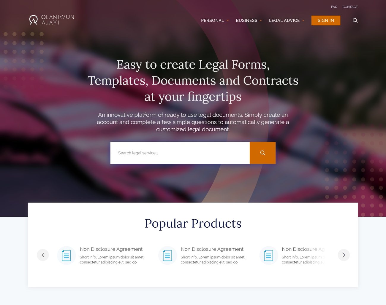
The homepage, a storefront that sells legal services like products. Browse, search, buy; a lawyer fulfils it behind the scenes.
Overview
I led design for LaniDigital, a law firm's first digital product, from a blank page to a live platform.
Olaniwun Ajayi had run legal services in Nigeria for decades, but to get a will drafted or a contract reviewed, a client had to book a lawyer, schedule meetings, wait days, and pay a lot. The partners wanted to change that: a website where you buy legal services the way you buy groceries on Amazon.
Pick a service, fill in a form, pay, and a lawyer handles the rest in the background. I joined as lead designer to figure out what this thing should even be, and what it should look like.
I owned it end to end, user-flow journeys for all five roles, personas, sitemap, a full wireframe set, high-fidelity UI across every user type, and a complete design style guide.
The law is serious, slow, and full of jargon. Getting a will meant booking a lawyer, meetings, and days of waiting.
Legal services sold like products, plain English on top, an honest, complex system underneath.
The firm's first digital product went live in 2020, a decades-old offline practice you can now buy from in an afternoon.
Impact · What shipped from day zero
A decades-old firm's first digital product.
Context
Decades of legal work, all of it offline.
The model was law-as-e-commerce: browse a catalogue of legal services, buy one like a product, and let a lawyer fulfil it behind the scenes. Nobody had done legal-as-retail for this market.
DIY-template sites felt cheap and untrustworthy. Global players like LegalZoom weren't built for Nigerian law or a specific firm's brand. And traditional firms (including Olaniwun Ajayi itself) were entirely offline. The opening was a trusted firm with an e-commerce experience.
Discover · The landscape
Nobody had done legal-as-retail for this market.
Information Architecture
One storefront, three flows, five dashboards.
The architecture had to hide enormous complexity behind a shopping metaphor. Before any UI, I mapped every action each role could take, down to the click, so five dashboards could share one honest system underneath.
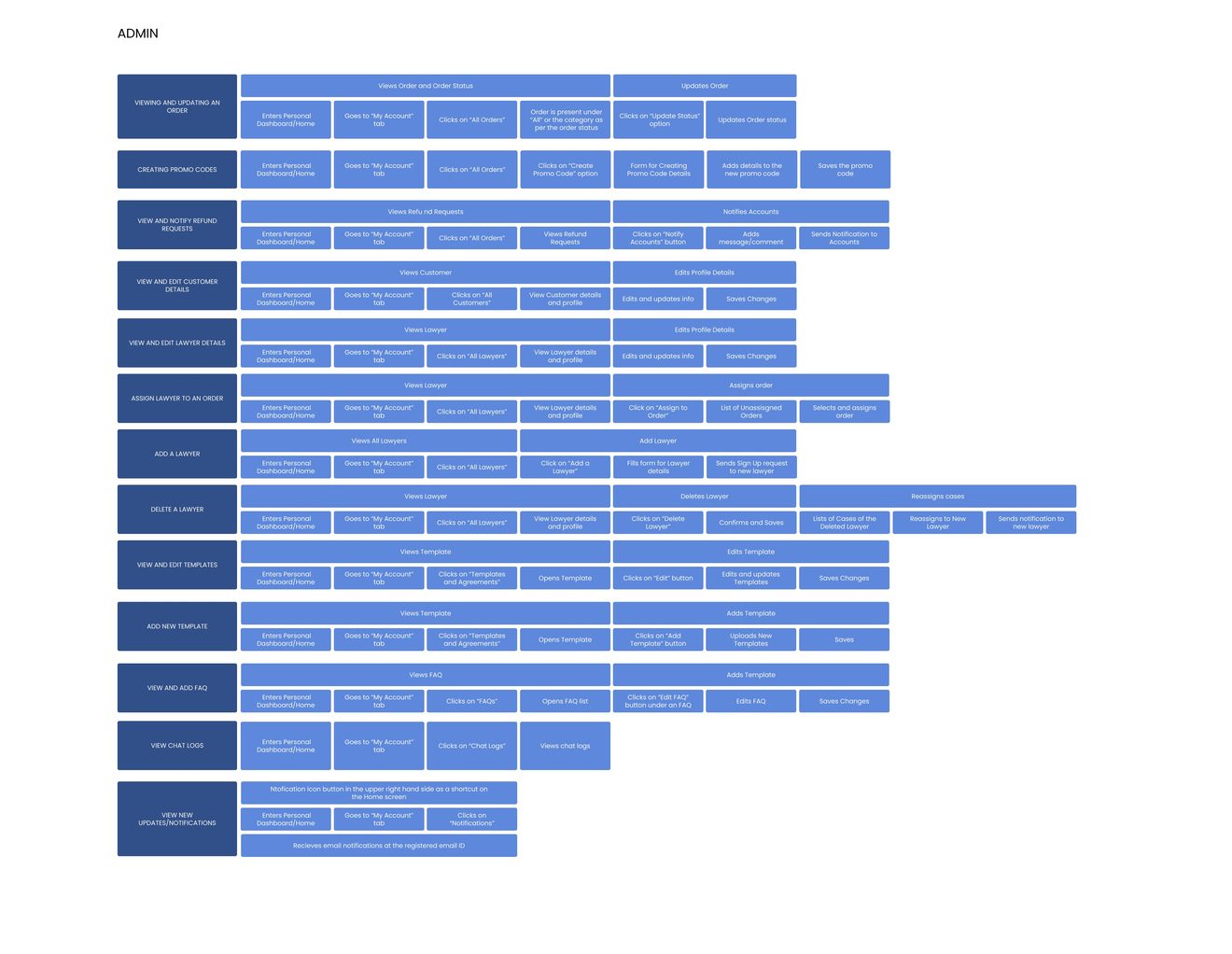
The admin role's full flow map, one of five, mapped click by click before a single screen was drawn.
Design System
Built to feel official, not intimidating.
Color palette
Navy is trust and structure. Orange means "this is the safe thing to click," reserved for primary actions, never decoration.
Type & shape
Minimal rounding throughout, sharp edges signal precision and trustworthiness to a legal audience.
The Problem
Where a law firm and a storefront pulled apart.
Each problem pulled toward either accuracy or simplicity. The design job was finding where both could win.
Legal services don't behave like products.
Buying a will isn't like buying shoes, every case has unique details, documents, and back-and-forth. What I did: mapped every legal service into three buckets, fixed, semi-custom, and consultation-based. Each got its own page template and checkout. From the outside it still feels like browsing a store; under the hood, the flows match the messiness of real legal work.
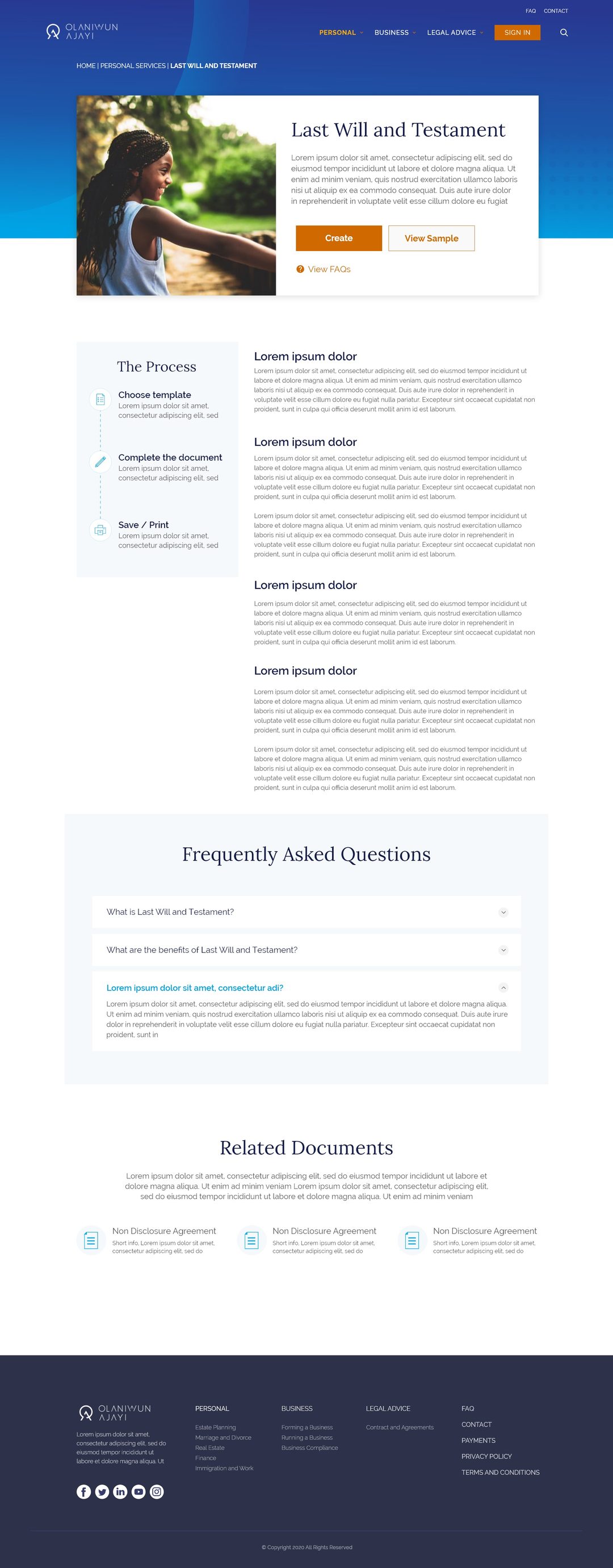
A product page for a legal service, buyer-first info above the fold, legal depth progressively disclosed below.
The users couldn't read legal English.
The target buyers were regular people, not lawyers. The first content draft was full of "letters of administration" and "deed of assignment." What I did: rewrote every service description in plain English, keeping legal terms only as secondary labels. This was a fight, lawyers don't like simplifying, and it was the single most impactful UX change on the platform.
Letters of Administration
A grant of Letters of Administration is a legal document issued by the probate court that gives the administrator authority to deal with a deceased person's estate where no will has been left behind.
Settle a loved one's estate
If someone close to you has passed away without a will, we help you get the legal authority to manage their finances, property, and belongings, without the jargon.
The most impactful UX change on the platform wasn't visual, it was copy.
You can't show the whole document, but people still need to trust it.
A buyer won't pay for a document they can't read first, but showing the whole thing upfront means there's nothing left to sell. What I did: half the document previews in full, clean and readable. The rest fades into a soft blur. You can see enough to trust it's real and built for you, but you buy it to read the ending.
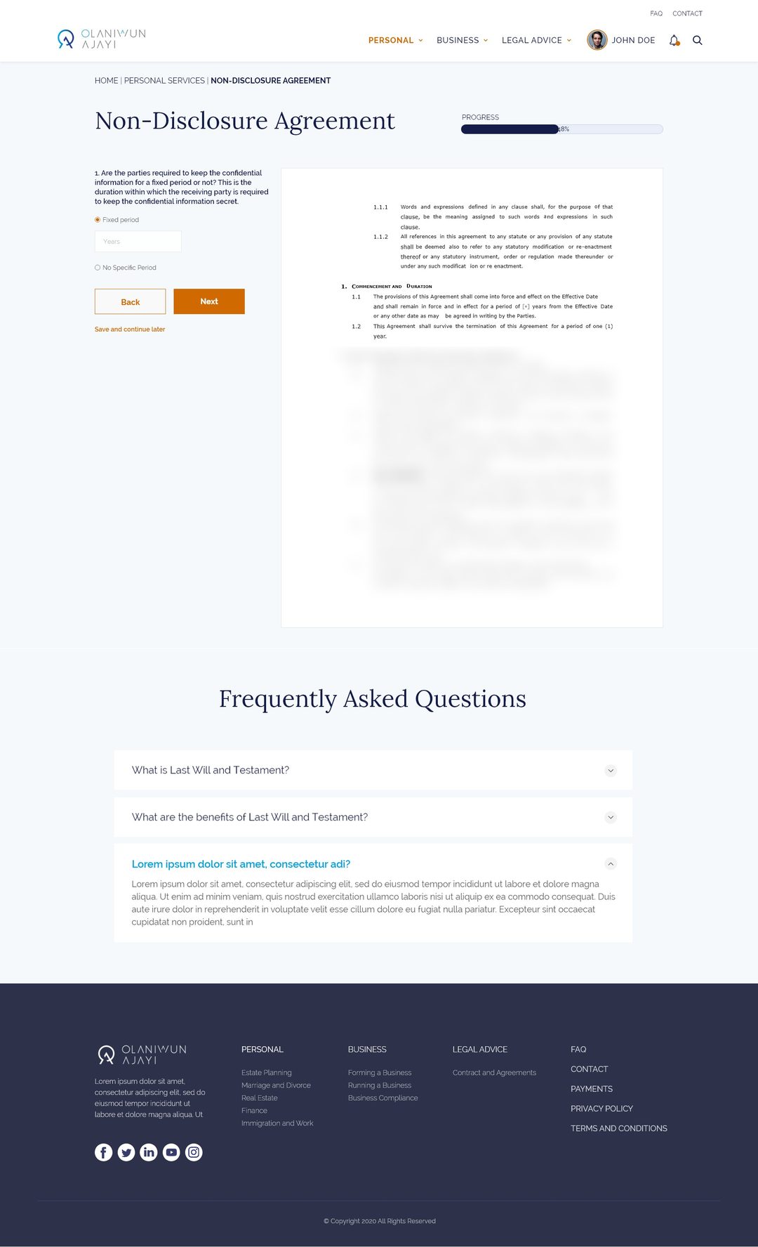
A guided, progress-tracked checkout for a semi-custom service, the legal depth disclosed only when it's needed.
Five user types, one platform.
Client, lawyer, admin, finance, and support each needed a completely different dashboard, but the system had to feel like one product. What I did: separate flows for each role, then a single component library all five dashboards shared. Same buttons, tables, and nav; different content and permissions. It made the platform feel consistent and cut dev time significantly.
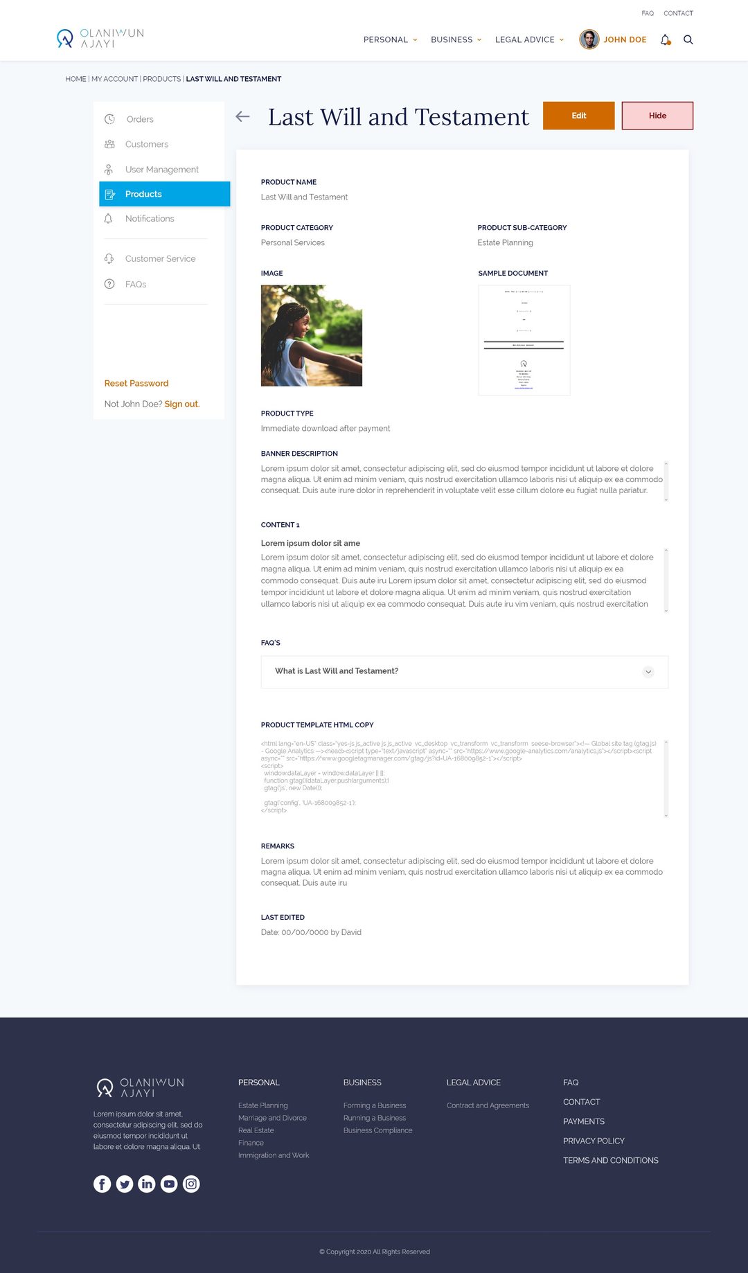
The admin product editor, same shared component system, different permissions from the client's storefront.
Getting the category browsing right, before it had a face.
The Personal Services landing page went through a rough grayscale pass to settle the layout and hierarchy, then a mid-fidelity pass to test it with real photography and color before final polish.
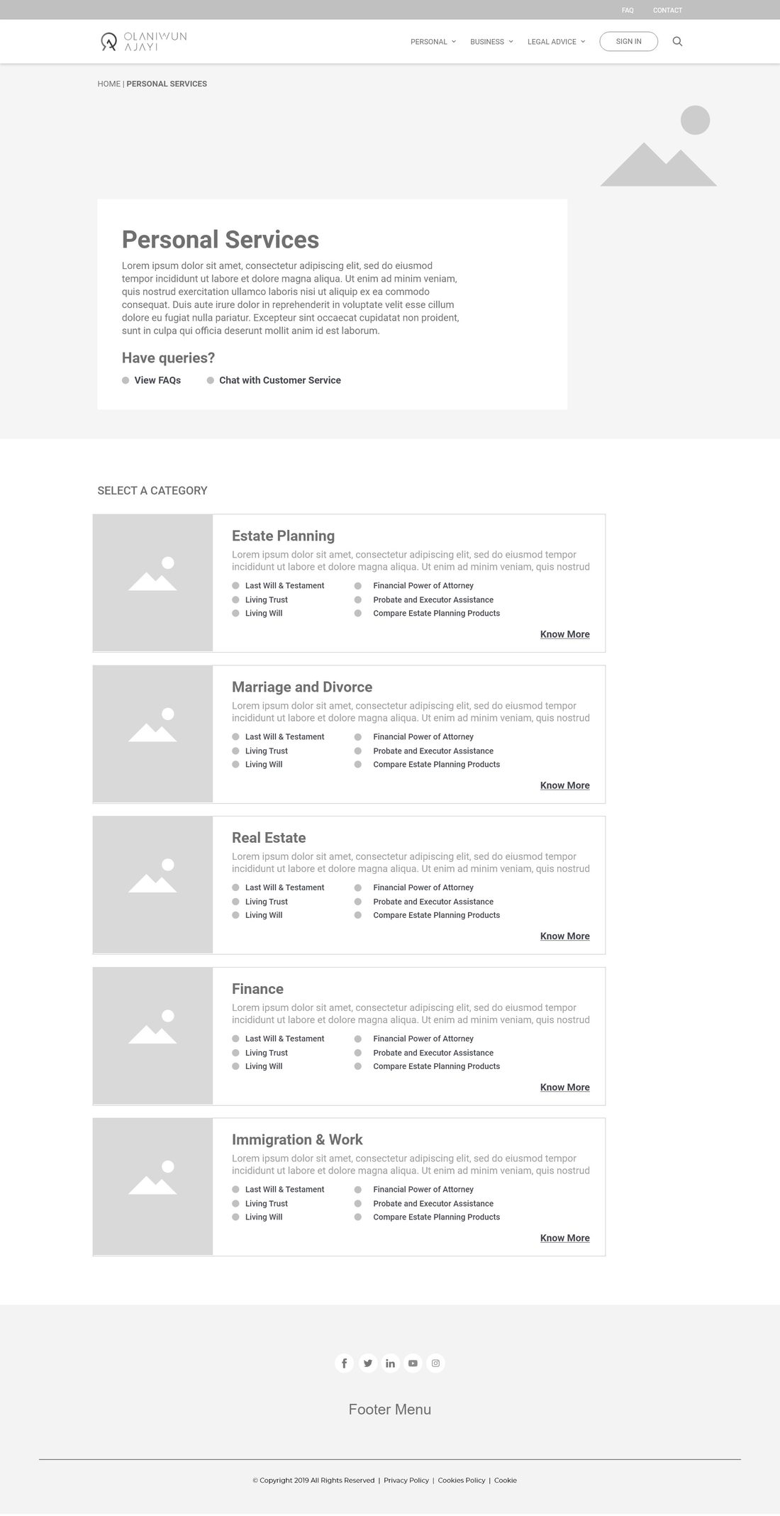
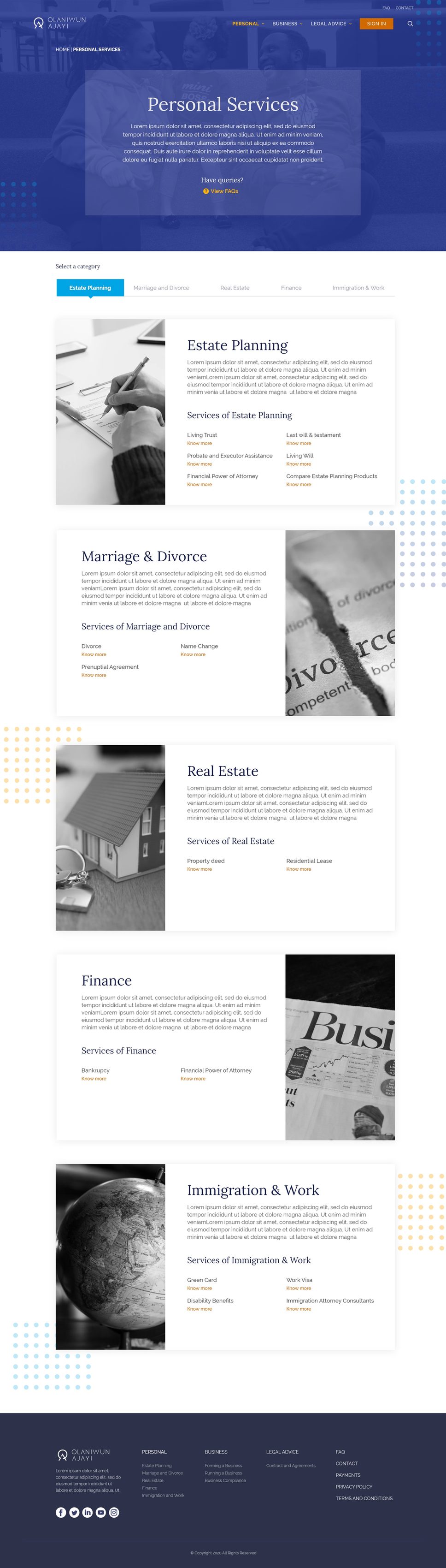
Left: the grayscale pass, structure and hierarchy only. Right: the mid-fidelity pass, testing real imagery and brand color.
What shipped, on both sides of the login.
Designed desktop-first (this is research-heavy work, not impulse buying) with mobile as a stripped-down companion for tracking orders. Public pages that sell like a store; dashboards that run like an operations tool, held together by one system.
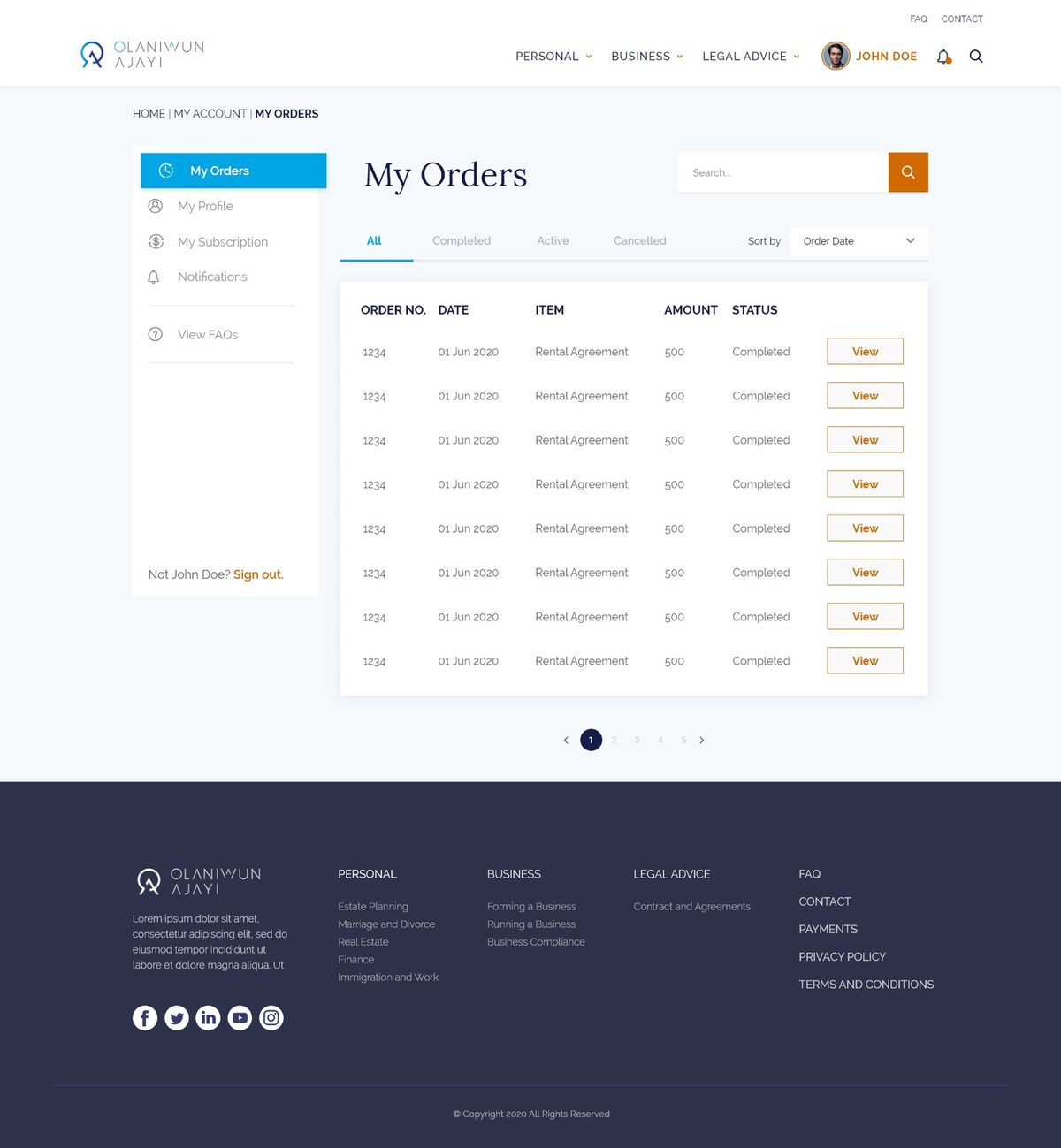
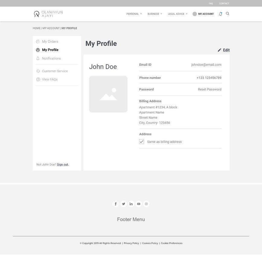
The client's orders and profile, a consistent shell shared across all five roles.
Next Case Study
A full smart-home app redesign: new flows, new visual system, new component library. Same product underneath, completely different experience.
View case study