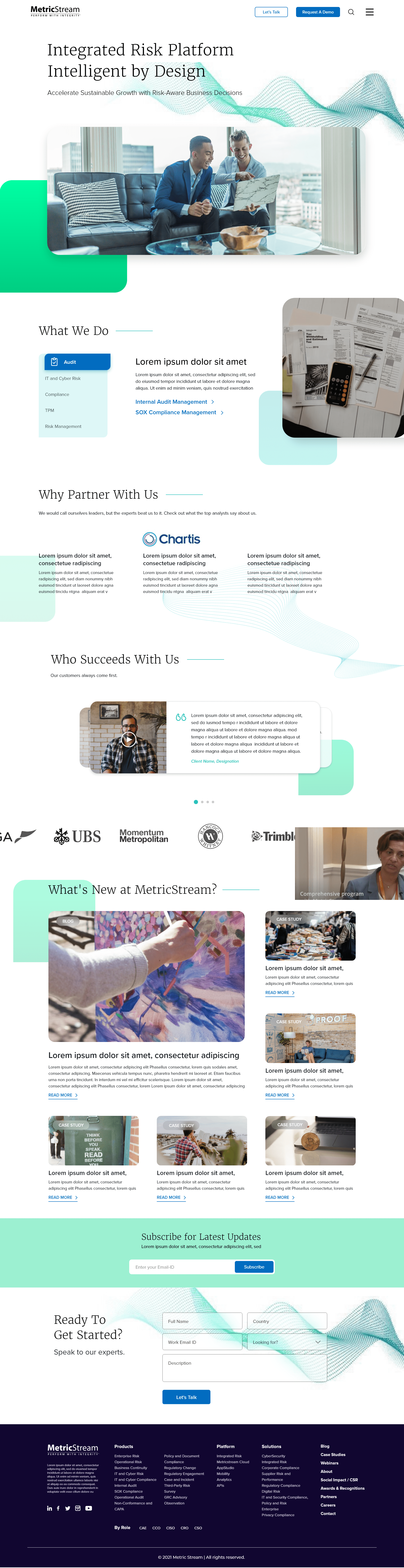
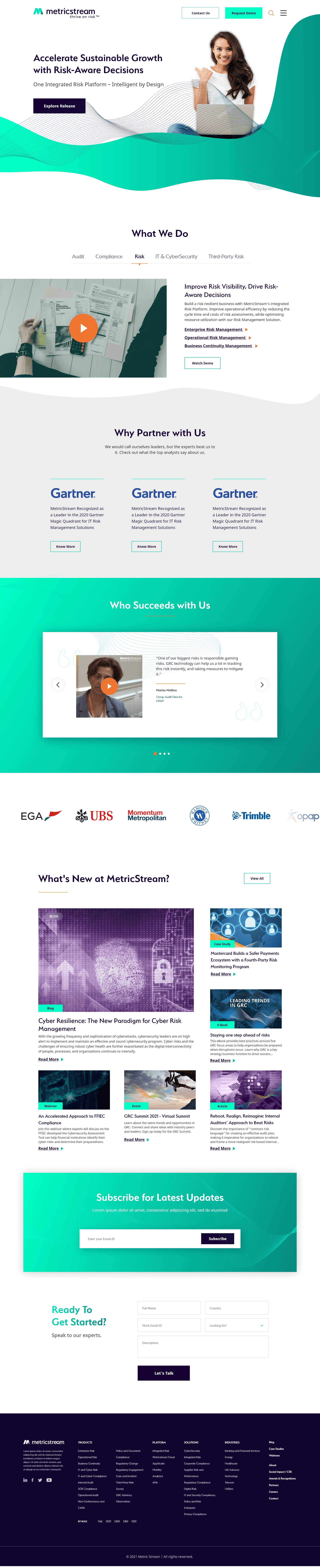
The redesigned homepage, built to the new brand system, with a dense enterprise message made to feel light.
Overview
I led UX for MetricStream's website redesign, aligning years of dense product content to a brand-new identity.
MetricStream had just gone through a rebrand, a new logo, a new visual language, a new story about what the company stood for. The website hadn't caught up. It still ran on the old structure, and that structure had grown, over years, into a maze of product pages that no visitor could navigate with confidence.
The brief arrived looking like a visual refresh: reskin the site to match the new brand. What it actually needed was a full information-architecture pass. I owned the whole redesign, UX process, wireframes, client workshops, every high-fidelity screen, the site's style guide, and dev handoff.
Years of dense product content had grown into a structure no visitor could navigate with confidence.
Wireframe the architecture, test it, then layer the new brand on top, never the other way round.
A site that finally matches the brand the rest of the company had already moved to.
The Work
Structure first, brand second.
The visual system came last, and it had to work as hard as the structure underneath it.
Solve the maze on paper before touching a single pixel.
The old site buried products several clicks deep, under category names that made sense internally but not to a first-time visitor. What I did: mapped every product and content type, grouped them by the buyer's job-to-be-done rather than MetricStream's internal org chart, and wireframed the new navigation and page templates. I tested the structure with the client before a single brand color touched the page.
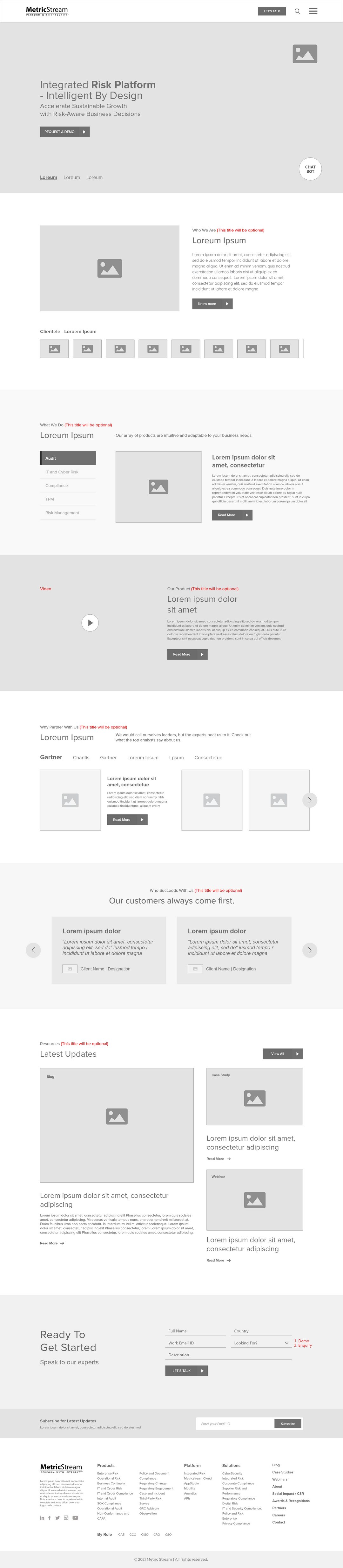
The wireframe stage, where the real problem got solved, well before any visual design began.
Dense content, given room to breathe.
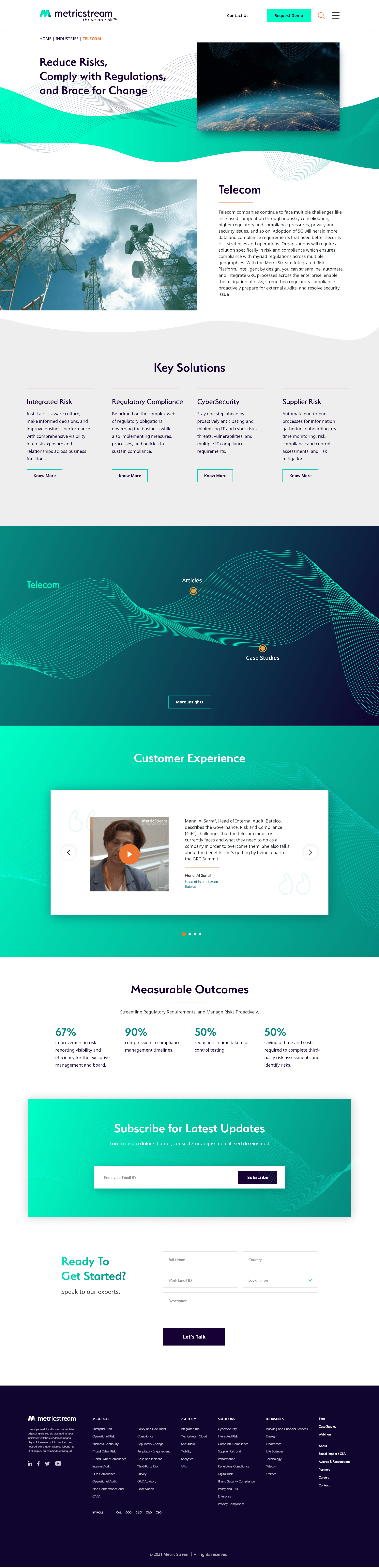
Enterprise software pages are naturally text-heavy: features, integrations, compliance frameworks, case studies. The new brand's flowing teal gradients and generous whitespace had to carry that weight without feeling thin or losing the company's serious, established tone. What I did: built a page template system, hero, feature grid, proof section, CTA, so every product page reads as one family, and let the brand's gradient language mark transitions between dense sections rather than fighting them.
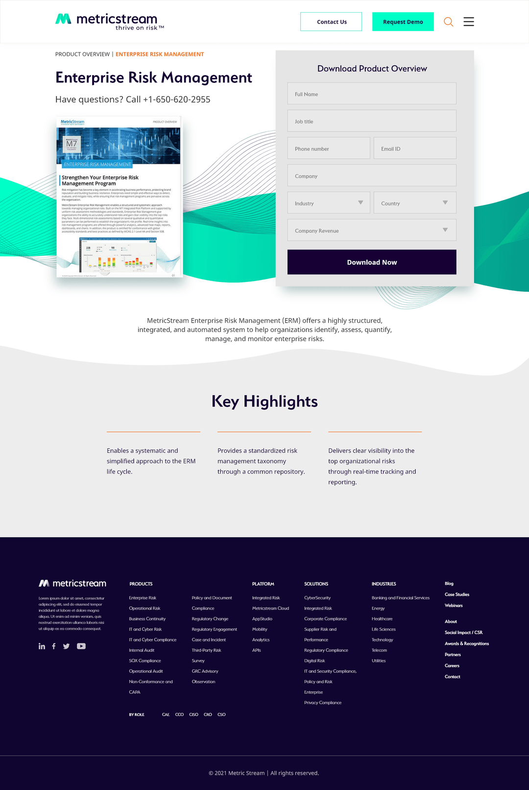
One of several product pages, all built from the same shared template.
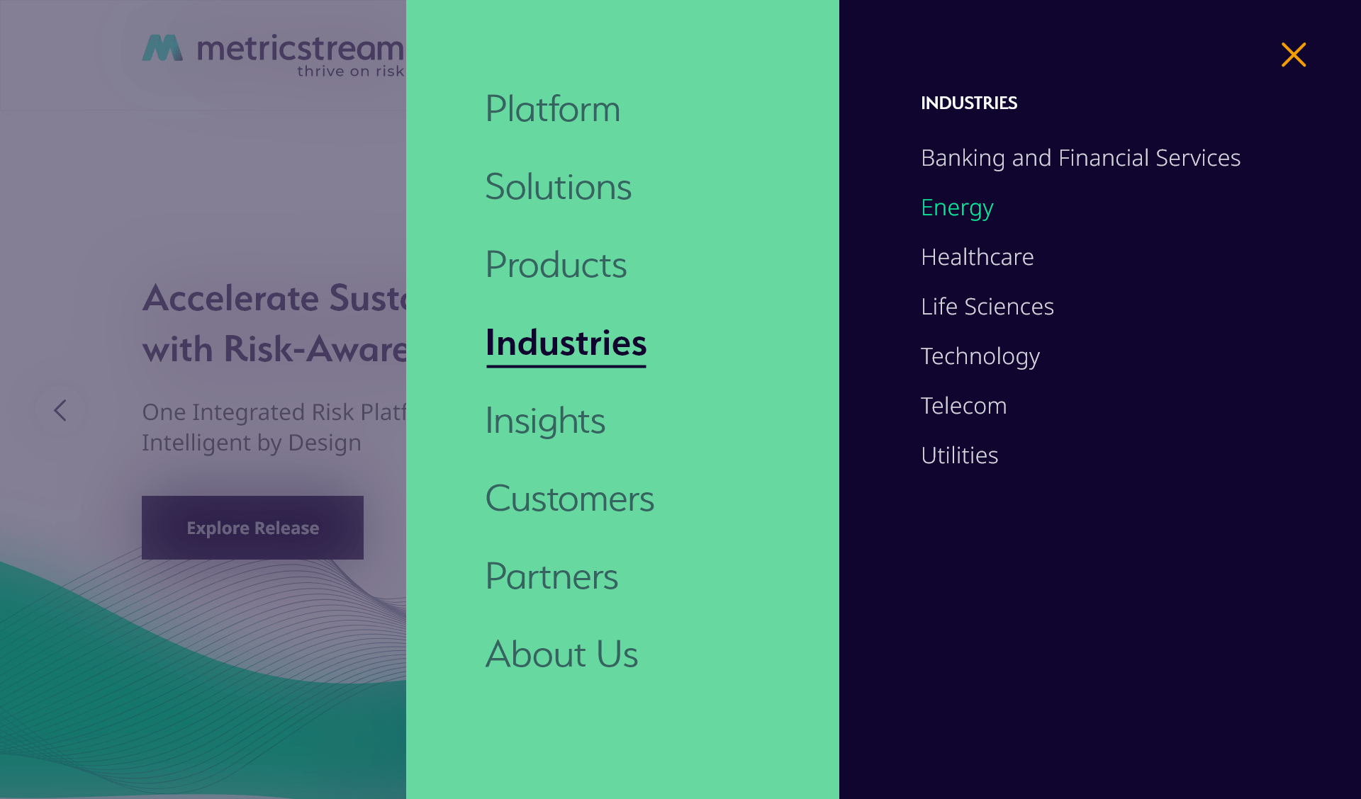
The site, end to end.
A style guide kept every page, built by different contributors over the rollout, speaking the same visual language.


Reflections
A rebrand is a content problem wearing a color problem's clothes.
Ask what the brief is actually asking for.
"Match the new brand" sounded like a visual task. The real work, and the real value, was underneath: fixing years of structural drift the rebrand had simply made visible.
Working inside someone else's system is its own skill.
There was no blank page here. Every decision had to fit an established brand and please stakeholders across product lines who'd never had to agree on anything before.
Templates are how you scale a rebrand honestly.
A shared page-template system meant dozens of product pages, built over months by different hands, still felt like one company.
Next Case Study
A full smart-home app redesign: new flows, new visual system, new component library. Same product underneath, completely different experience.
View case study