 Claude Design
 Cursor
 Figma
Figma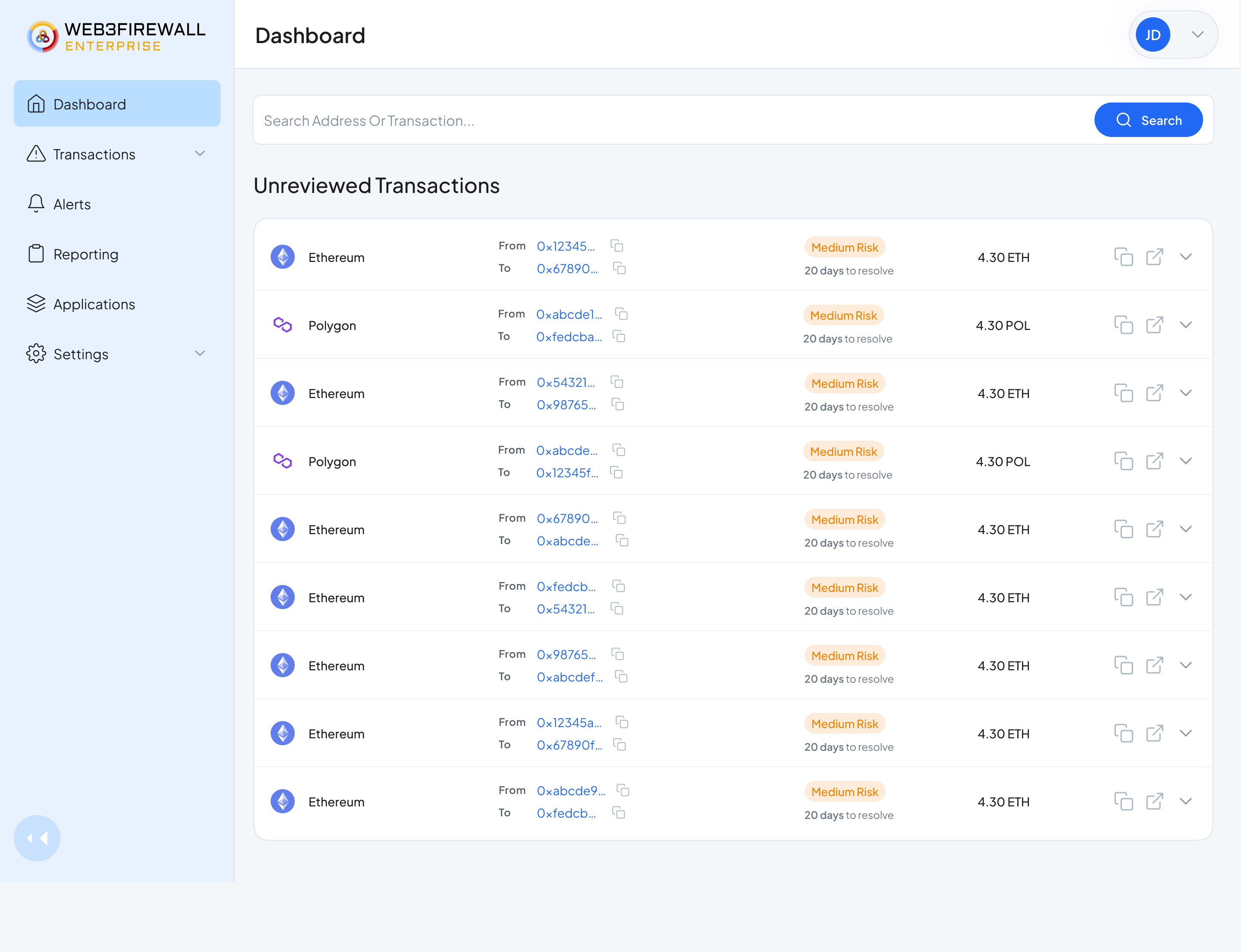
The Dashboard, the unreviewed queue is the hero. Everything an analyst opens the app to answer, up top.
Overview
I led product design for Web3Firewall Enterprise, from a blank Figma file to a shipped platform that major crypto exchanges use every day.
The company had strong tech and strong customers waiting. What they didn't have was a product surface. Compliance teams were bouncing between six or seven tools to review one transaction. Analysts made risk calls from raw JSON. Setting up a policy took an engineering ticket. The tech was ready, the workflow was not.
My job was to turn all of that into one clean workspace. A place where a compliance officer can see every risky transaction, understand why it flagged, act on it, and move on.
I owned it end to end, research, information architecture, wireframes, high-fidelity screens, and the design system that now powers every new feature the team ships.
Analysts juggled 6–7 legacy tools to make a single call, high cognitive load, slow reviews, and risk hiding in the gaps.
A single control room where an analyst can see the risk, understand why, and act, without ever leaving the page.
A ~80-component design system, 100% adoption, and 4+ supporting applications folded into one workspace.
Impact · First year in market
Numbers from the first year in market.
Context
Web3Firewall is like an antivirus for crypto transactions.
Their customers are the companies moving billions in digital assets every day, crypto exchanges, custodians, stablecoin issuers, and blockchain infrastructure providers.
When a bad transaction tries to move through their systems (a hack, a scam, a sanctioned wallet, a policy break), Web3Firewall's AI catches it and stops it before it broadcasts. Simple to say. The workflow to make that call, and to prove the call was right, is not simple at all.
Design System
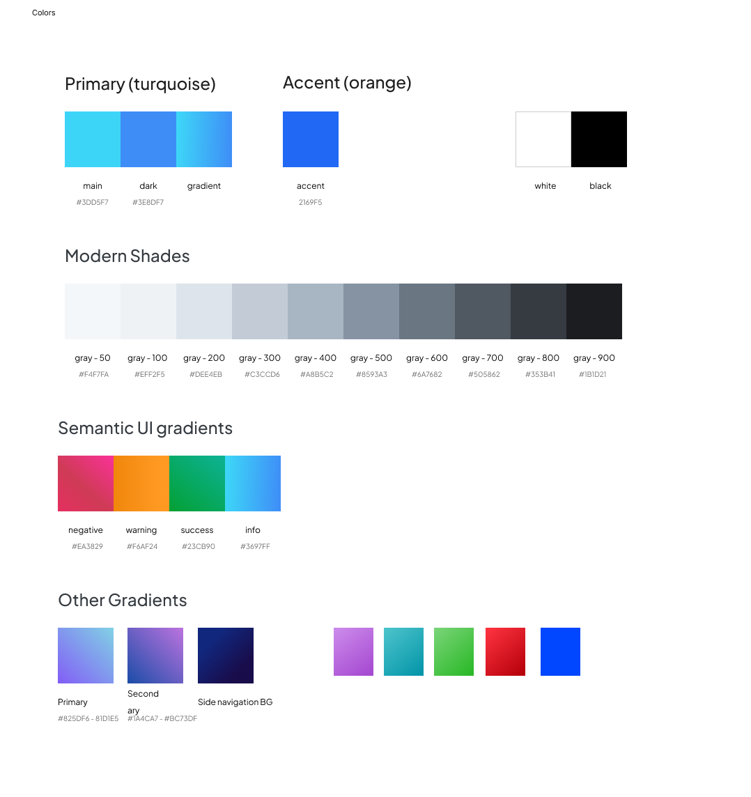
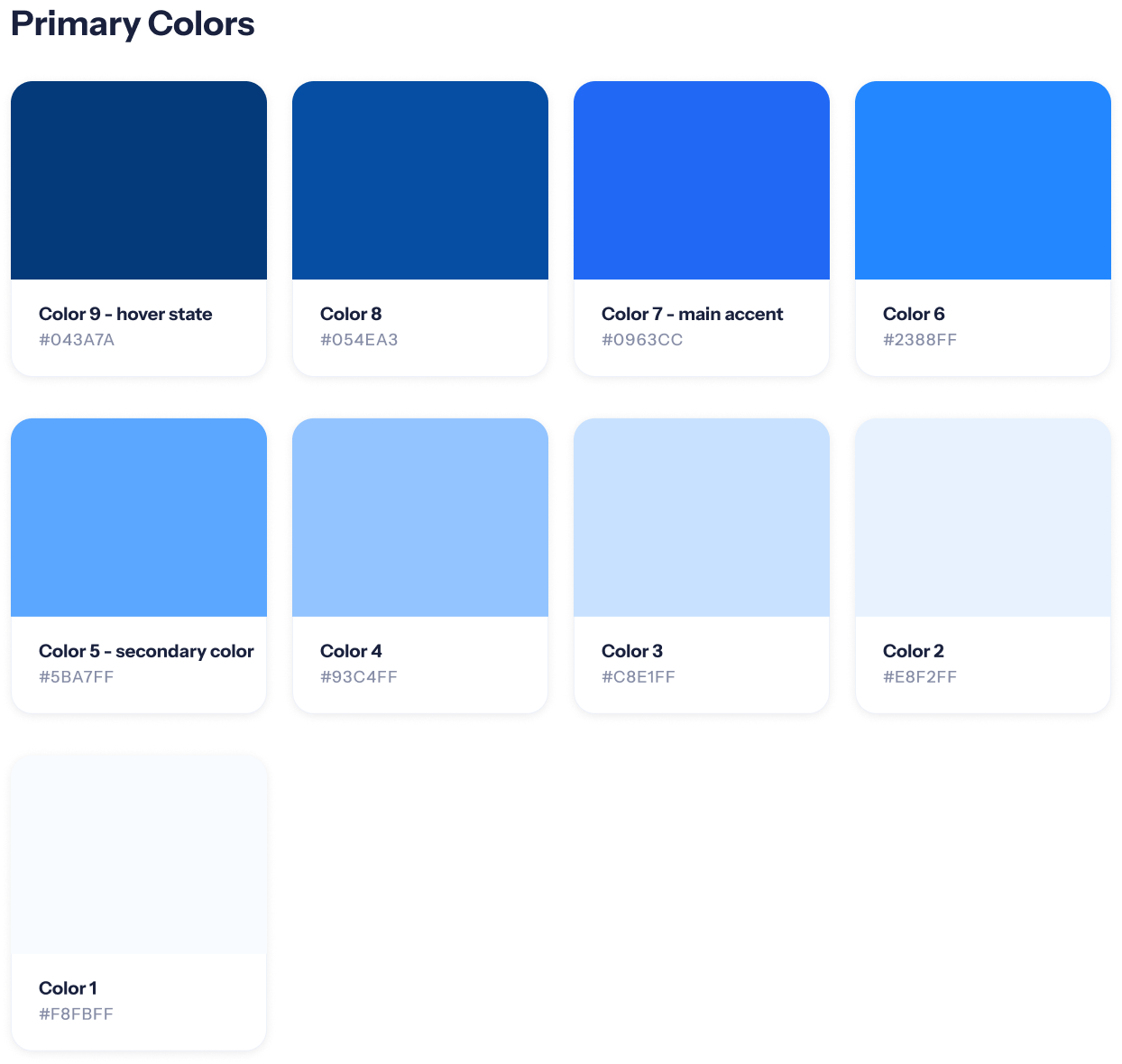
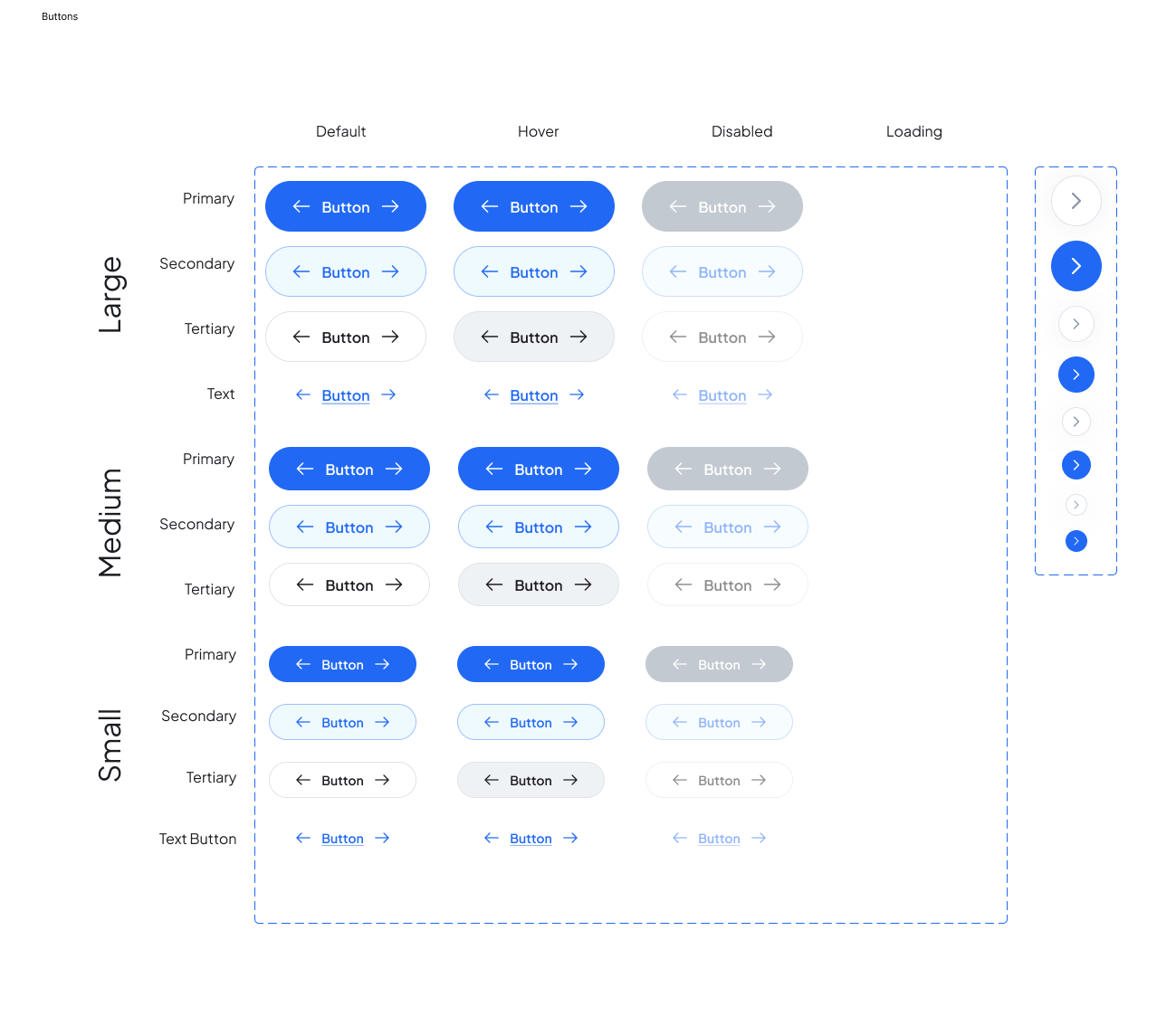
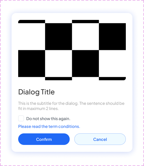
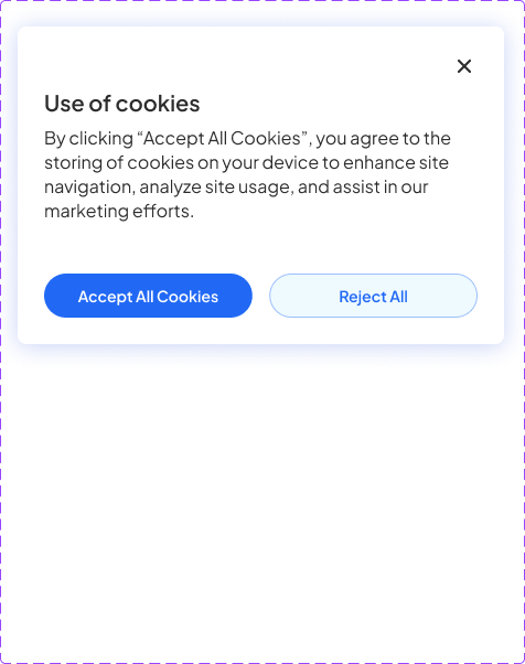
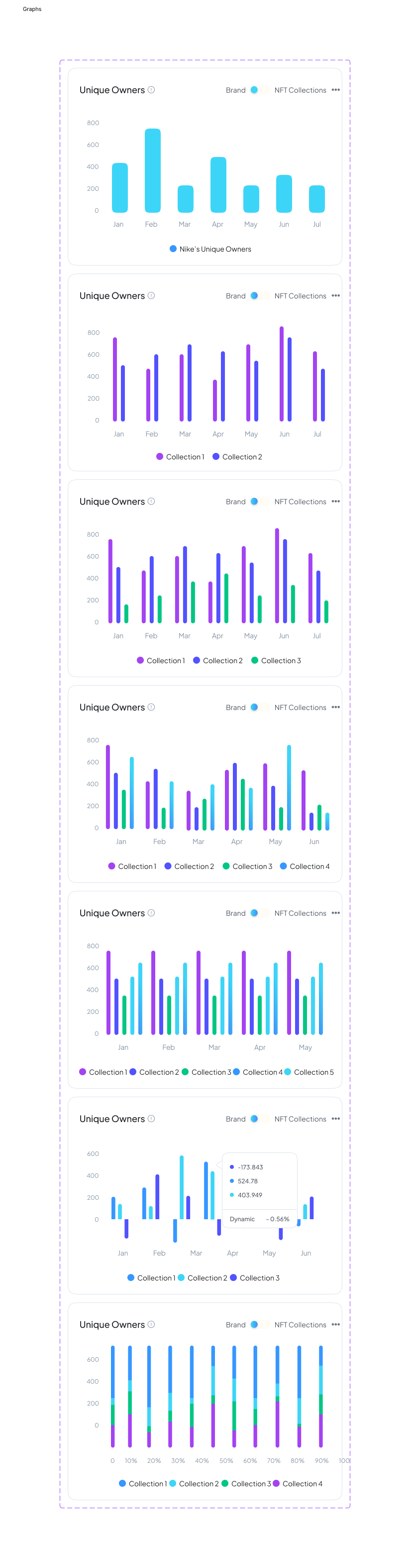
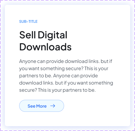
Design System needs to read calm and professional
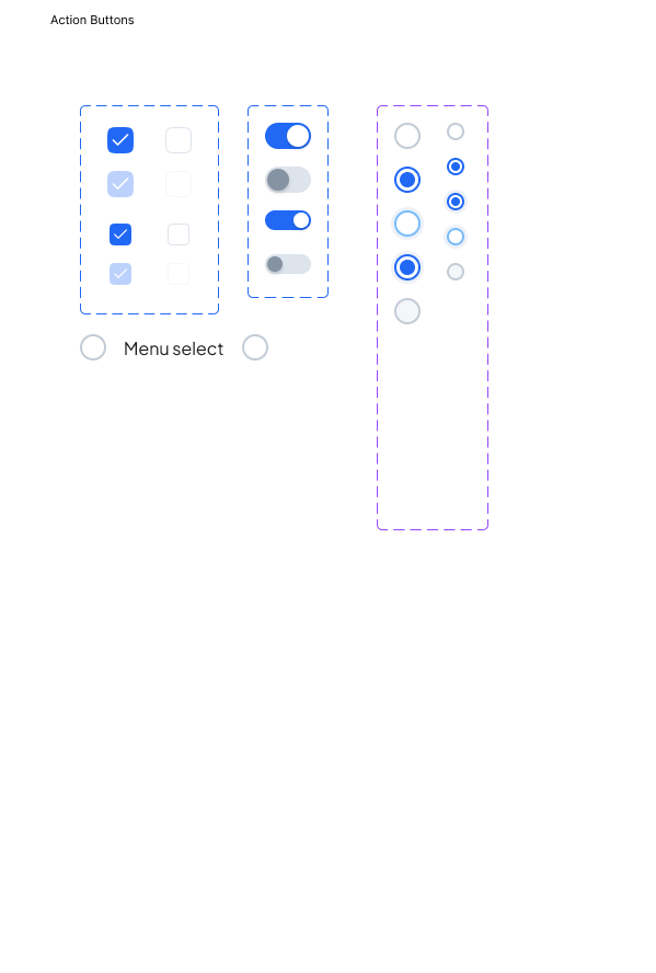
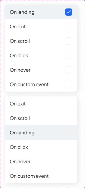
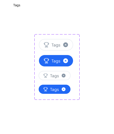
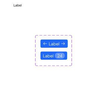
By ship date there were about 70 components, and every screen in the product uses only these parts.
Color
Buttons & actions
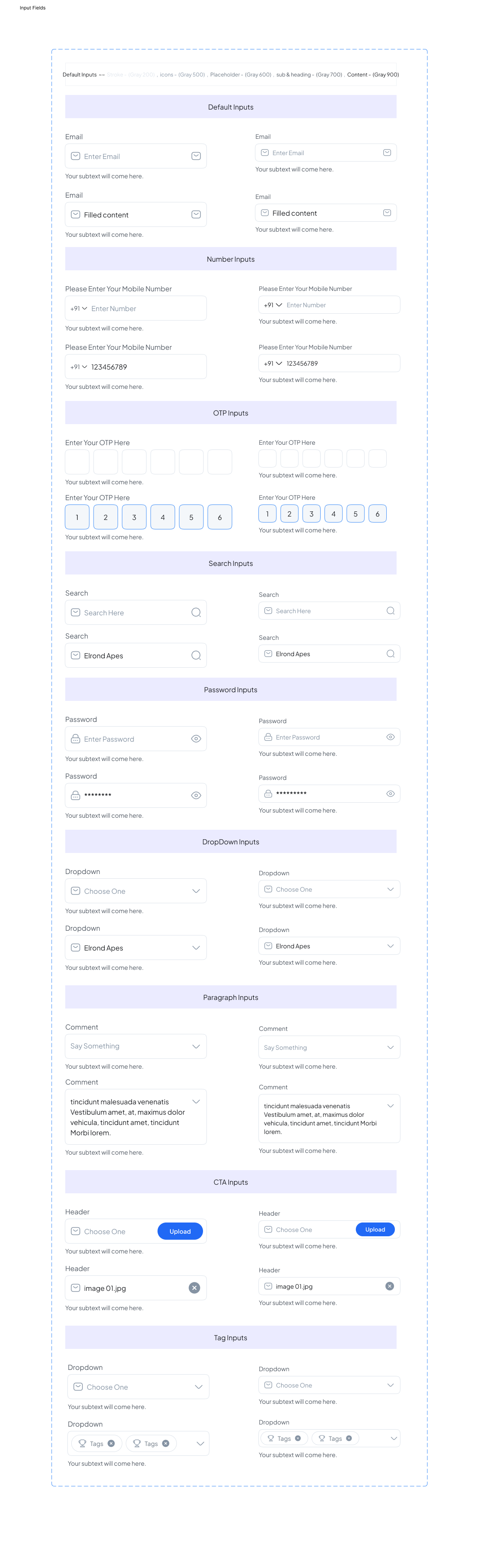
Forms & inputs
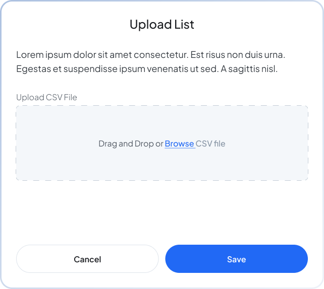
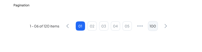
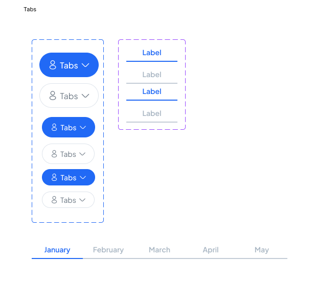
Navigation
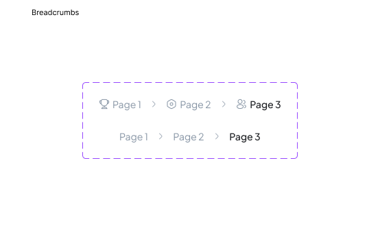
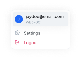
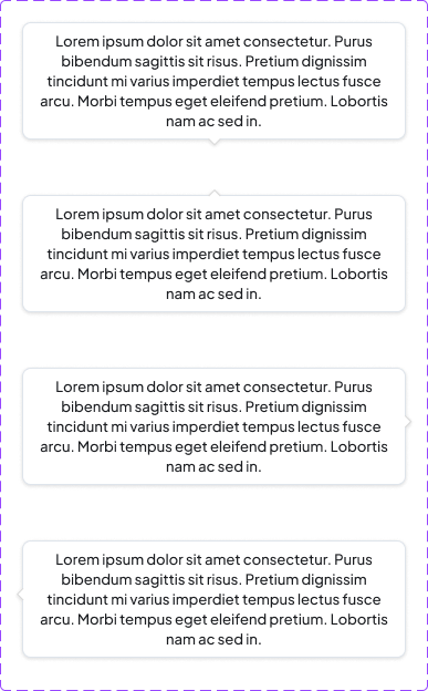
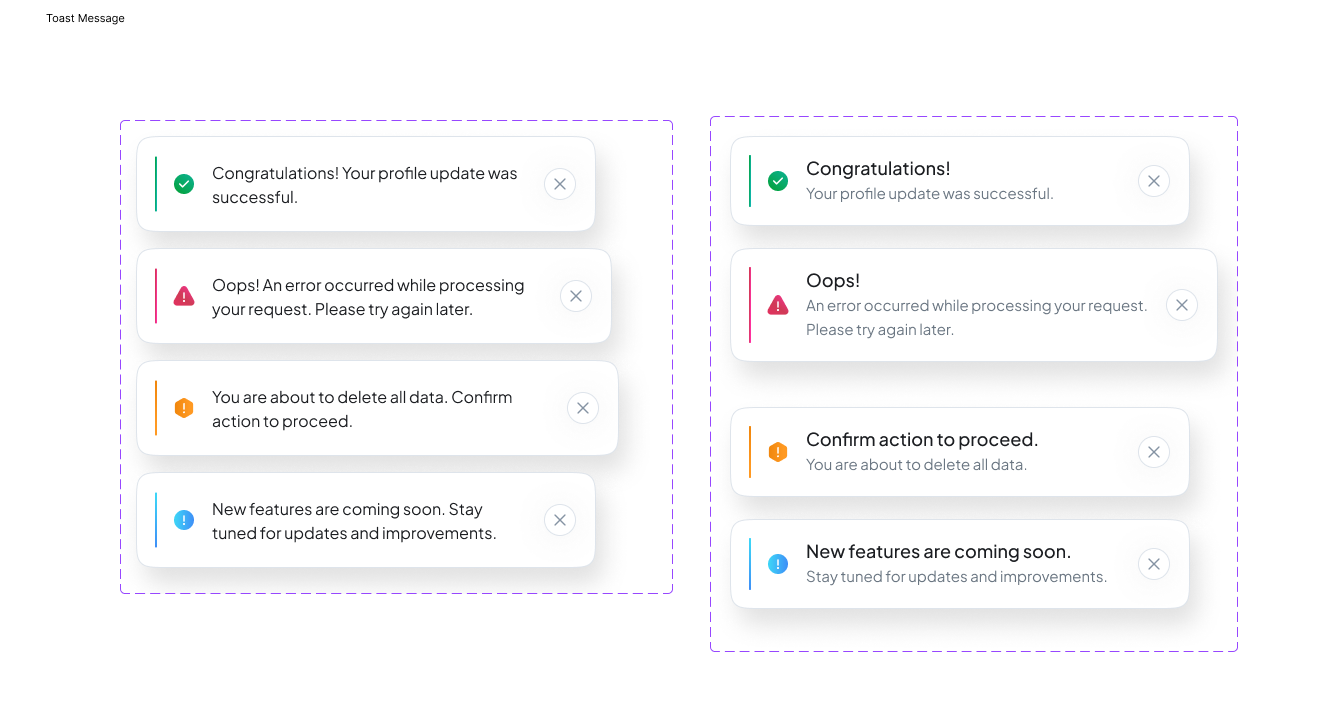
Feedback & data
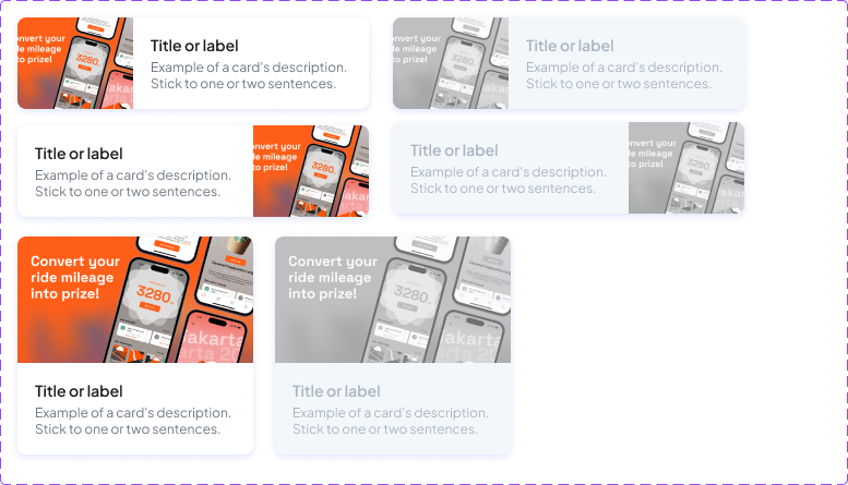
Cards
Final Designs
The Dashboard, built around the one question analysts open the app to answer.
That question is simple: what needs my attention right now? So the dashboard opens with the answer, a live queue of unreviewed transactions, sorted by risk, with chain, amount, the API key it came through, and days left to resolve.
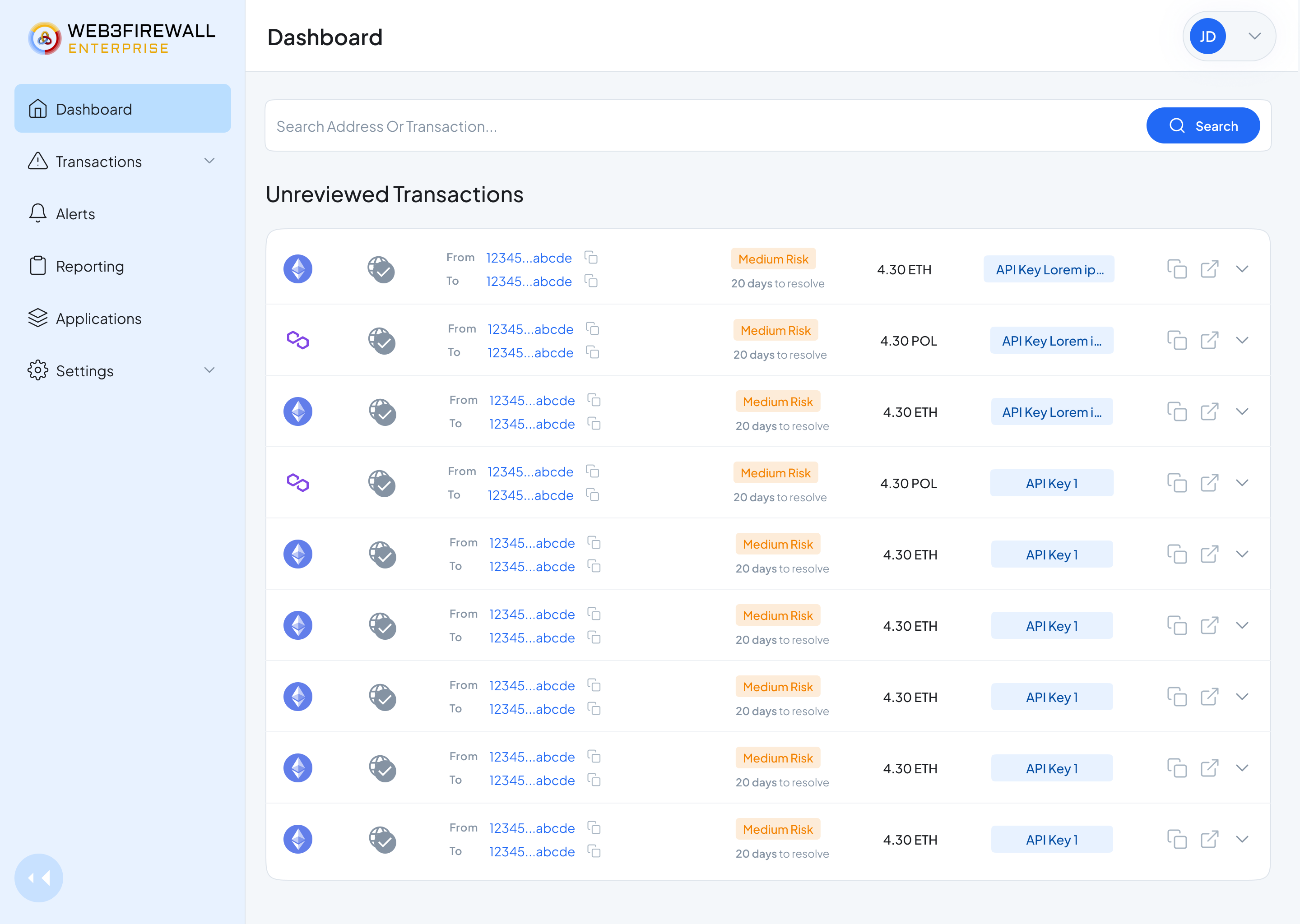
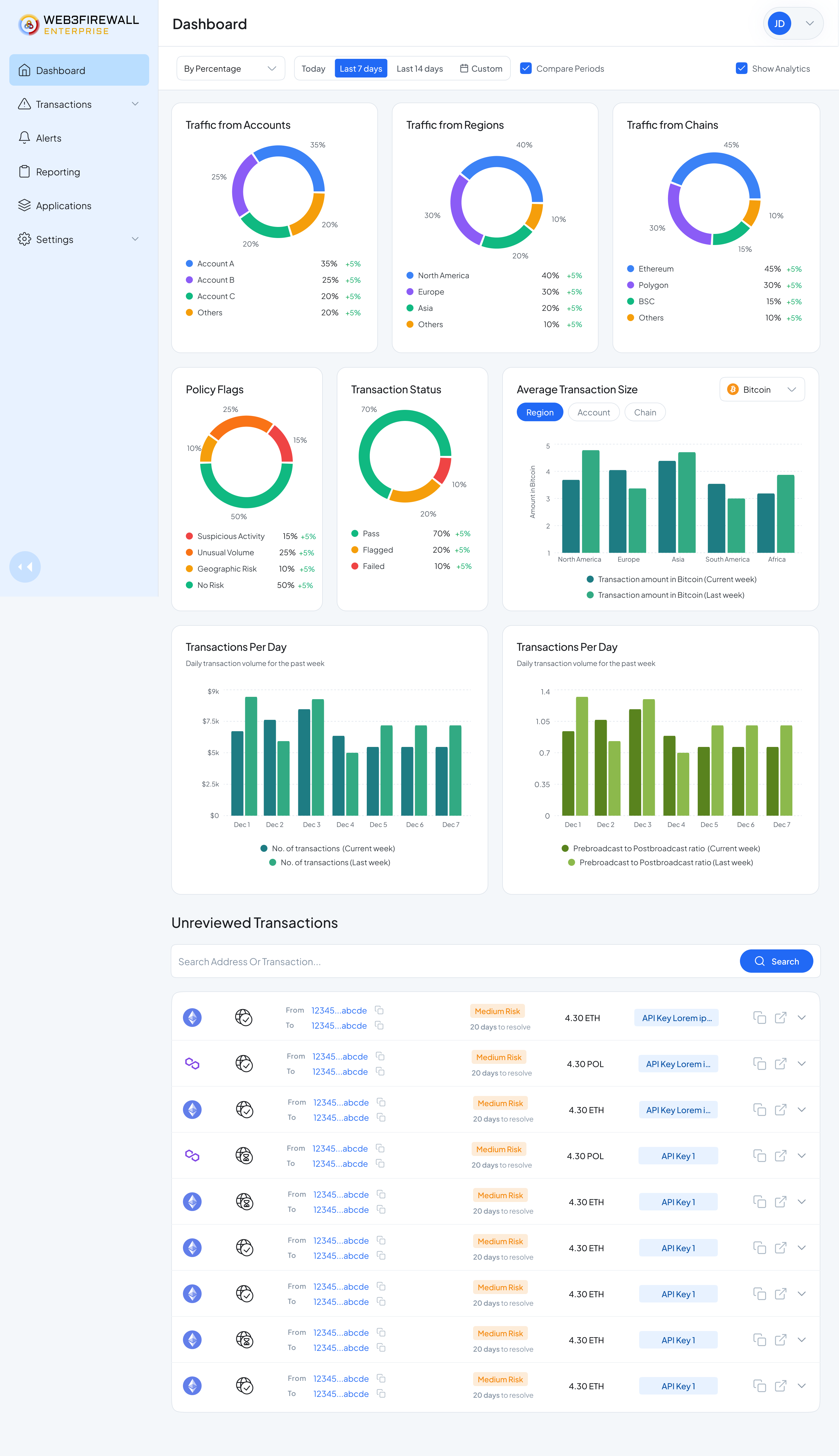
Dashboard · full view. Traffic analytics up top, the unreviewed queue below, the whole day in one scroll.
The Transaction Review flow.
This is the core loop: open a flagged transaction, understand why it flagged, act on it. Sanctions info, wallet history, risk score, and past decisions all sit next to the transaction. The decision buttons (approve, rejected) are always visible.
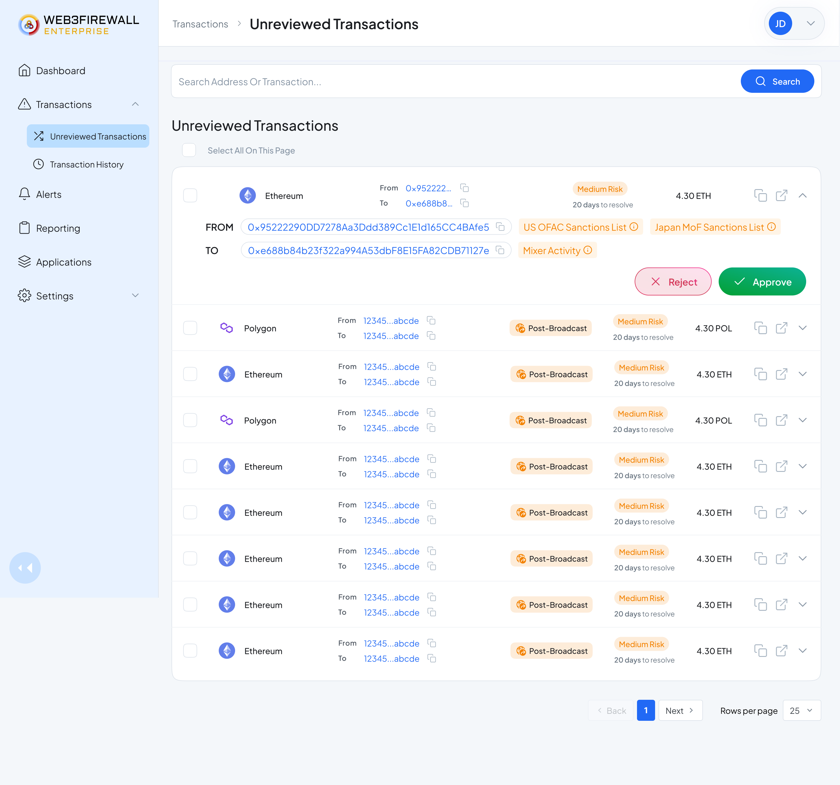
The unreviewed queue. Every row is one decision to make, expandable inline for the full picture.
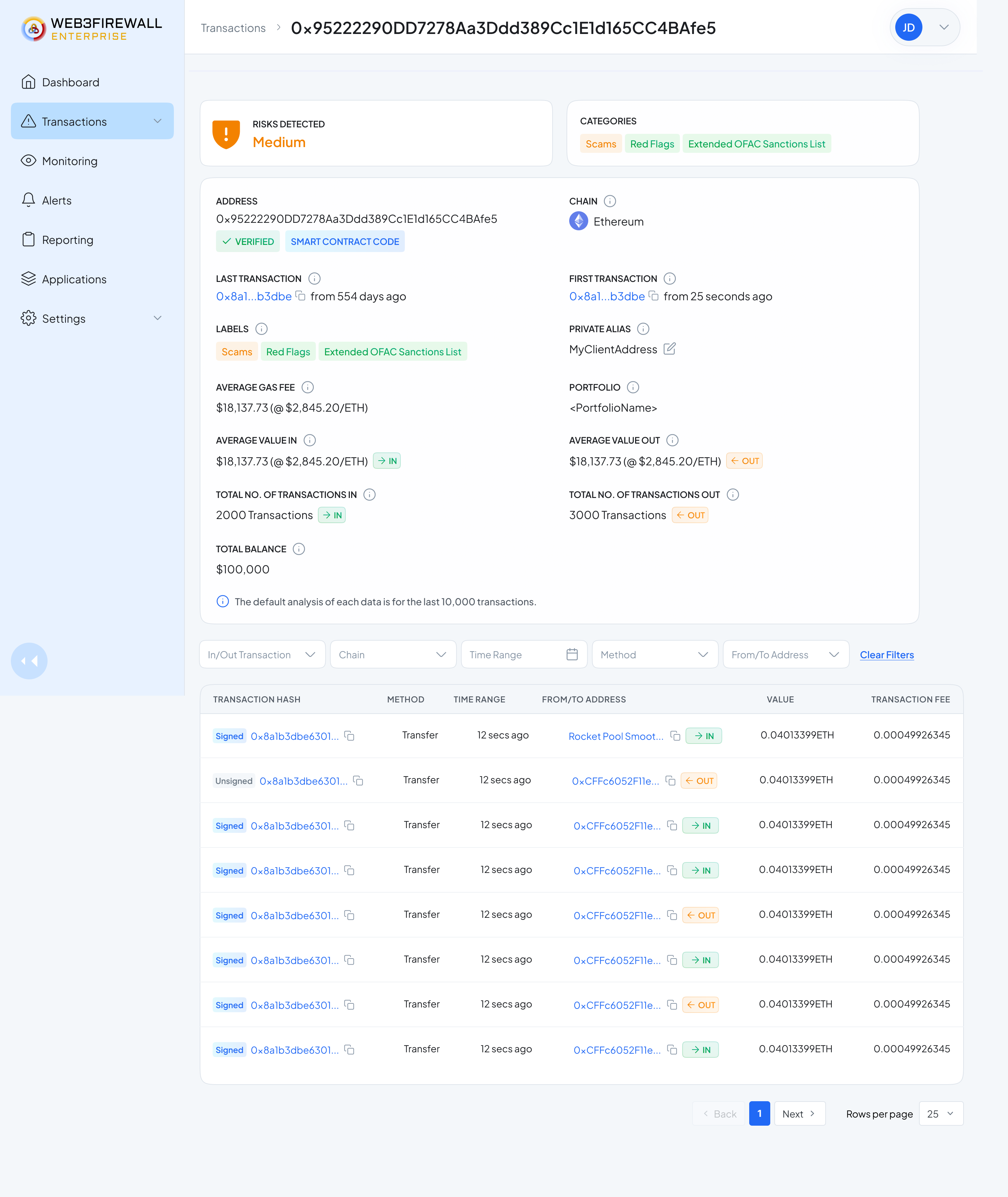
Address details. Every piece of context an analyst used to hunt for: screening, history, past transactions, tags, and notes, on one page.
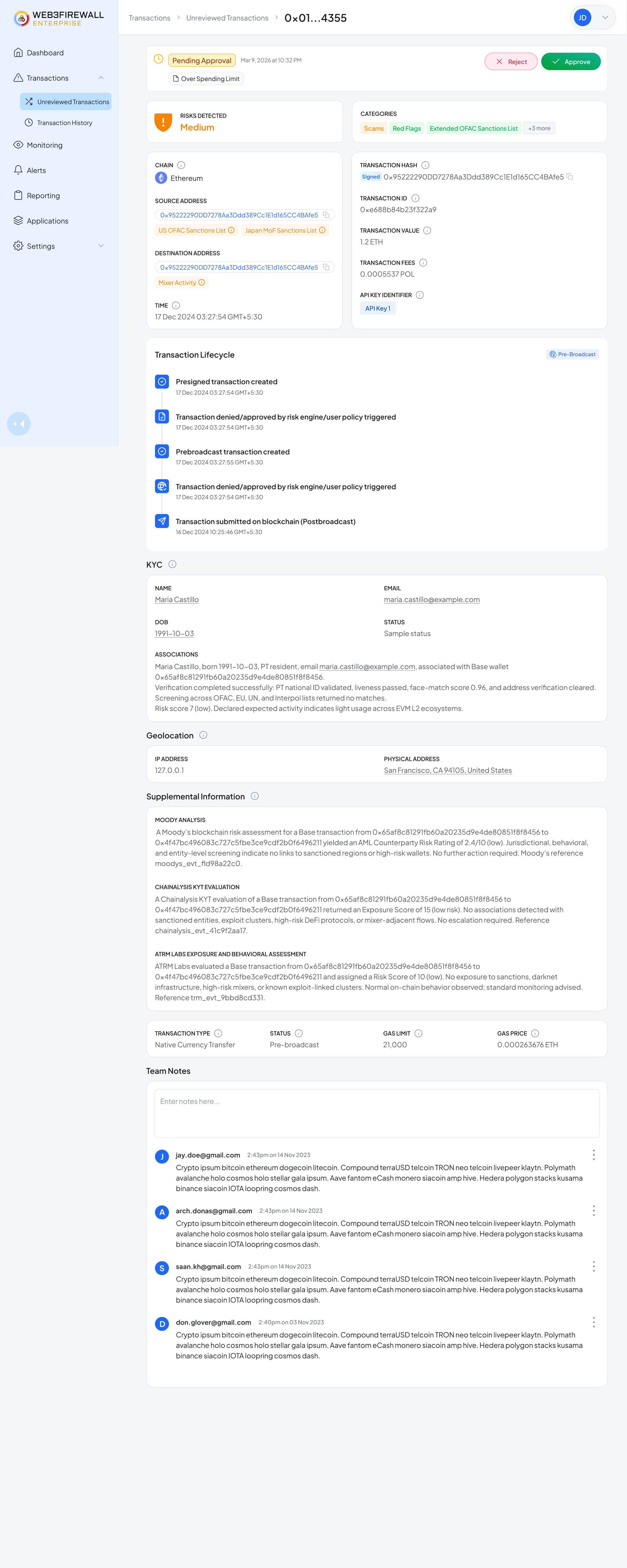
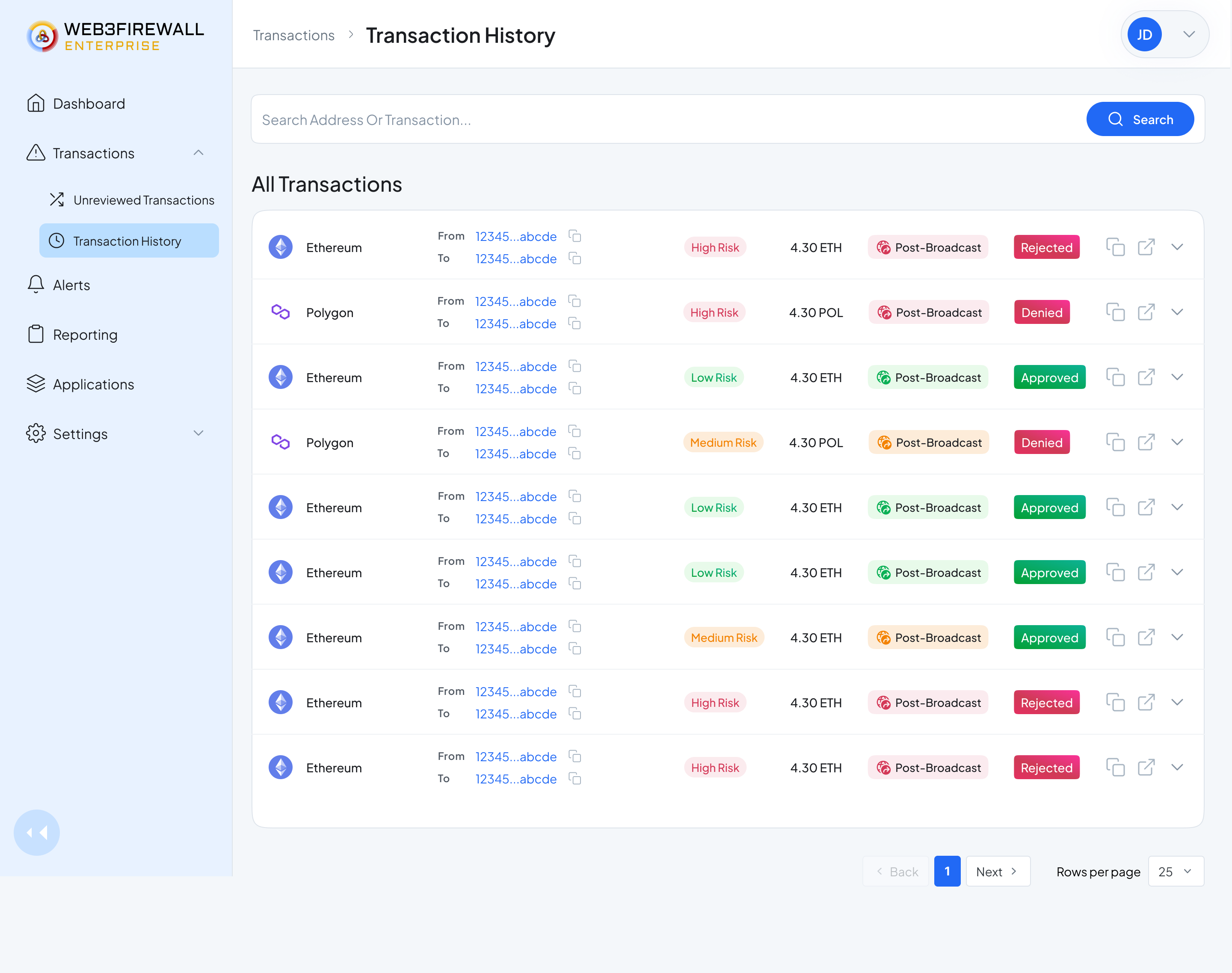
Left: pending approvals for a second reviewer. Right: full history of every decision the team has made, auditable by default.
The Policy Center
For easily scanning and managing policies, with in-built policies that are vital.
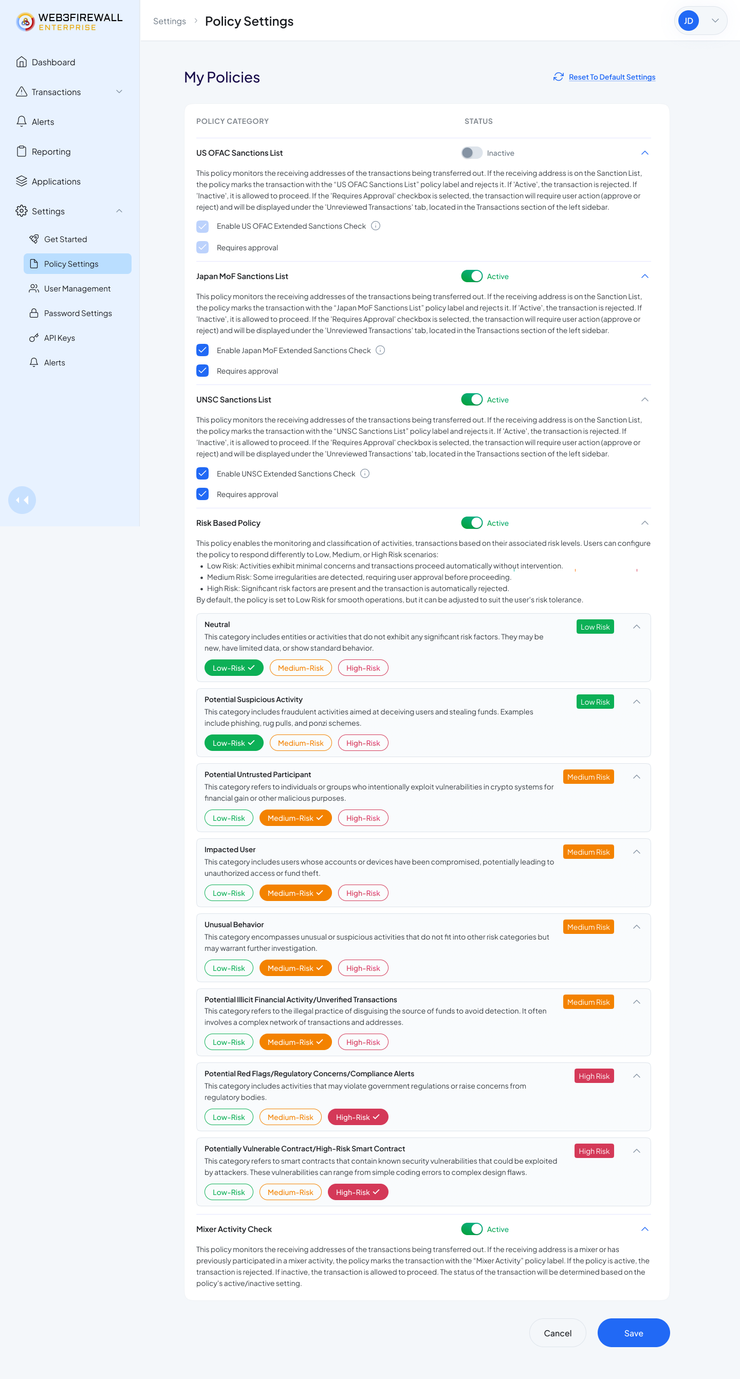
Policy Center. Every rule is scannable at a glance, status, conditions, and last edit visible without a click.
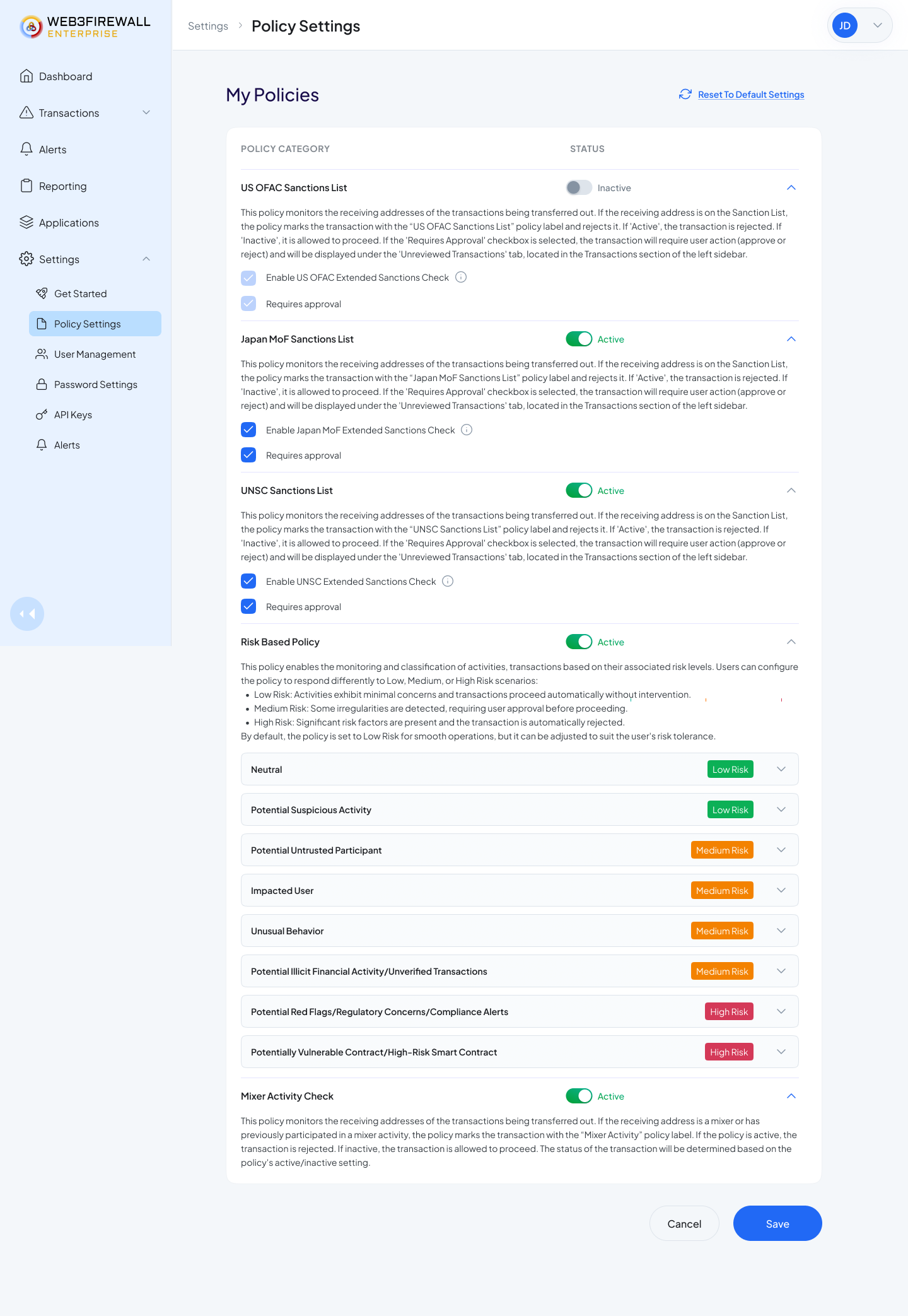
Risk policies view. Compliance leads can enable, disable, or edit any rule they own, and set the Low / Medium / High response per category.
The Allow List, for the addresses you trust and don't want to re-check.
Every customer kept a running spreadsheet of vetted addresses, employee wallets, treasury, known partners. The Allow List brings that into the platform with a hard limit
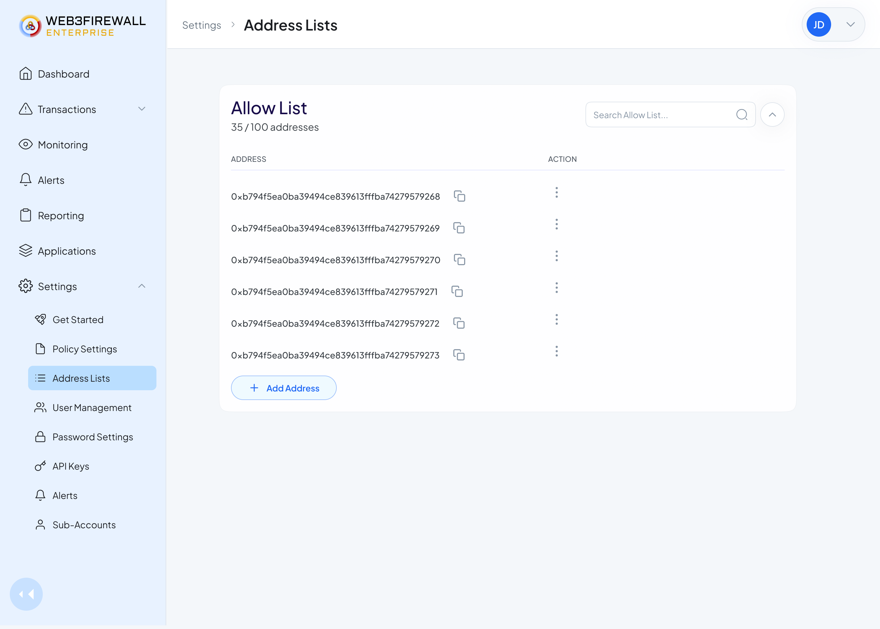
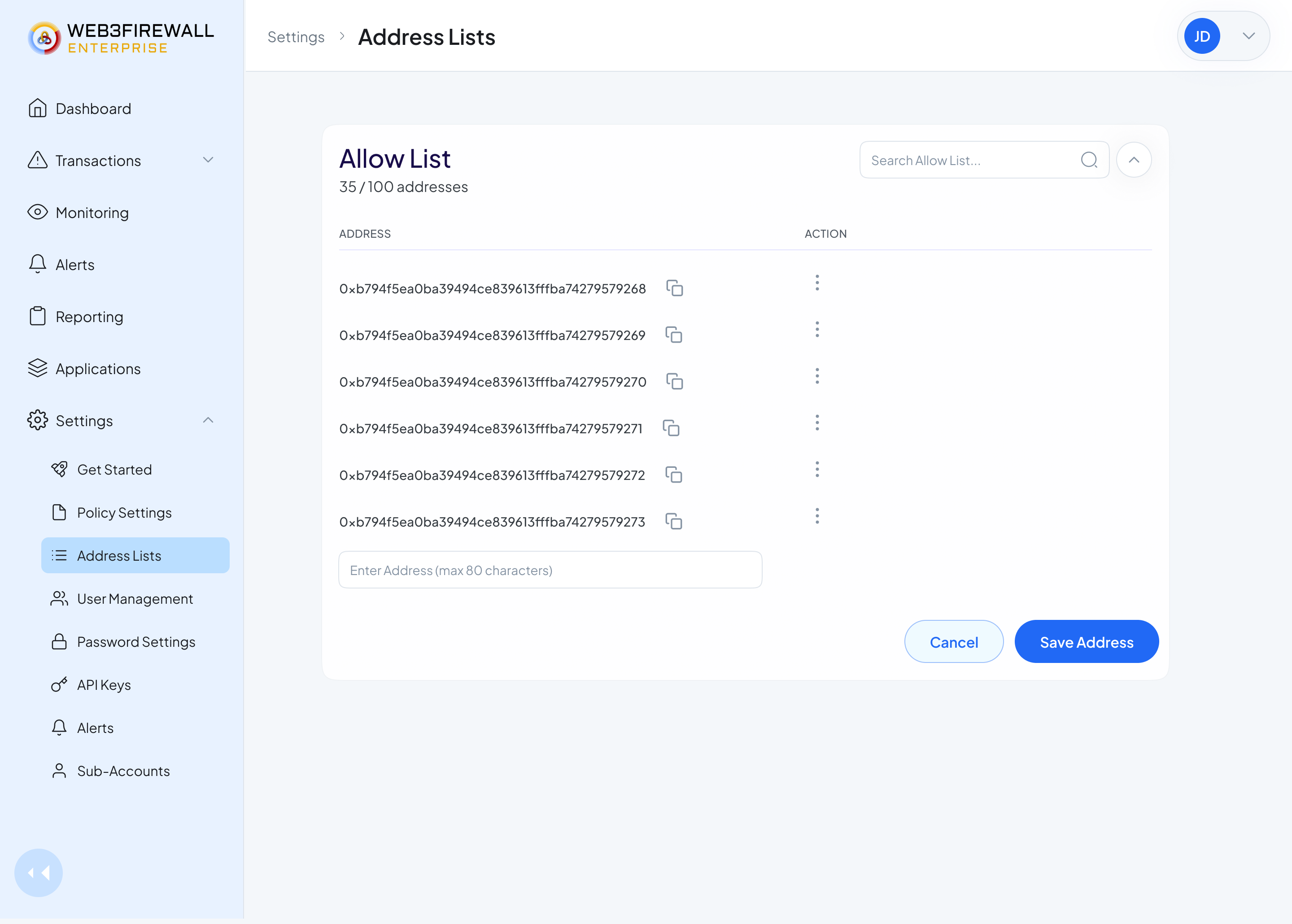
Left: the main allow list. Right: adding a new address inline.
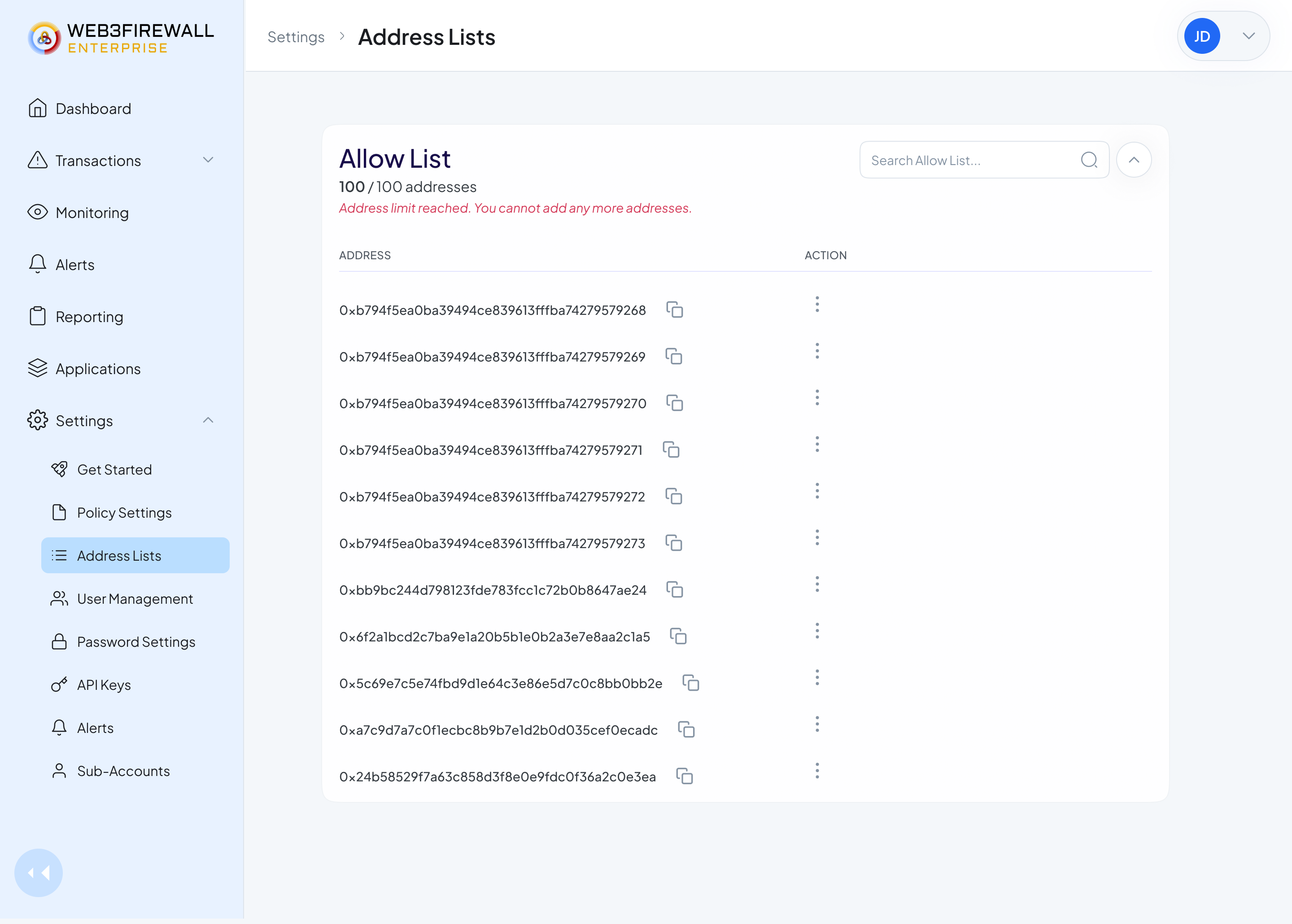
Address limit hit.
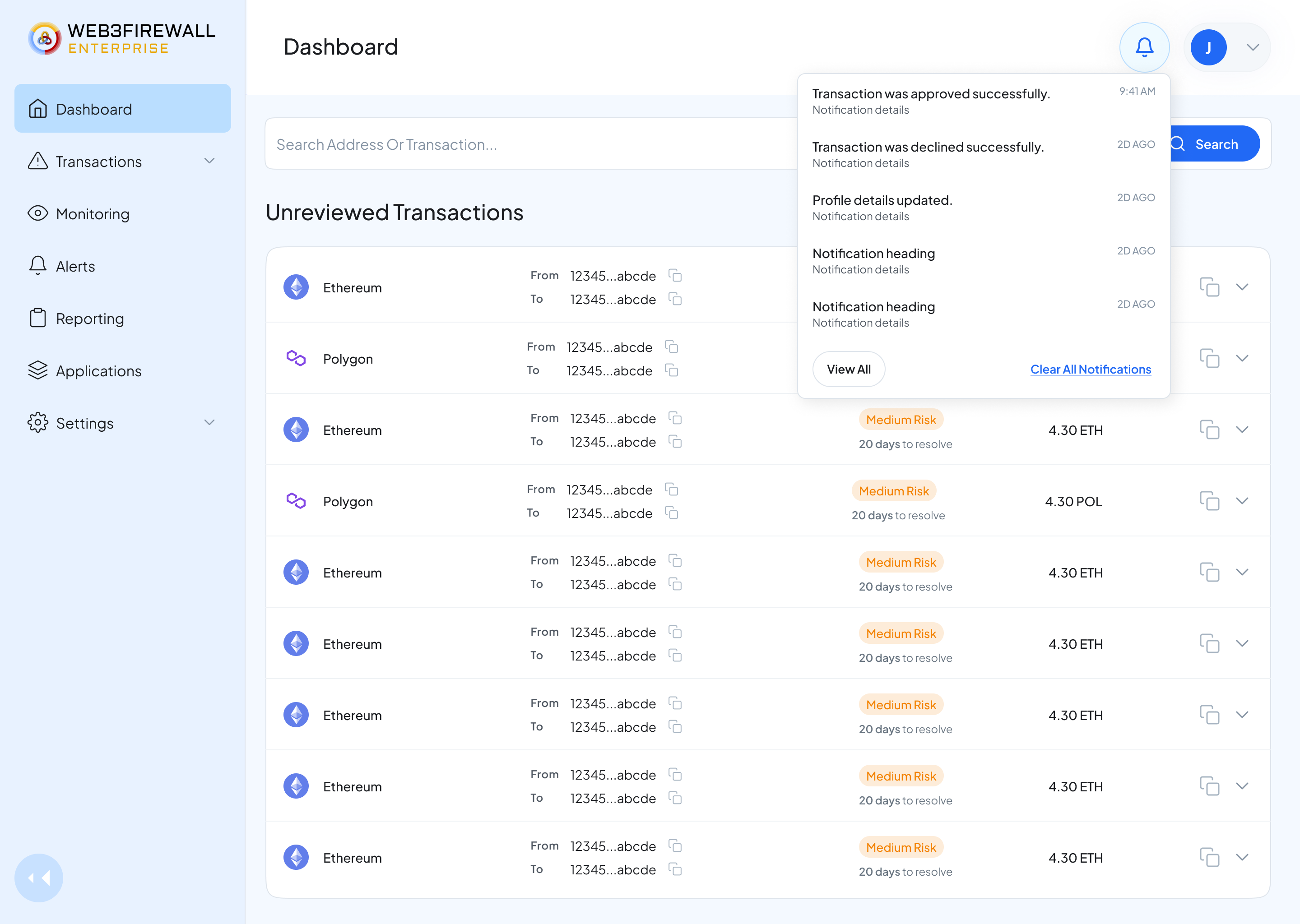
Risk Alerts that fire when your rules break.
Analysts don't want more notifications, they want the right ones. Alert configuration lets teams tune exactly what gets sent, how often, and to whom, with sensible defaults drawn from what we watched teams settle on after months of tuning, so new customers start well from day one.
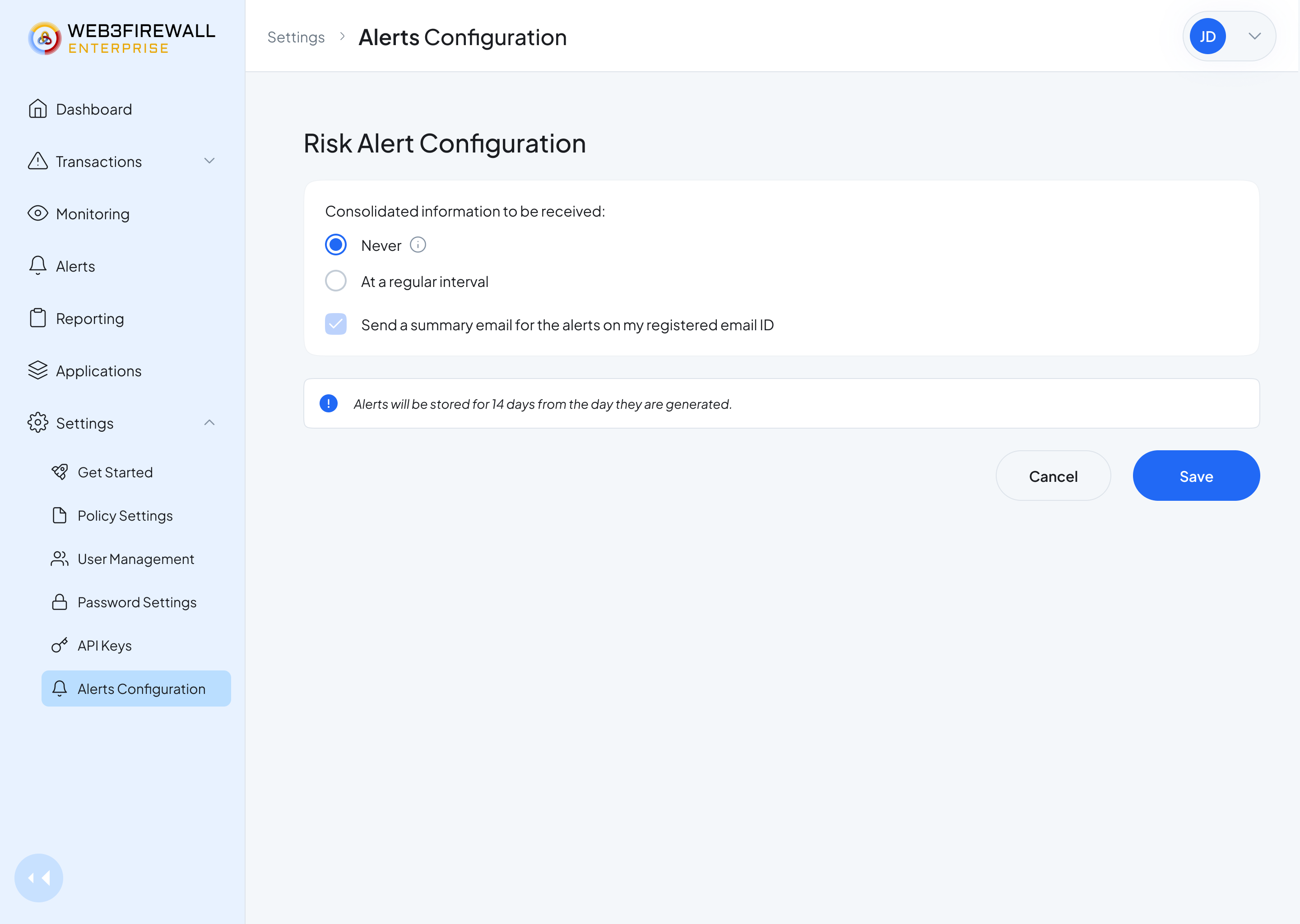
Alert configuration. Set the rule, pick who gets paged, and choose how loud it should be.
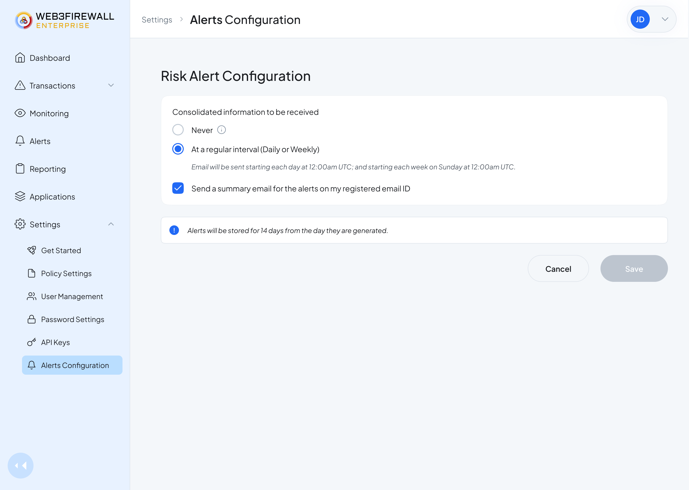
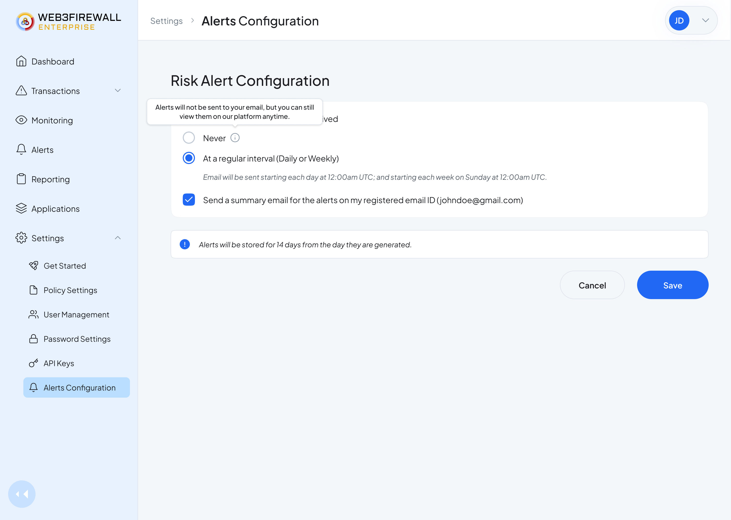
Progressive disclosure keeps the first view clean.
Reporting for all.
Every regulated customer owes auditors a quarterly report, a week of spreadsheet work, before this. Now someone picks a date range and a report type and gets a signed PDF the auditor will accept. Behind the scenes, every action ever taken is tied to a user, a timestamp, and a policy. Auditable by design.
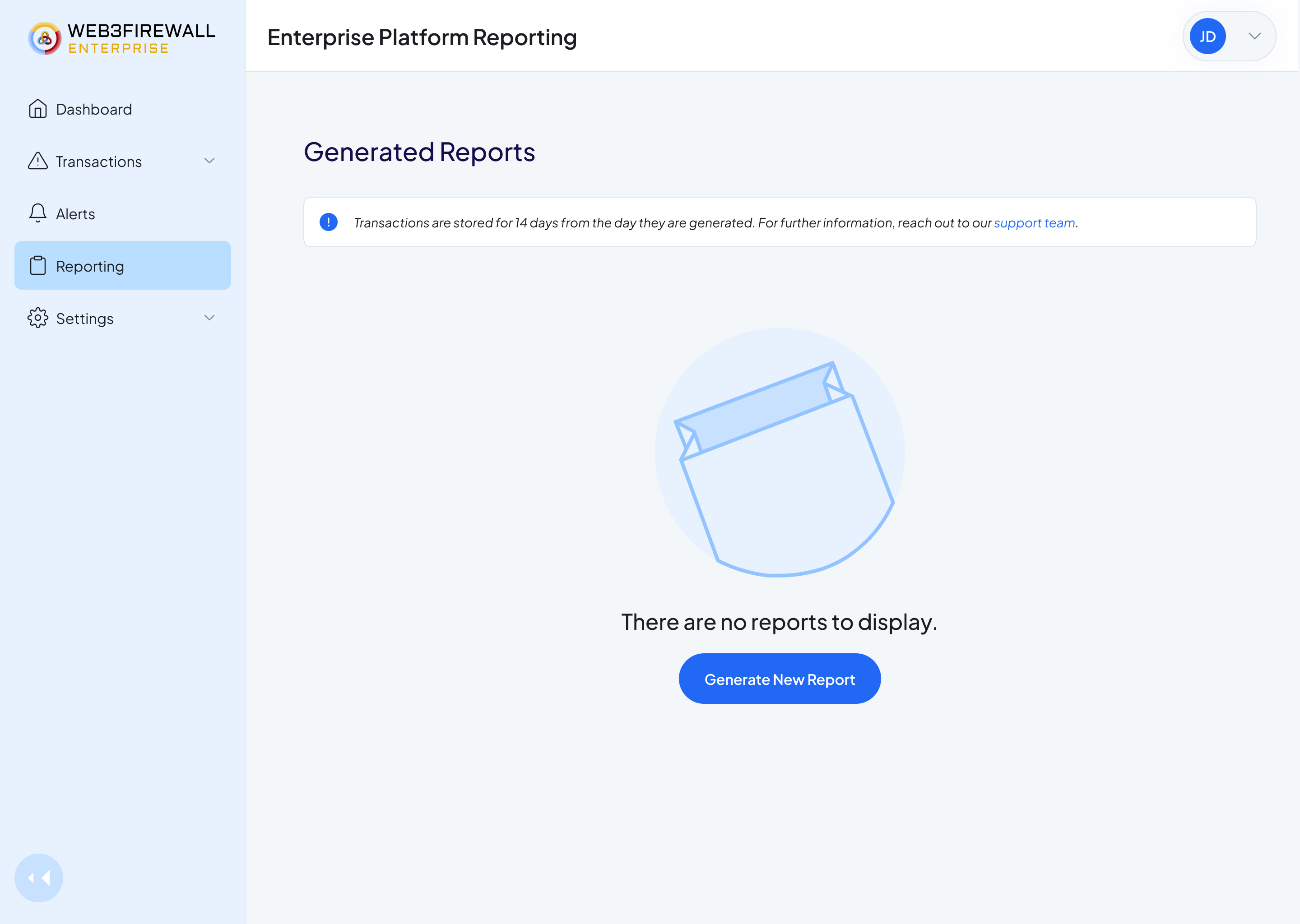
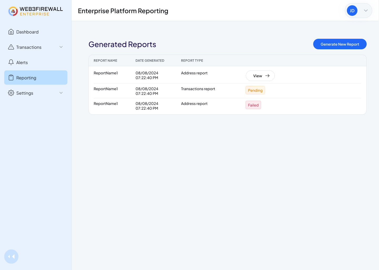
Left: an empty state that teaches what a report is for. Right: the reports list, status at a glance.
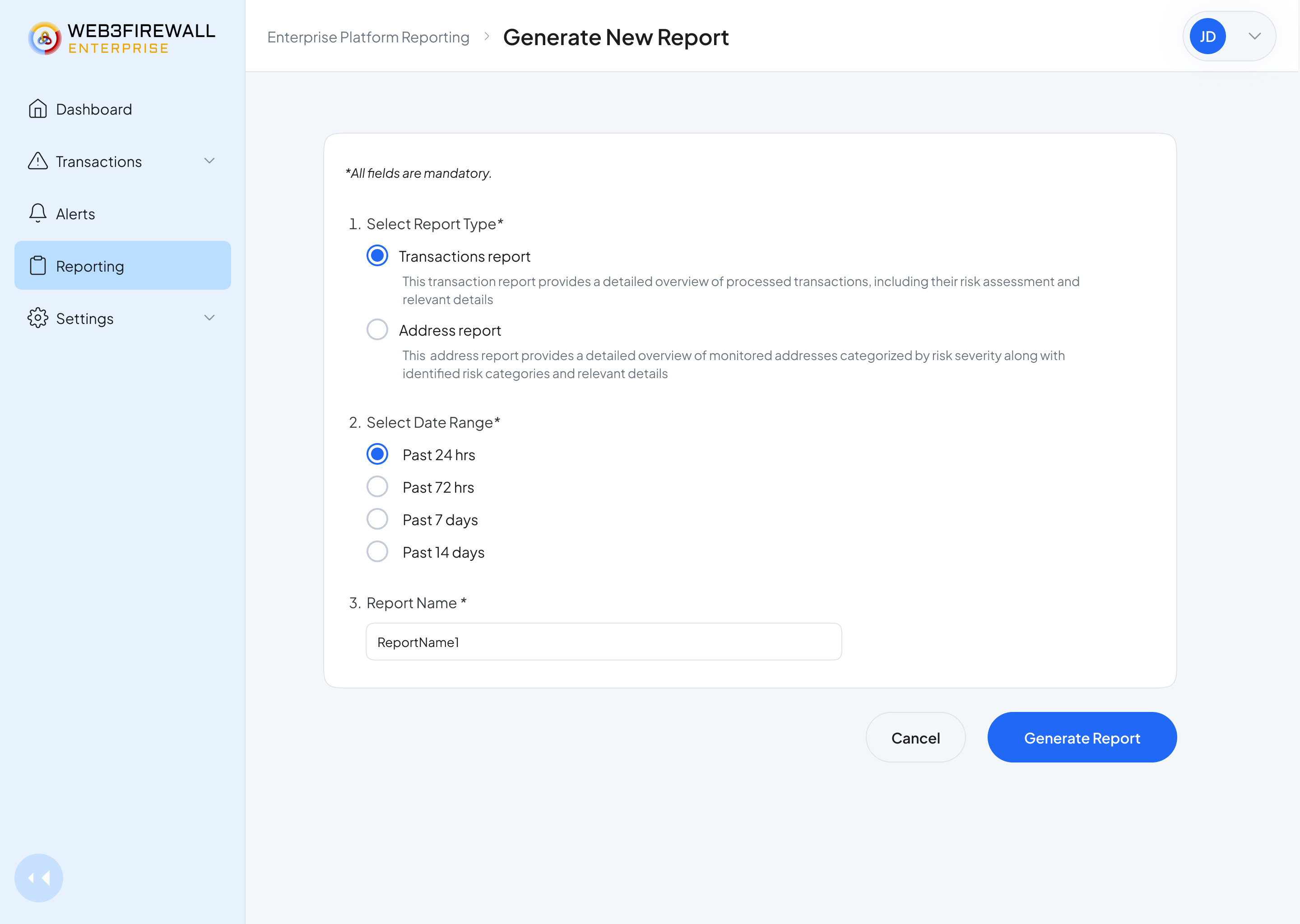
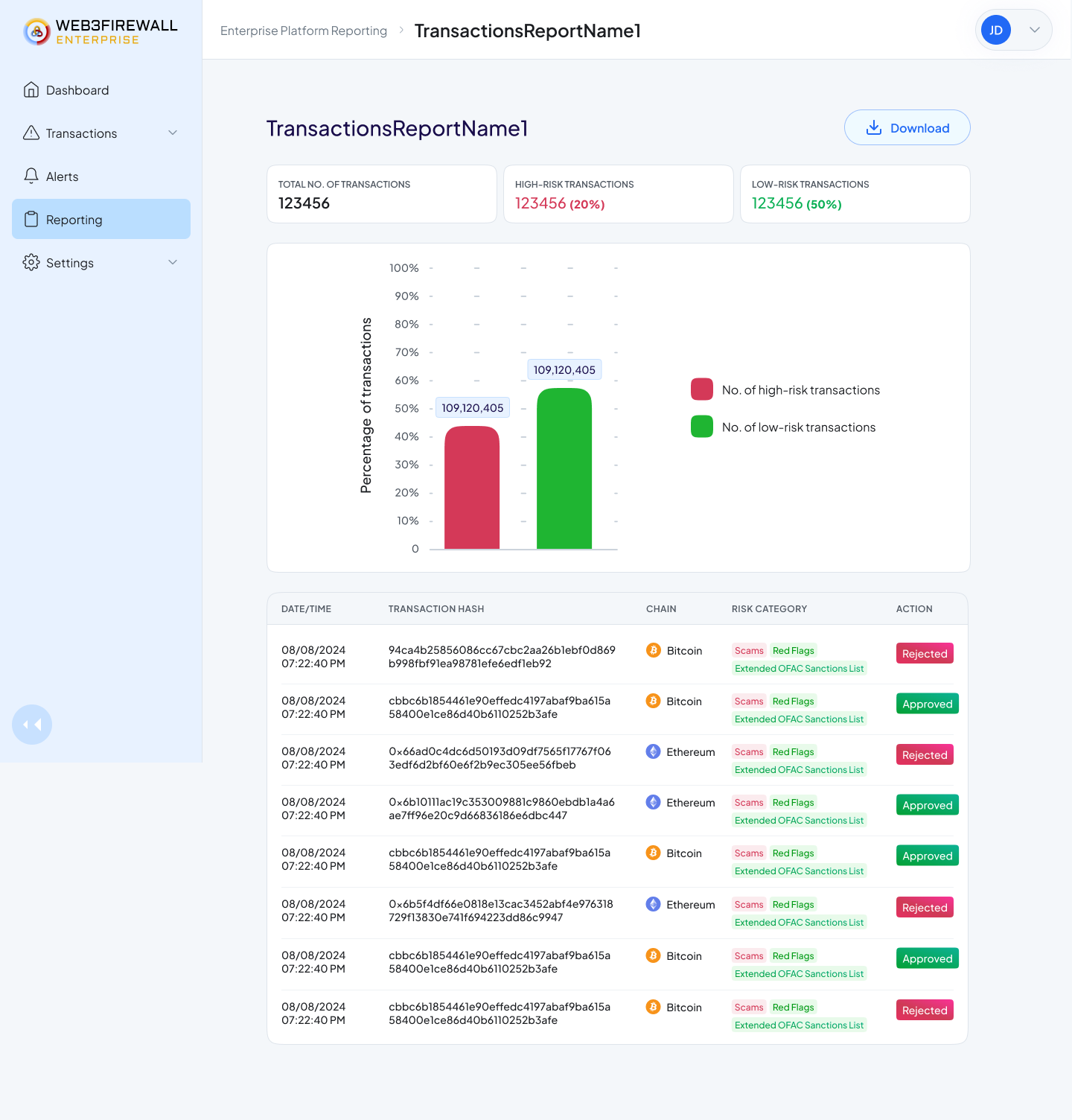
Left: the generation form, kept short. Right: the generated report, formatted for compliance handoff.
Tags, so context sticks to addresses across the whole team.
When one analyst learns a wallet belongs to a competitor exchange, everyone should know. Tags are how that knowledge travels, any user can add or remove a tag on any address, and the whole team sees it the next time that address shows up.
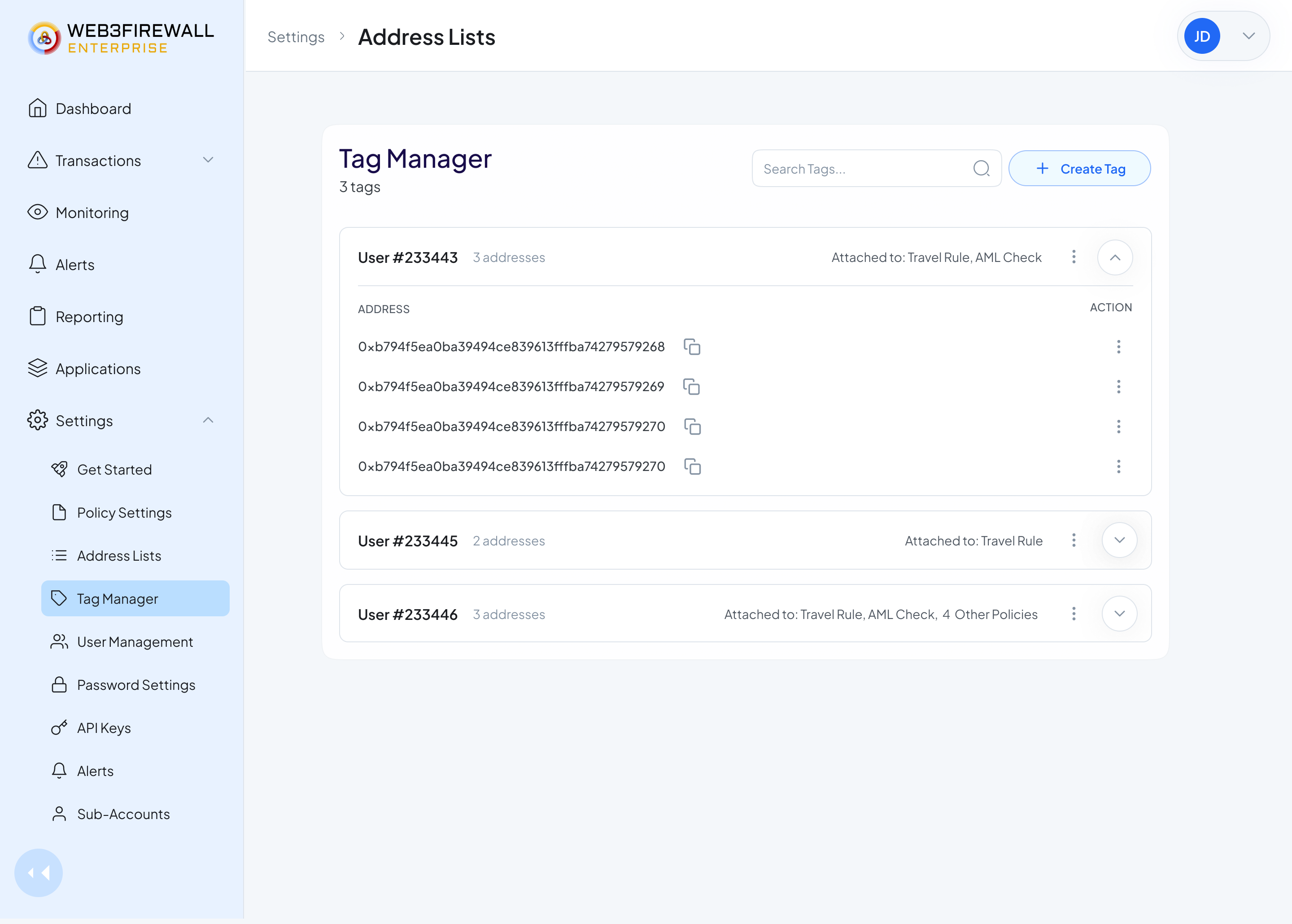
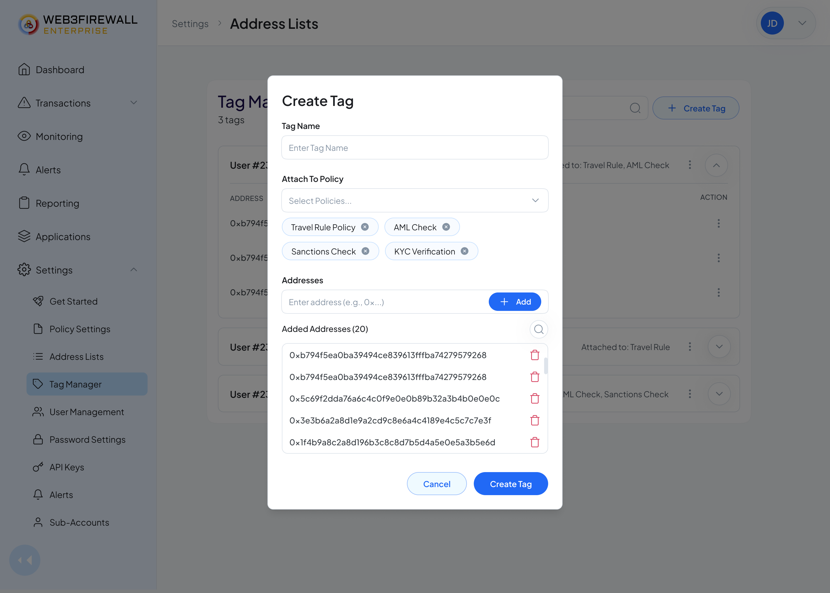
Left: the tag manager. Right: creating a tag.
A Get Started flow that meets a customer on their first day.
Onboarding a compliance team isn't onboarding a consumer app, there are legal steps, technical steps, and people steps. The Get Started page turns that into a checklist: read the briefing, add users, set up two-step verification, save the API keys. Each step ticks off on completion, so the customer always knows what's next and what's done.
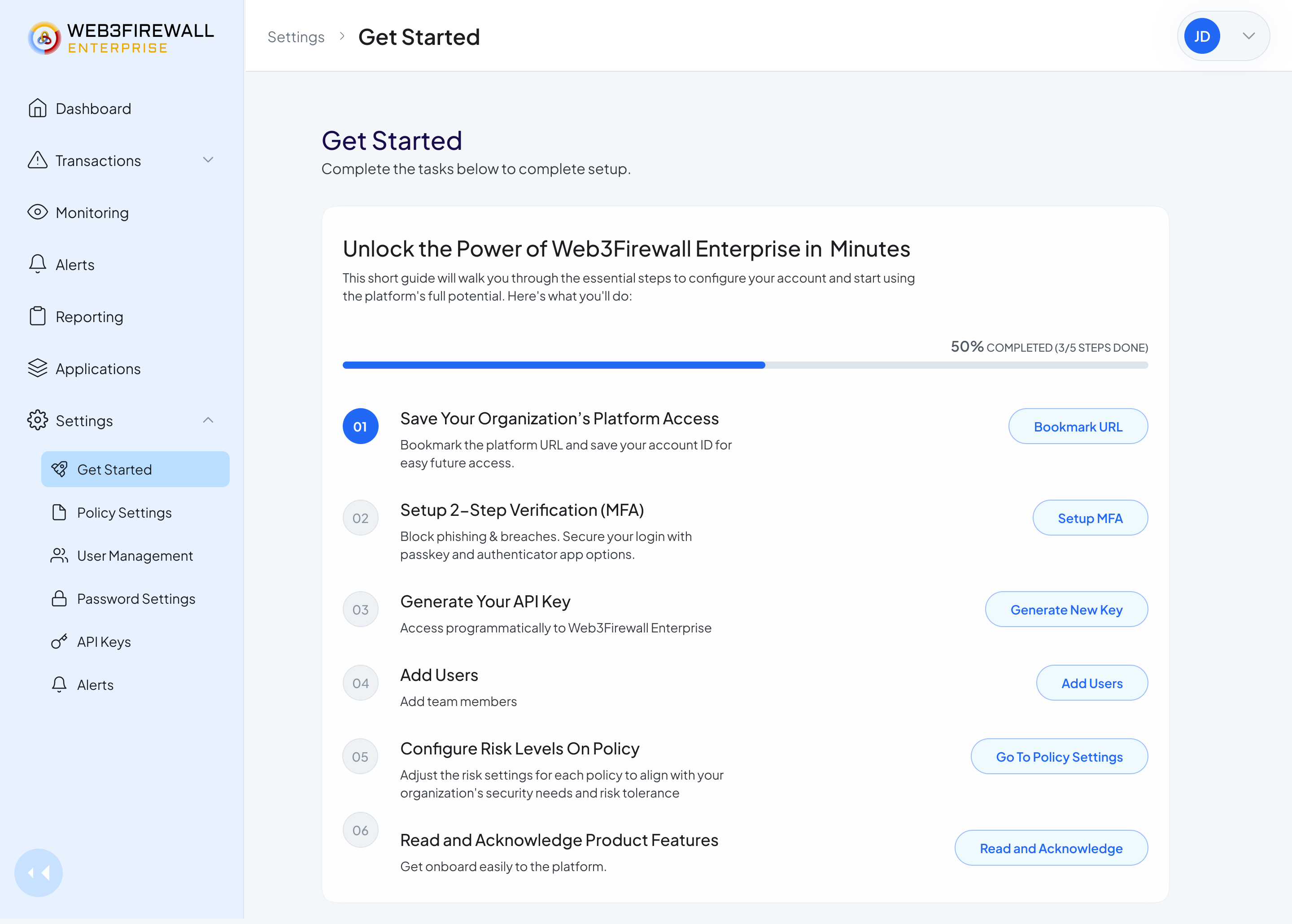
Get Started · a single scrollable page. Compliance leads can share the URL and everyone sees the same progress.
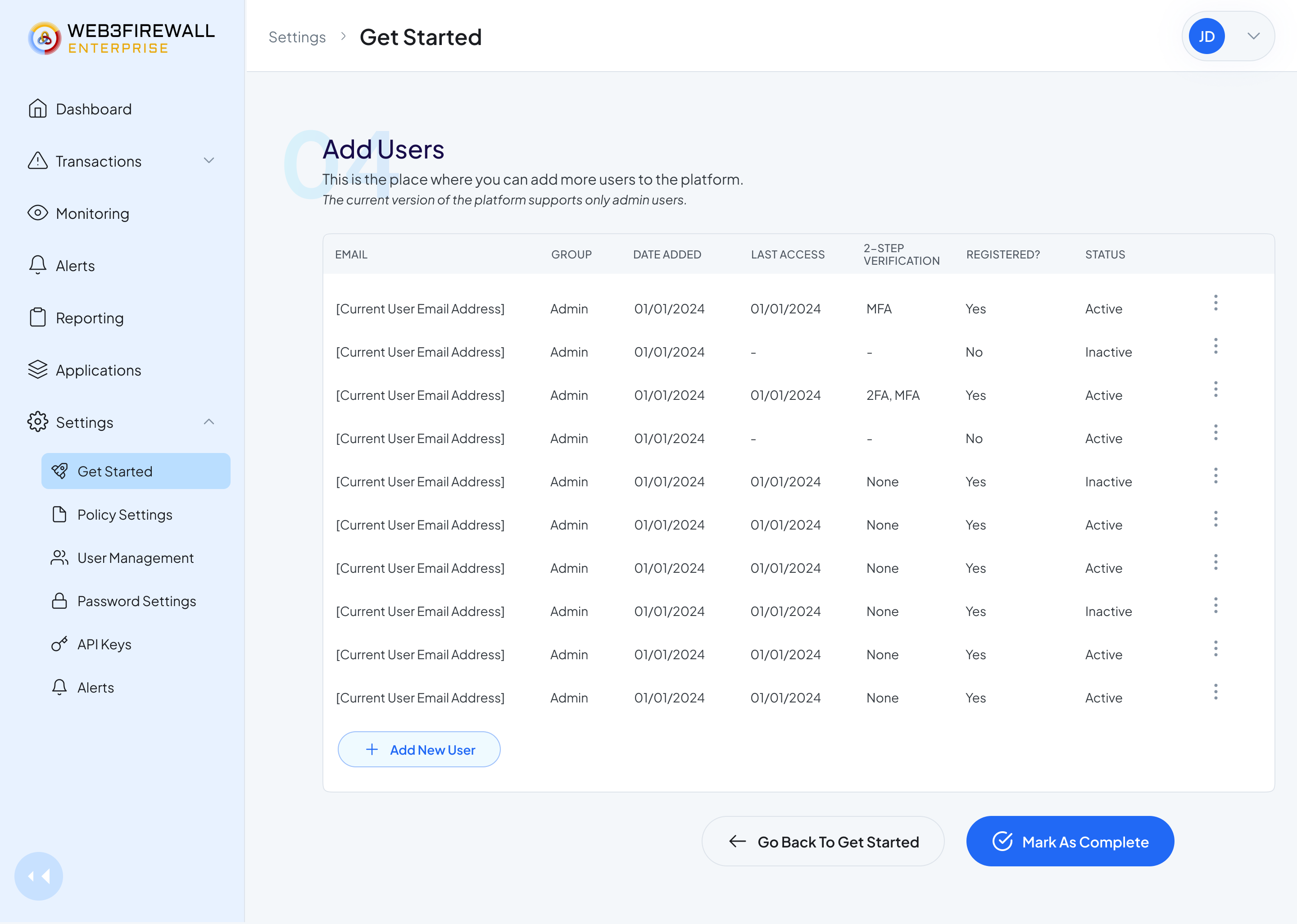
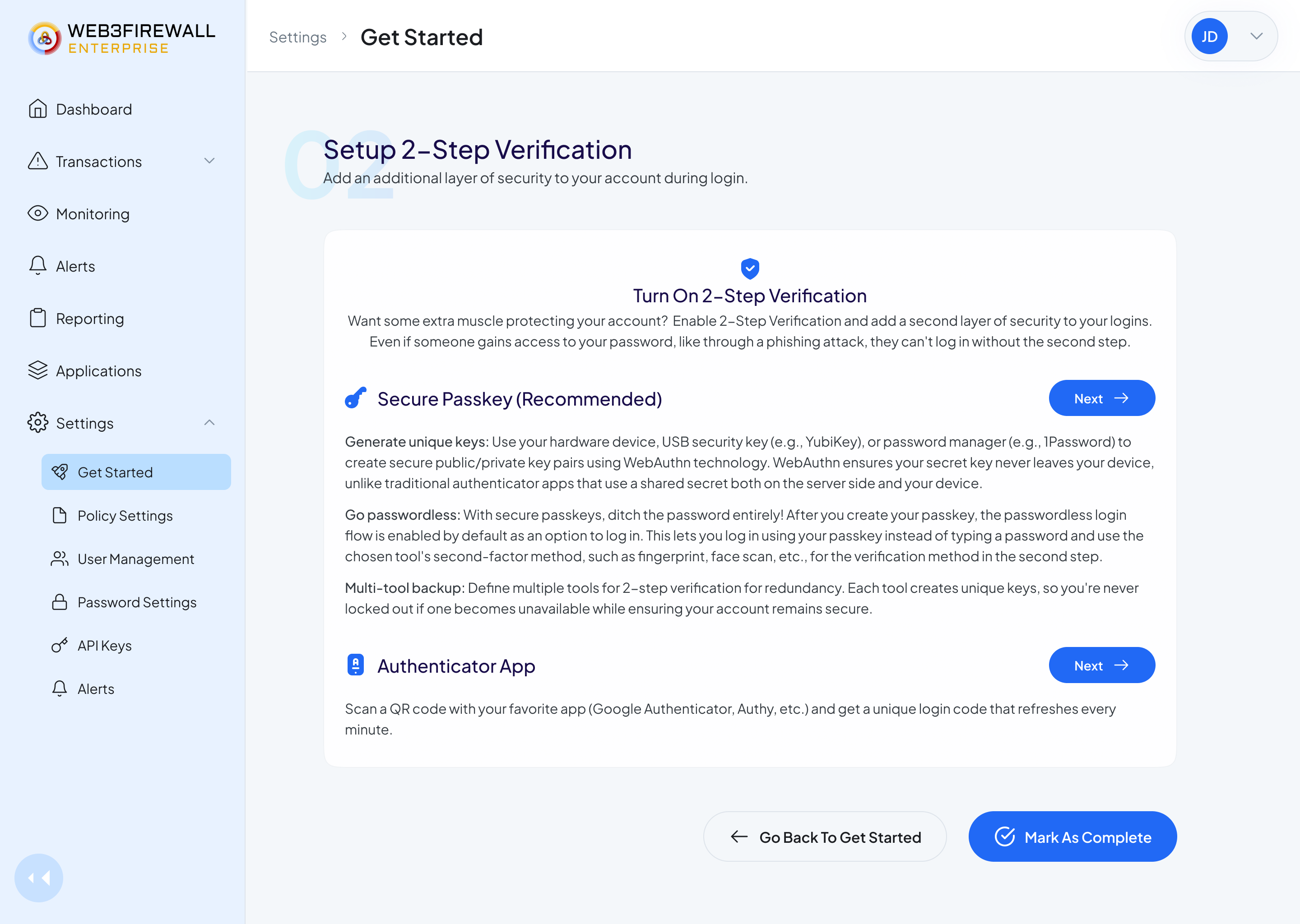
Adding users and setting up 2-step verification. Serious steps, presented calmly.
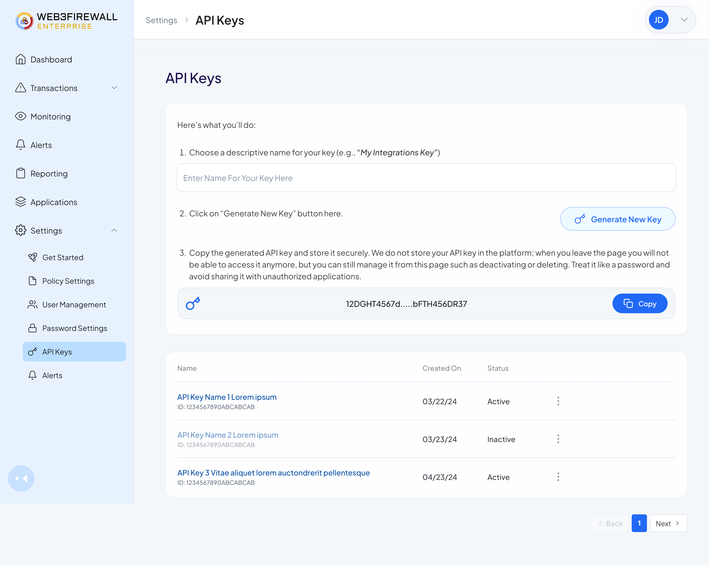
API keys, the most sensitive page in the product. Warnings sit next to the actions, not buried in a docs link.
Reflections
What I learned on this one.
On giving control to the people who actually own the risk.
The biggest structural decision in this project was a power shift. Policies used to live in engineering tickets. Compliance teams knew the rules but couldn't touch them. Moving policy ownership into the product meant redesigning who gets to make a decision.
On designing a product whose main feature is invisible.
Most of what Web3Firewall actually does happens in milliseconds, before a transaction even reaches a human. My job was to make the aftermath legible: why something was flagged, what happens next, who decided. Designing for a product that succeeds by being invisible taught me to put all my effort into the moment right after the automation hands off to a person.
On what "enterprise-grade" actually means in practice.
Every serious compliance lead I spoke to wanted less on screen, not more, because their real work happens in the decision, not in the scanning. Enterprise doesn't mean complex. It means the product has to survive an audit, a regulator.
On working solo on a system this size.
I was the only designer on a product used by companies moving billions of dollars. That meant every inconsistency was mine to catch, with no second pair of eyes.
What I'd do next
An AI copilot that reads the transaction and suggests the call.
The product already runs on AI in the background. The next thing I'd add is a light copilot for the analyst, not to replace them, but to give them a starting point. Something like: "Based on this wallet's past activity and your team's history with this counterparty, this transaction is probably fine to allow. Here's why, in three lines."
Next Case Study
Two-sided marketplace design for a regulated fintech. Web and mobile, built on top of an existing design system.
View case study